OUR ICFF FAVORITES 2016
This years ICFF was dominated by wood and LED lights. Overall there was a focus on unaltered building materials like stainless steel, concrete, and as mentioned above wood. Here are some of our favorites:

Pantosh Chair:
The original design of the Pantosh easychair was born of the fusion of two pieces of furniture: the Panton chair by Danish architect Verner Panton (created in 1968), and the Willow Chair, designed by Scottish architect Charles Rennie Mackintosh (created between 1902 - 1904).
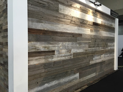
Atmosphere-Bois cladding comes from old Canadian and European loft barns. It can be used for interior or exterior trimming. The cladding is: greyish, brown or with original paint works, red, white, black, green, axe-hewn decorative beams, etc.
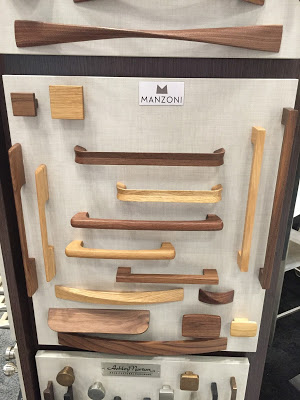
Mazoni has a series of wood handles and pulls. They come in two finishes, and would look great for an all wood look on cabinets or the pull just creating some accent.
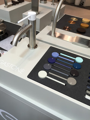
cea design has beautiful stainless steel plumbing fixtures. All very simple and elegant. Their Gastone serie includes customizable faucets.
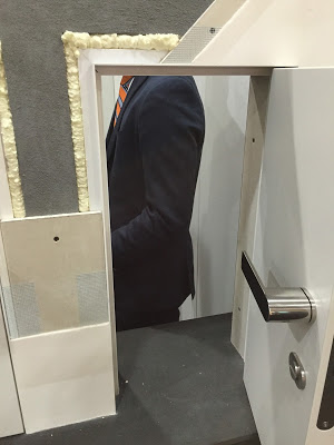
Xinnix Doors are beautiful ready made frameless flush doors and pocket doors which make the installation easy:
They include everything you don’t see after the install (which is the important stuff like the completely milled frame, installation materials, gaskets, 3D hinges, magnetic locks, door straightener…)"
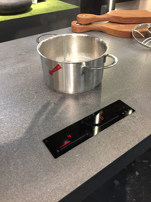
Bazzeo Kitchen:
Very exciting. Above you see an induction cook top which is installed below a stone counter. Only engraved rings indicating the location of the induction plates otherwise you see an continuous stone counter. Elegant and easy to clean
Another new invention by Bazzeo Kitchenis their movable counter top. Ideal for small spaces. See movie below
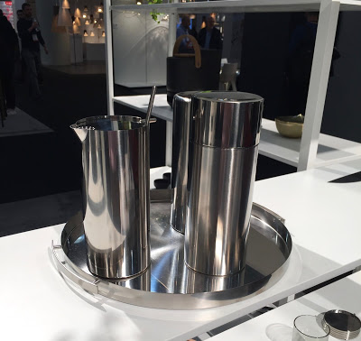
And lastly some fun with a cocktail set from Stelton....
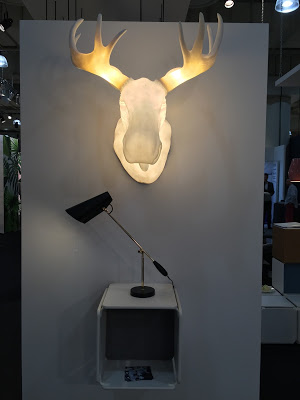
an elk....
and a leather sofa

A few more links for items we really like but we didn't take picture of them
Beautiful wood and concrete light fixtures:
Juniper THIN Chandelier:
Basaltina Mosaic:
Smart Water Table by DAS
3 empty water bottles patiently stood next by my desk awaiting their fate. My office building does not recycle plastic. As I toyed with disposal possibilities that created mounting alarm in my business partner, I took a closer look. The shape of a Smart water bottle is very elegant, and the side with the semi transparent caps has an especially strong aesthetic quality. Recycling a potential contributor to a land-fill as inexpensive furniture seemed an obvious, if not original idea! Our office waiting area lacked a coffee table - and this seemed a natural fit. The objective for this project was to create a table out of reused and reclaimed materials
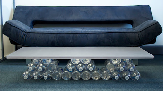
The base of the table consists of Smart water bottles melted together with a Weld-On plastic adhesive. The table top is a slab of Varia Ecoresin which is in turn made of 40% pre- consumer recycled content from the 3-Form reclaim program. The reclaim program reuses and recycles materials removed from installations or panels damaged in production. It prevents panels from entering the landfill and extends their useful life. By filling the bottles with colored beads (recycled), crumpled fabric or light powder, the tables can be uniquely customized to an individual's taste - and yes, if they are willing, to their mood!

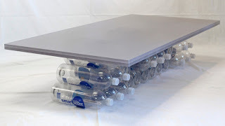
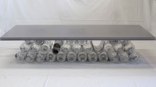
The table top slab stays in place with its own 25 lb weight. It's semi-transparency matches that of the bottle caps. The basic element of the base is a frustum of nine bottles each - three frusta are used. Depth and sculpture are introduced by offsetting selected bottles and flipping their direction. The pattern created in this manner appears as two triangles and a seemingly suspended truncated triangle in the middle. The outer two triangles book-end a flattened U that supports the middle triangle. The spaces between the supports is used to store newspapers, magazine and books.
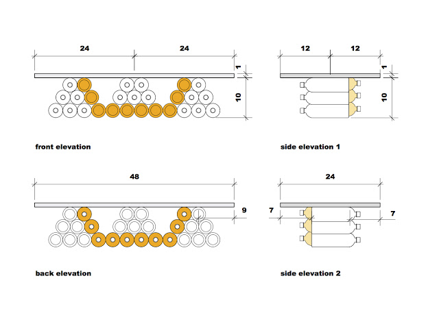
Another option as a table top is plywood painted with chalk paint. It adds color and can be drawn on.
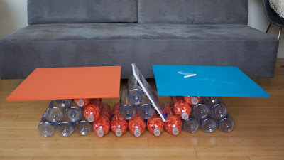
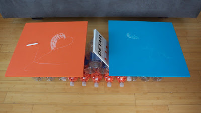
Similar to Duchamp's Readymades, this design moves the water bottles from garbage to a functional piece of design in a new context. While not tailored for mass production, it uses leftovers from mass production as its components and provides a high level of contextual customization.
Our first Micro Apartment is featured on Tiny House Nation
David introduces it in the Tiny House Nation episode below. You Can see the David and our design by jumping to minute 21. It is about 2 minutes long. Check it out!
http://www.fyi.tv/shows/tiny-house-nation/videos/204-sq-ft-climbing-gym
DAS NEWS
Design Bureau Magazine
DAS Architectural Idea
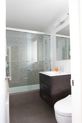
Making an Old Bathtub Look New.
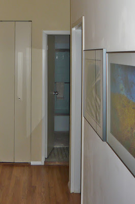
Renovating a bathroom can be a pricey, disruptive and time consuming endeavor: Demolish everything; Replace the tiles and fixtures. Taking the old and perfectly good bathtub and replacing it with a new one often of poorer quality adds even more cost without great benefits. However leaving the bathtub as is creates an eye sore in an otherwise new bathroom.
 |
| Before |
 |
| After |
One of the ideas we implemented in this project is keeping the old bathtub in place but enclosing it's front with tile. It appears new from the outside and fits in perfectly with the new styling of the bathroom. Two things should be considered when doing this: you need a big enough bathroom as the new ledge will take up 4", you must carefully waterproof the tile ledge and floor. In our case we used the floor tiles for the ledge This visually links the front of the bathroom with the floor, eliminates the ugly standard bathtub front and the room feels more continuous and spacious.
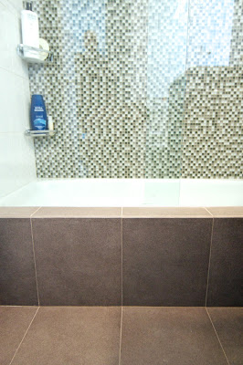 |
| Floor tiles creating the edge |
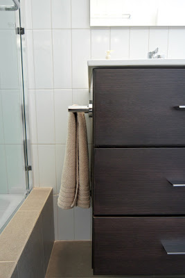 |
| Ledge and Vanity |
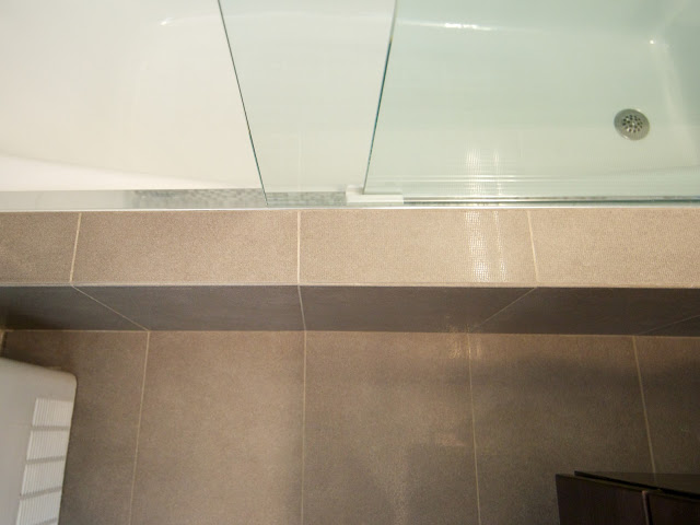 | |||
| Ledge with Shower Door Track |
Things We Like
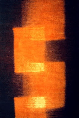
Tania Johnson Design does custom contemporary hand-knotted rugs. She specializes in translating her textural photographs into ethereal designs. Every rug starts with an image that inspires her. The great thing about the carpets is that most of them can be ordered in different qualities knot, which makes them affordable to more of us while being beautiful and of good quality.
DAS Interior Design Ideas
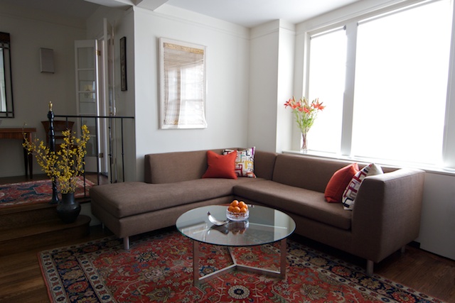
Let's go back to David and John's place and show you how very minor modifications can lead to significant changes in mood and setting.
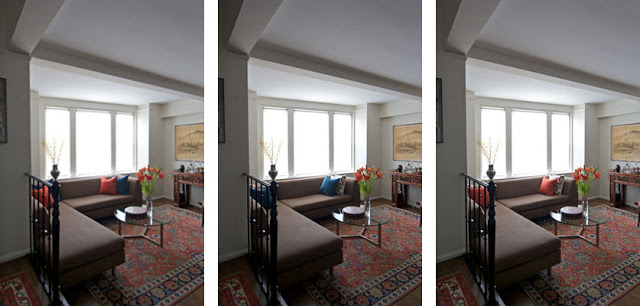
In the following photos we show the same couch with different pillows. As you see, the atmosphere of the room changes. Some pillows intensifying the colors in the rugs others subduing them. These photos, all taken with at the same time of day with identical lighting and exposure settings, show stark differences between the effect of the black, orange and white patterned pillows. The black ones create a subtle lounge like effect, creating a sophisticated evening atmosphere. While the orange pillows pick out the colors of the rug and console in the back - giving the space a lighter casual daytime feel. Two starkly different moods created by swapping nothing but pillow covers.
DAS Spring Idea
DAS News
Name: David & John
Location: West Village, New York City
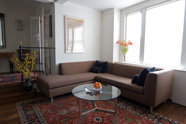
The apartment blends two distinct tastes, into a cohesive style: The traditional taste of John based on the Art Deco style of the building and David's modern tastes.
John, a Philadelphia born lawyer, with fairly traditional taste in interior design had lived in this West Village Art Deco condominium for fifteen years. It was furnished with a mix of old family pieces and antiques collected over the years for various former homes in Philadelphia, Washington DC and Connecticut. When David, a British architect and partner in DAS Studio (an architectural and interior design firm in Manhattan), moved into the apartment they decided it was an opportune time to redesign the space combining the best of both styles.
The result is an apartment that reflects two different tastes cohesively merged into one creating a calm and welcoming atmosphere.


