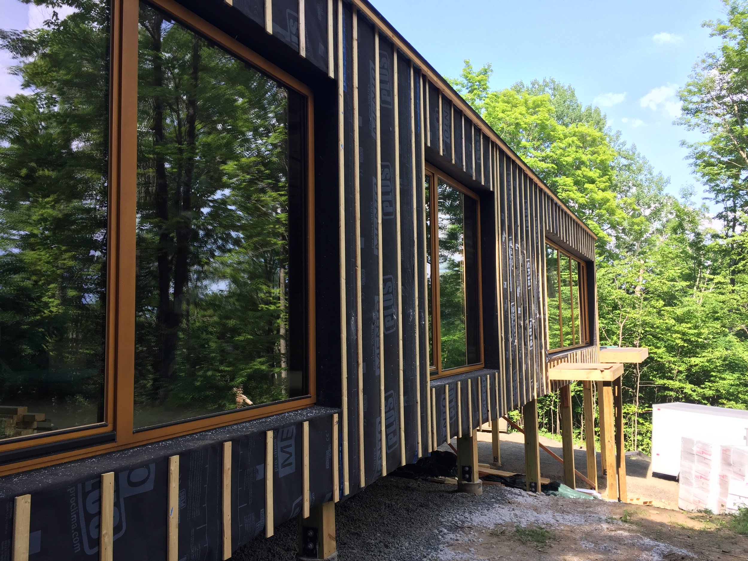
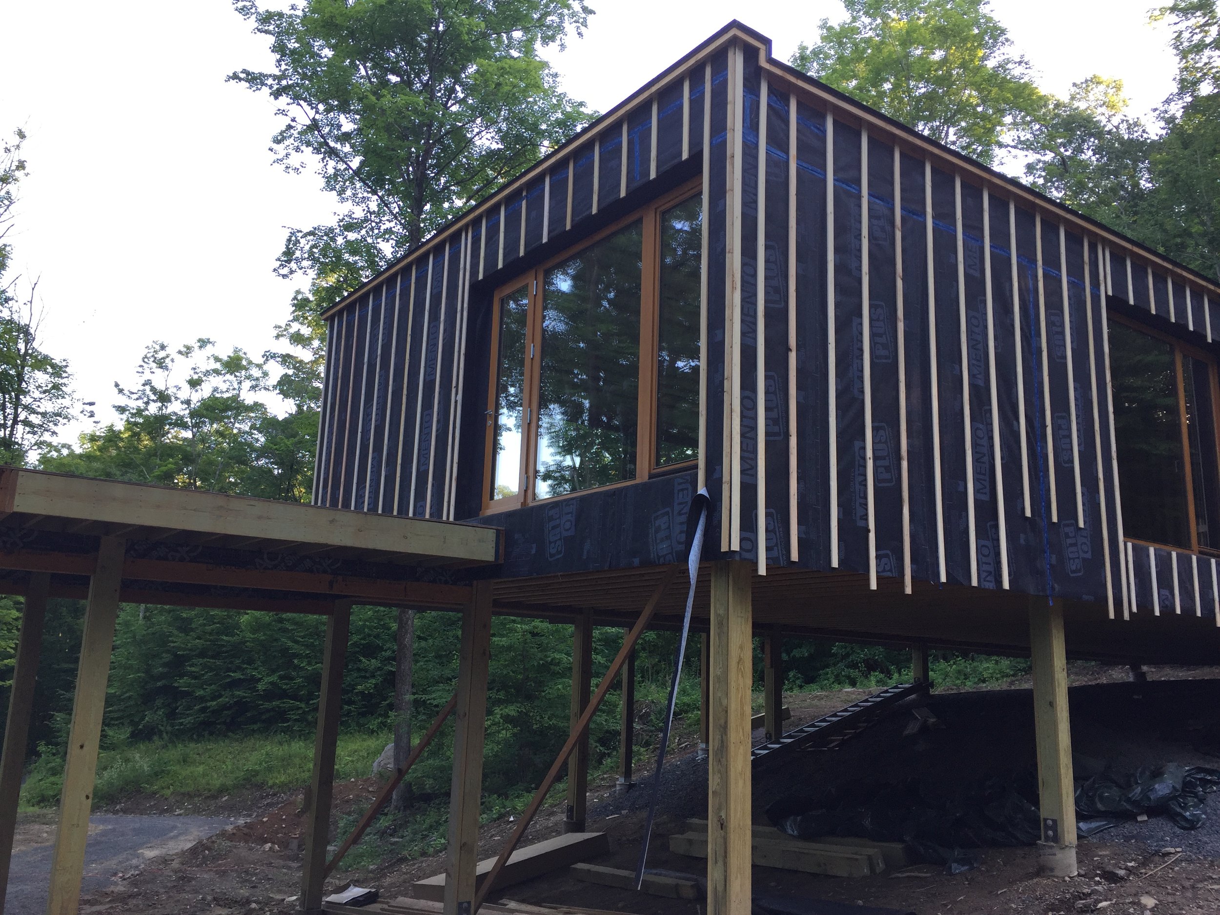
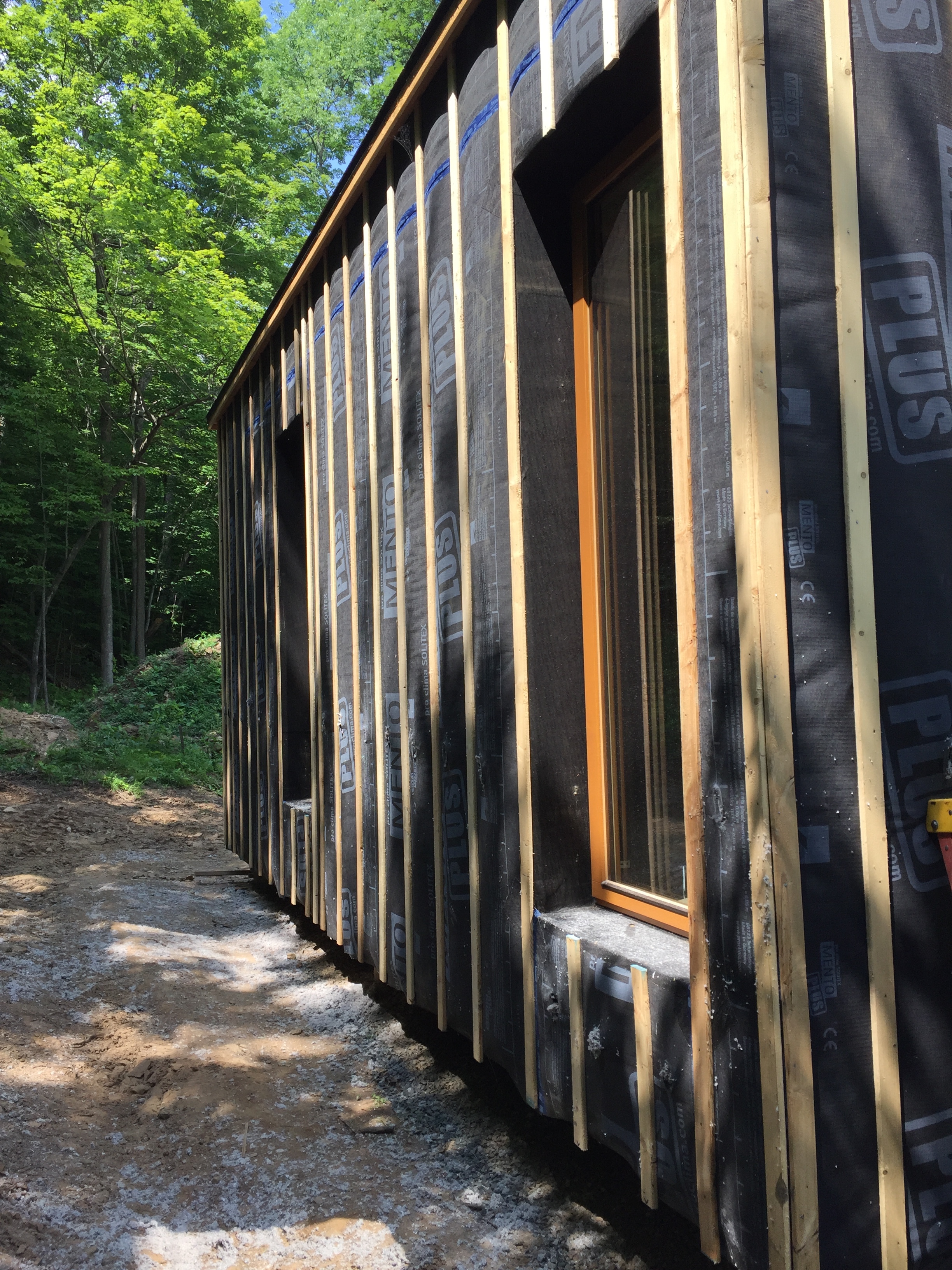
Touch The Earth Lightly- A Connecticut Passive House
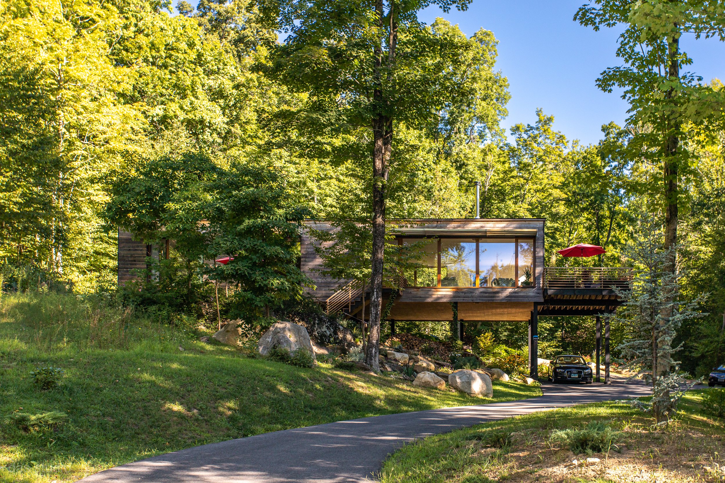
View from Driveway
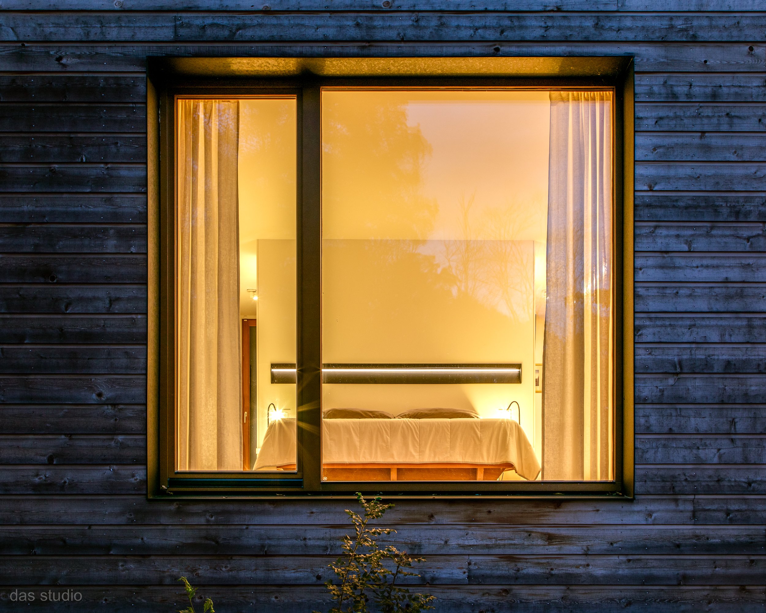
When David Burdett, a partner at the architecture and interior design firm DAS Studio, wanted to build his own house, he intended to make it a “forever home.” In conceiving this vision, there were four critical parameters David needed to address: energy independence, spaciousness and flexibility so the residence can be used as an office and serve guests within its small 1,400 SF footprint, aging-in-place requirements, and, of course, sustainability to address the pressing needs of the environment.
The Design
David has long loved Connecticut’s countryside. In 2016, he found the perfect place to make a home for himself in a parcel of land on the Northern edge of New Milford, Connecticut. Once David found this site, the design fell into place naturally. He fell in love with the topography of the land. The parcel is about four acres of forest, with a clearing towards the view of a valley. The valley views with southern exposure are an ideal setting for a Passive House (energy-efficient building) using the low winter sun to heat the building. A level, open space in the back of the house was perfect for creating a pollinator meadow. In front of the home, a rock outcrop provided the opportunity to include a rock garden.
Rock Garden Terrace
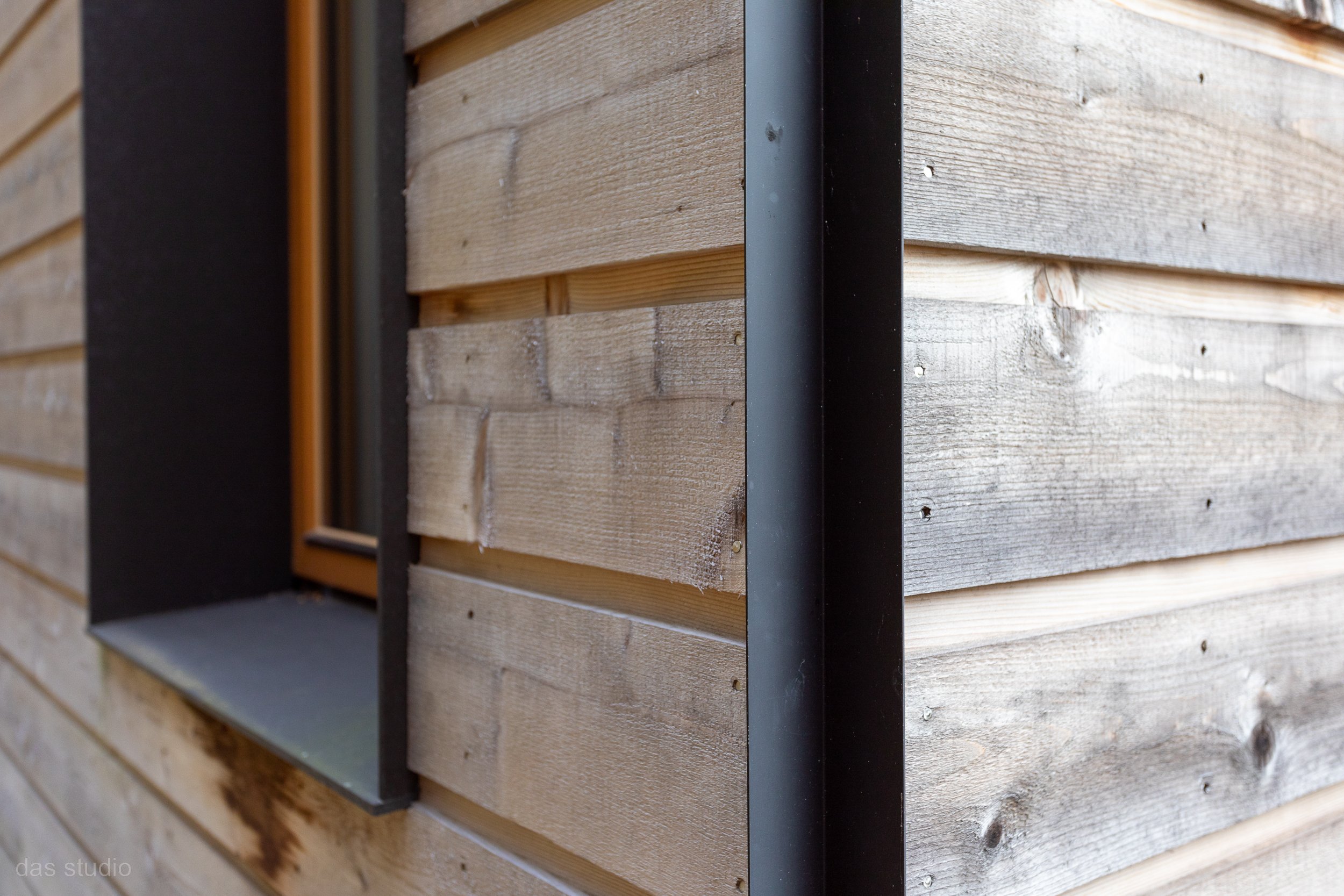
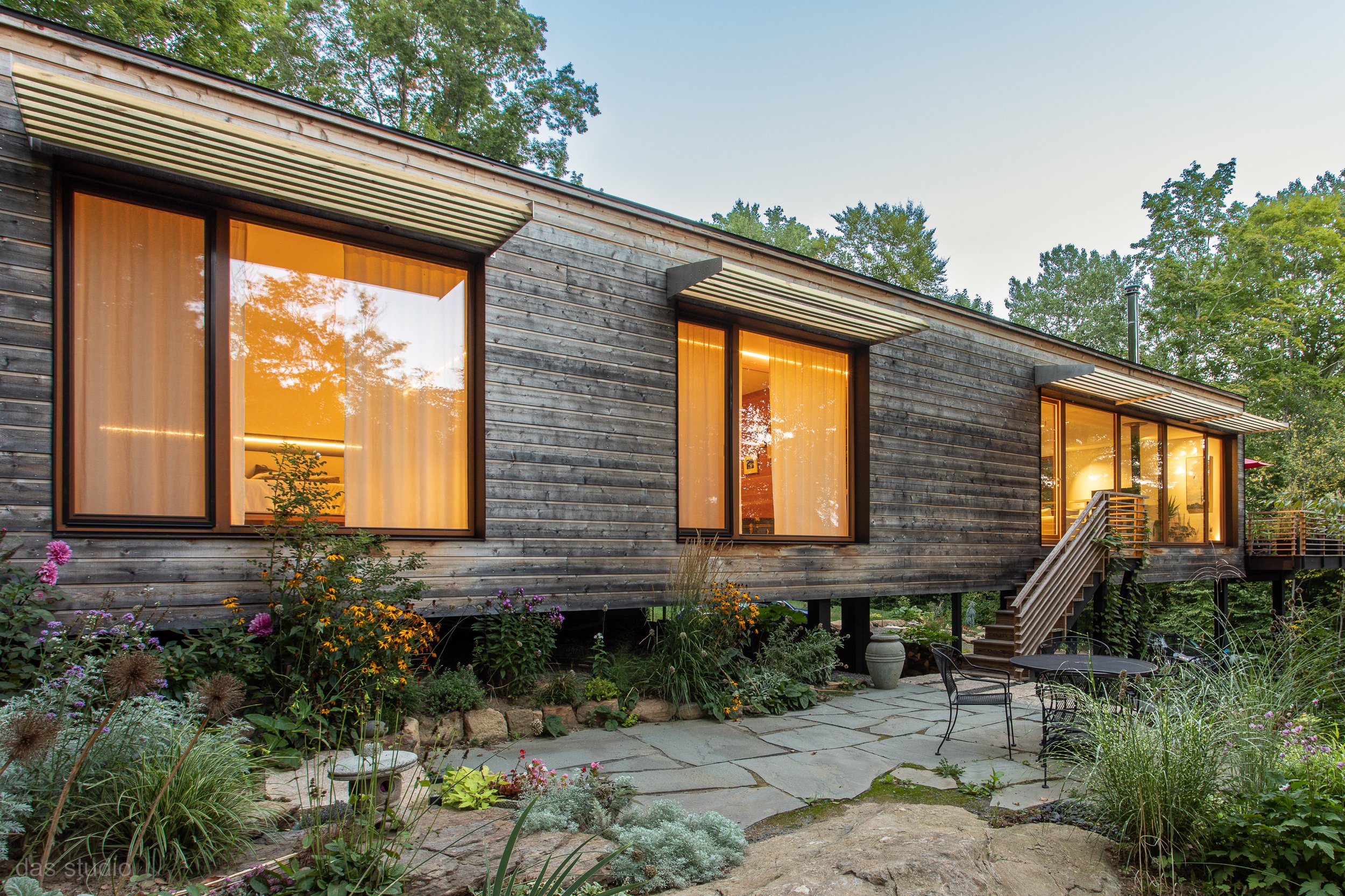
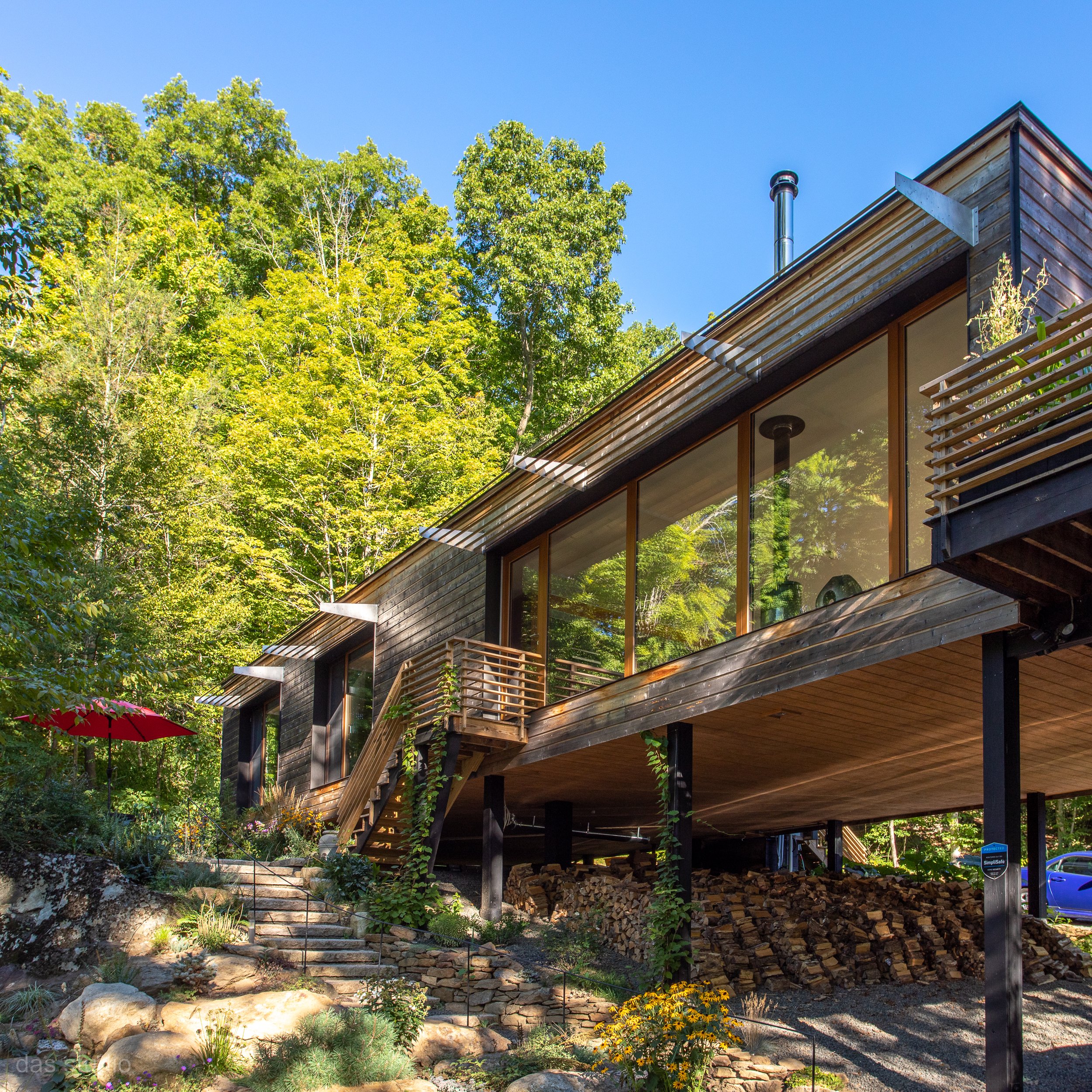
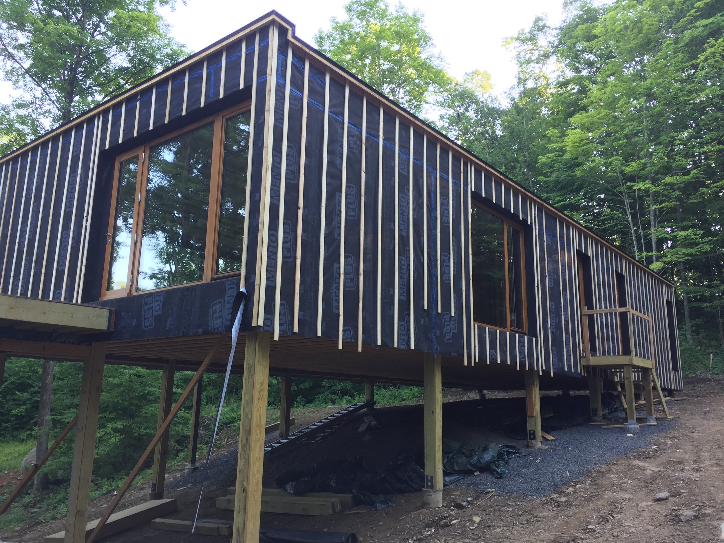
The overall design goal for the house was inspired by a quote from the Australian architect Glenn Murcutt, “Touch the earth lightly.” This means creating a living environment with minimal physical impact on the site. In David’s case, this was achieved by creating a single-story building hovering over an existing rocky outcrop. The floating horizontal box of the residence sits in juxtaposition with the verticality of the surrounding trees. The structure is supported on a grid of wood posts anchored to small concrete pads, minimizing the use of concrete and the disturbance of the existing topography. The exterior is clad with untreated cedar siding, which will visually blend into the natural surroundings and does not require any maintenance. The linear quality of the building is reinforced by the horizontal railings of the porch and stairs, a mid-level terrace, and the brise soleil.
Rock Garden
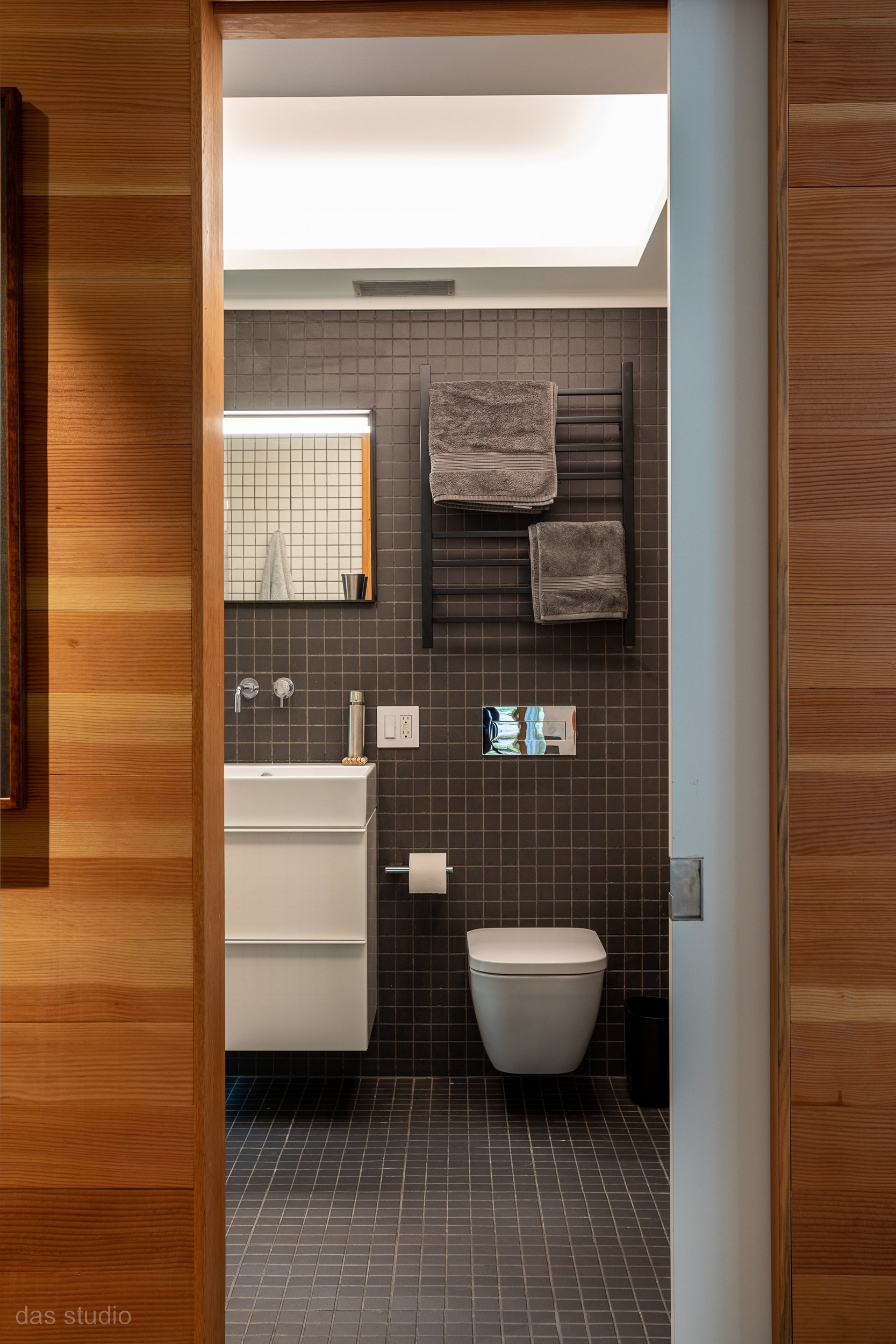
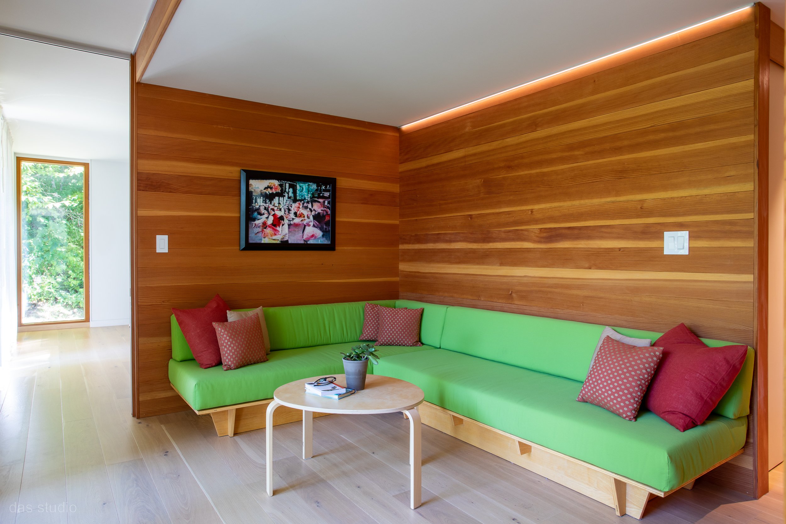
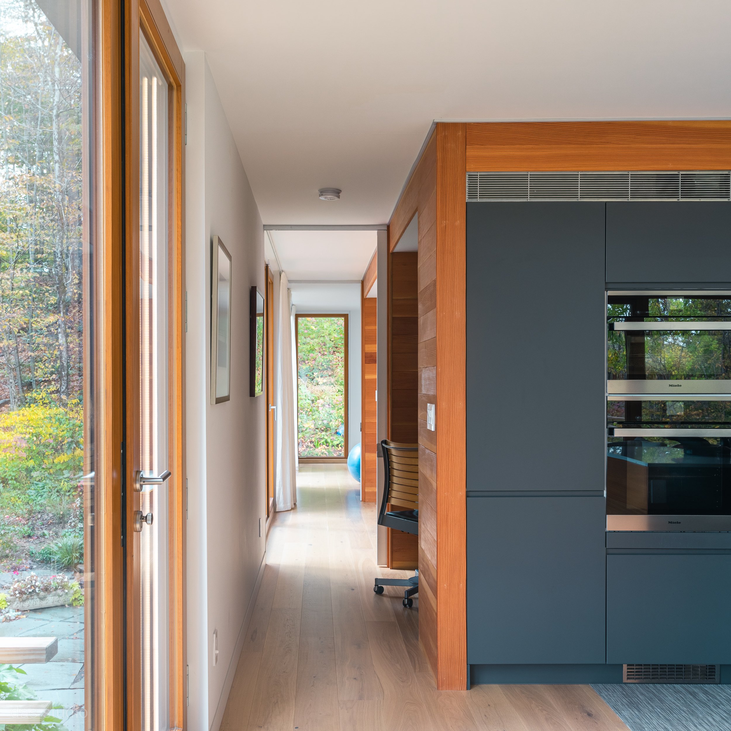
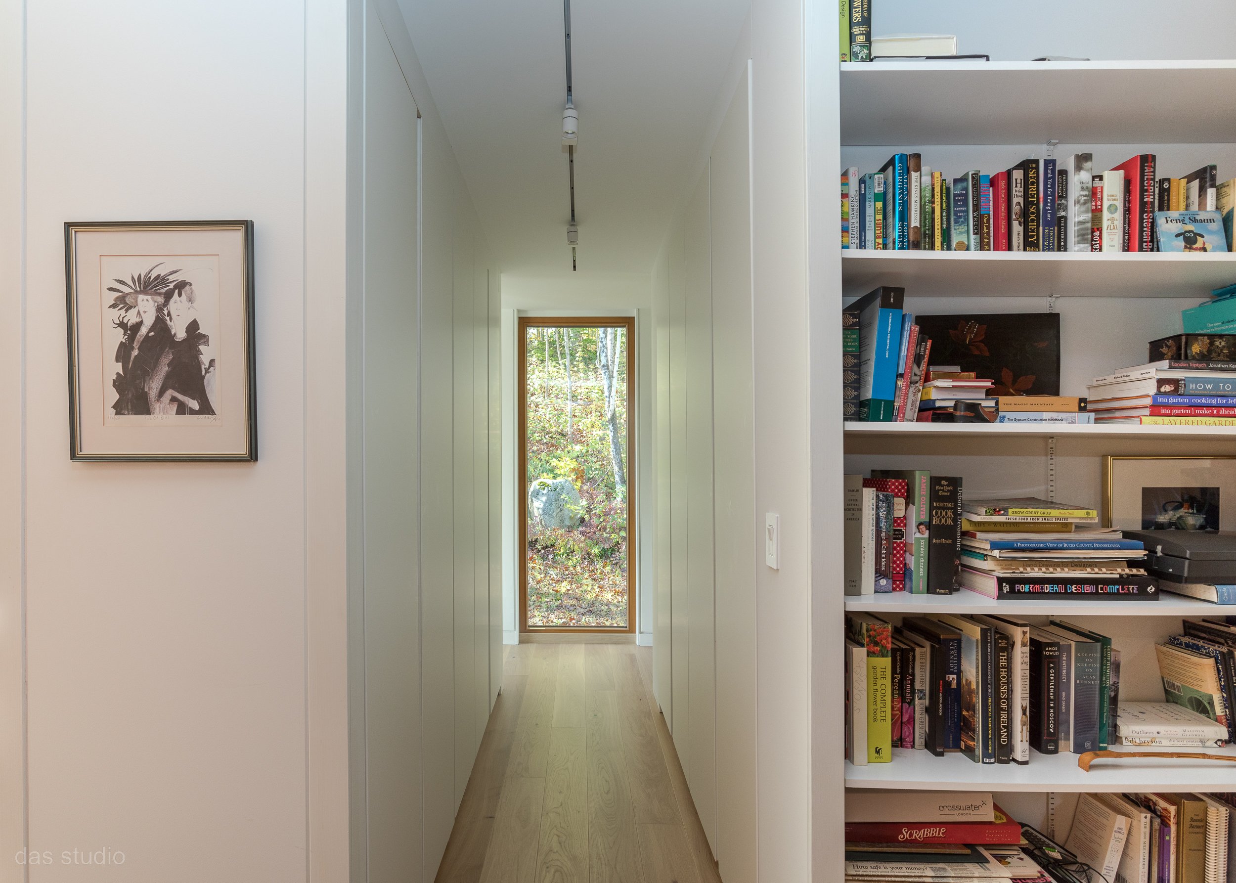
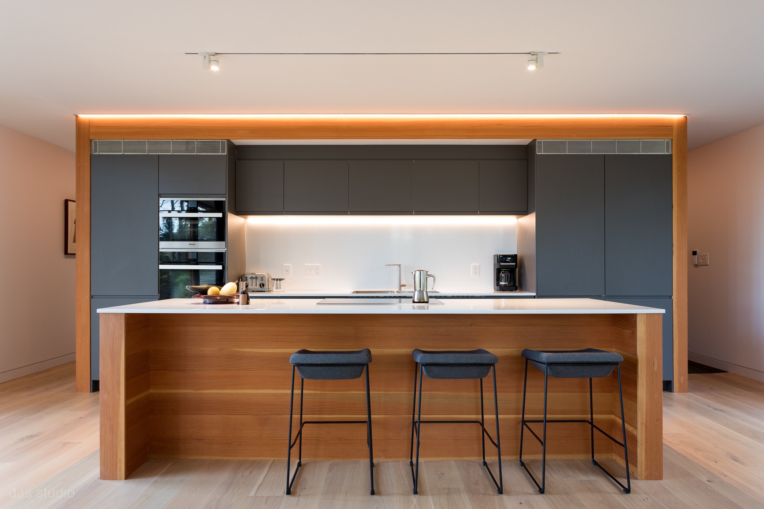
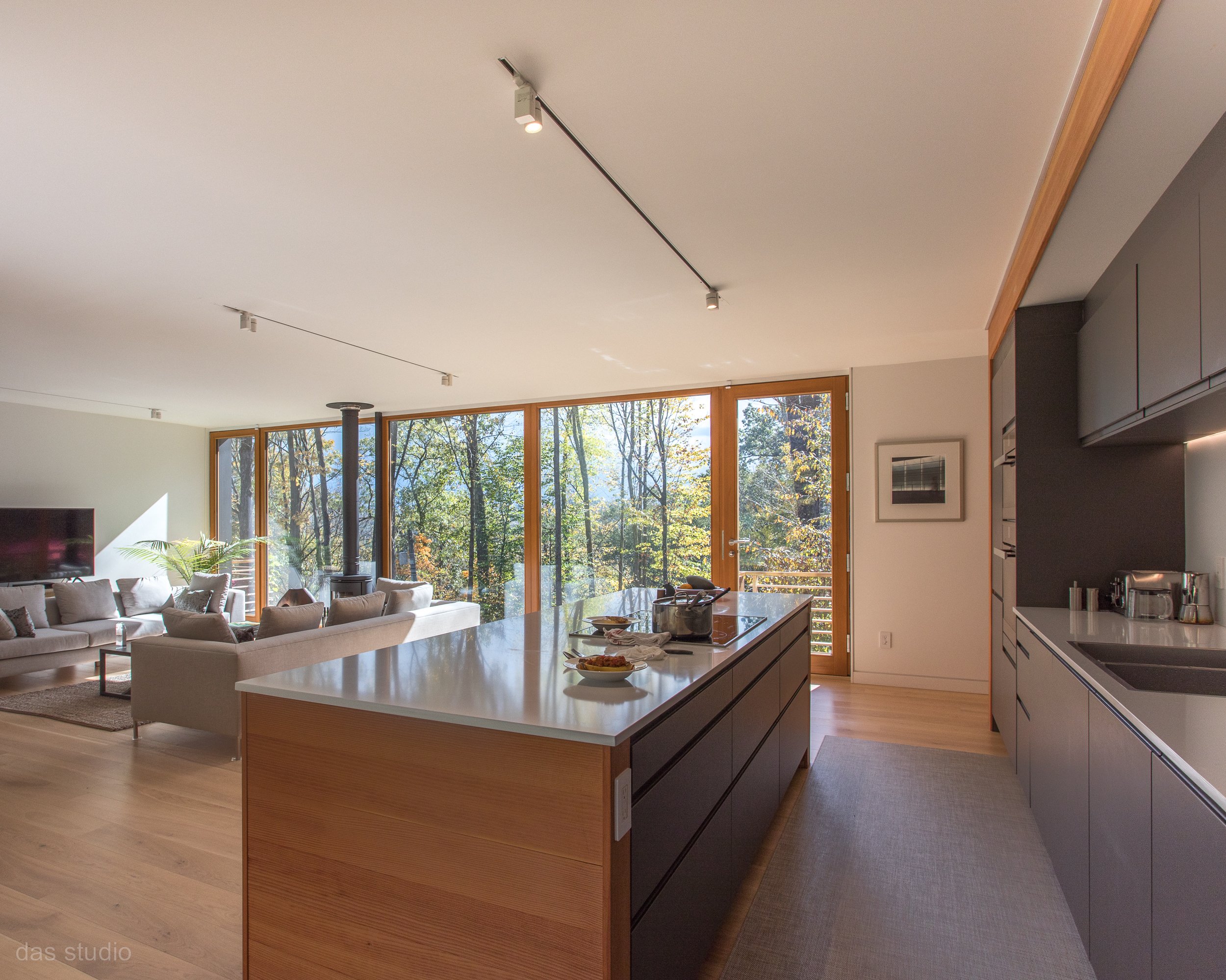
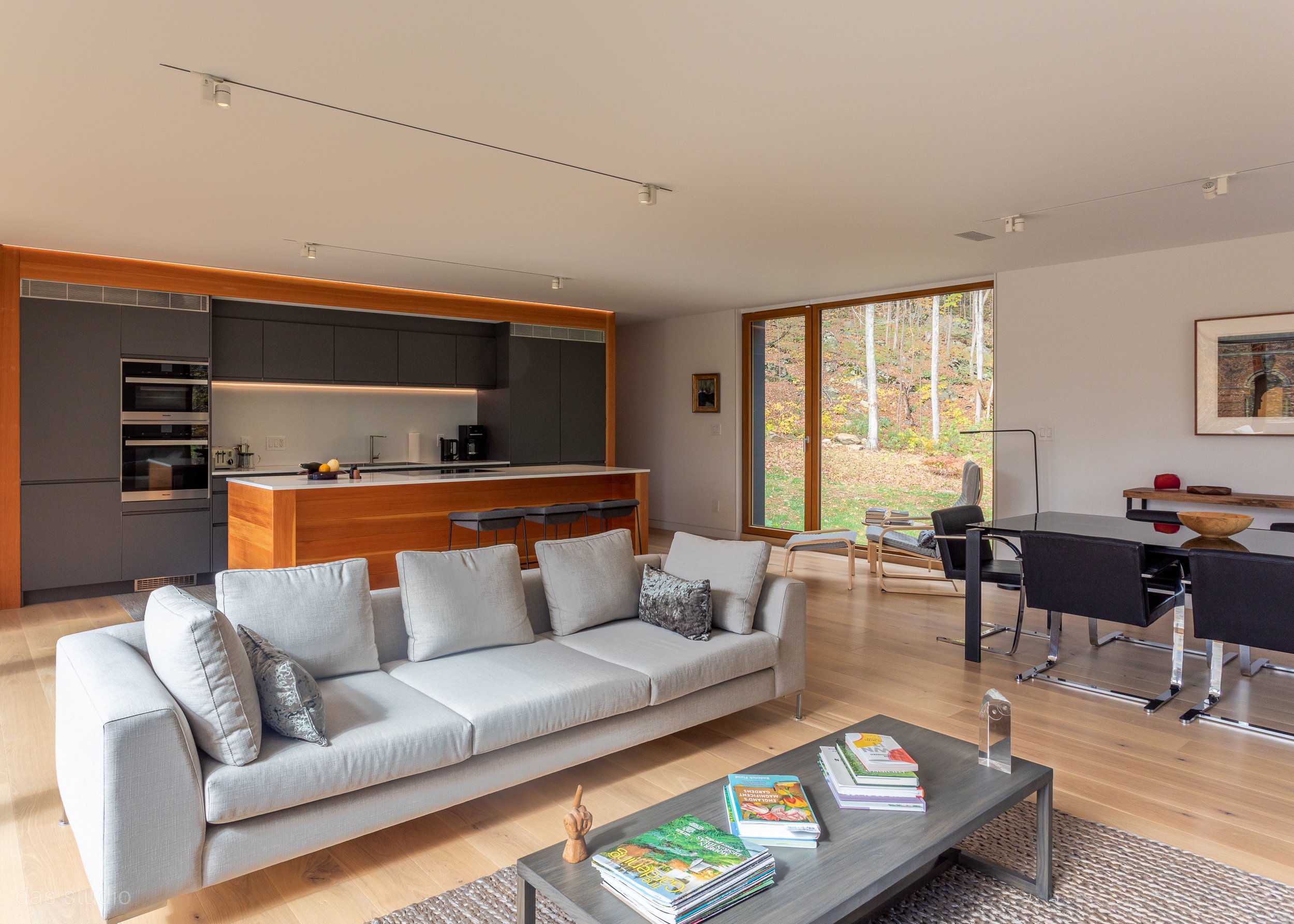
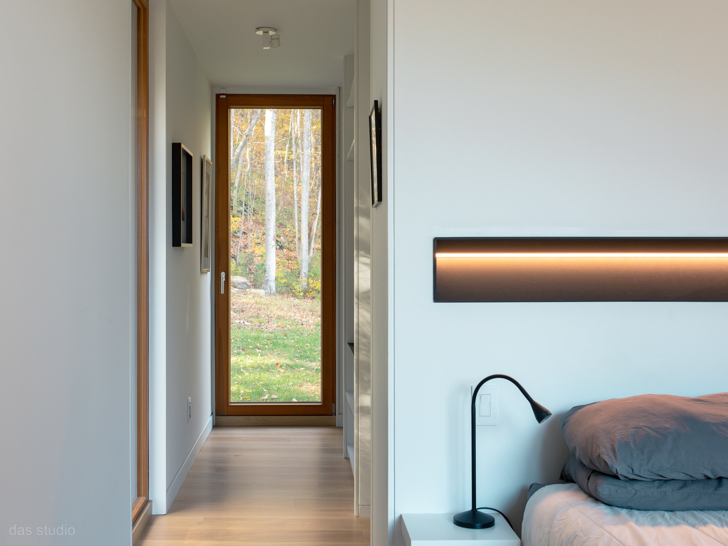
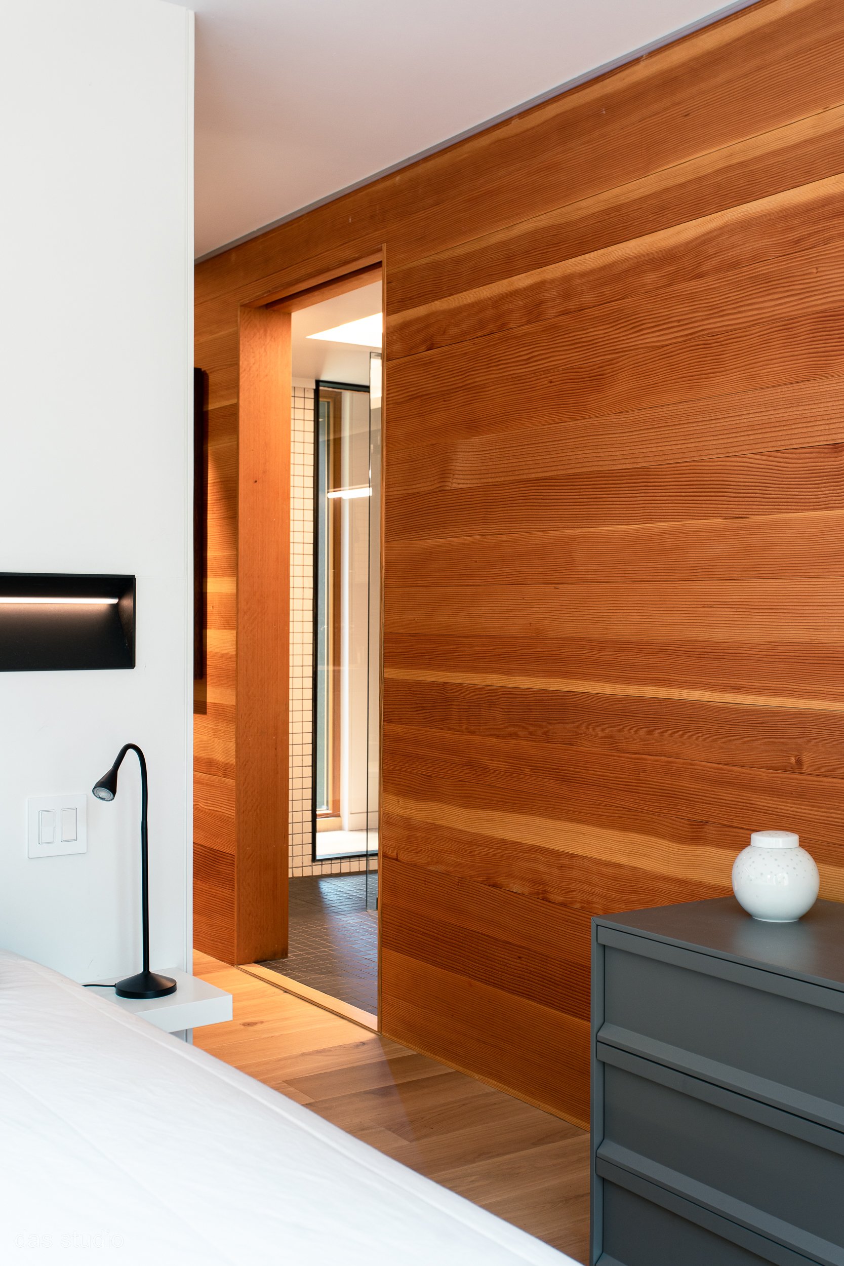
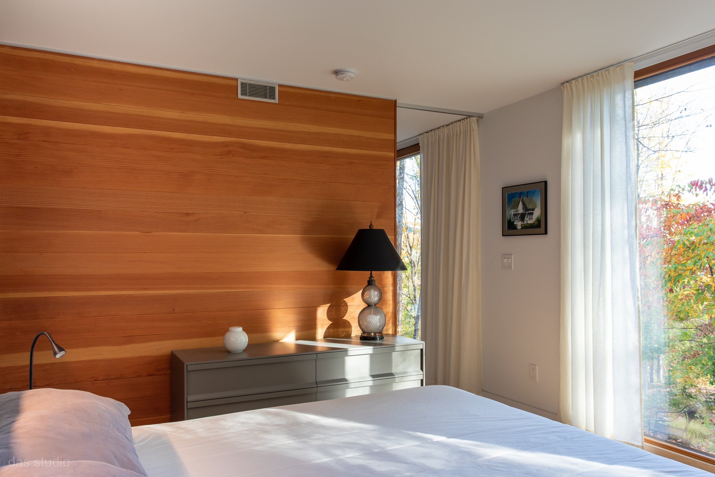
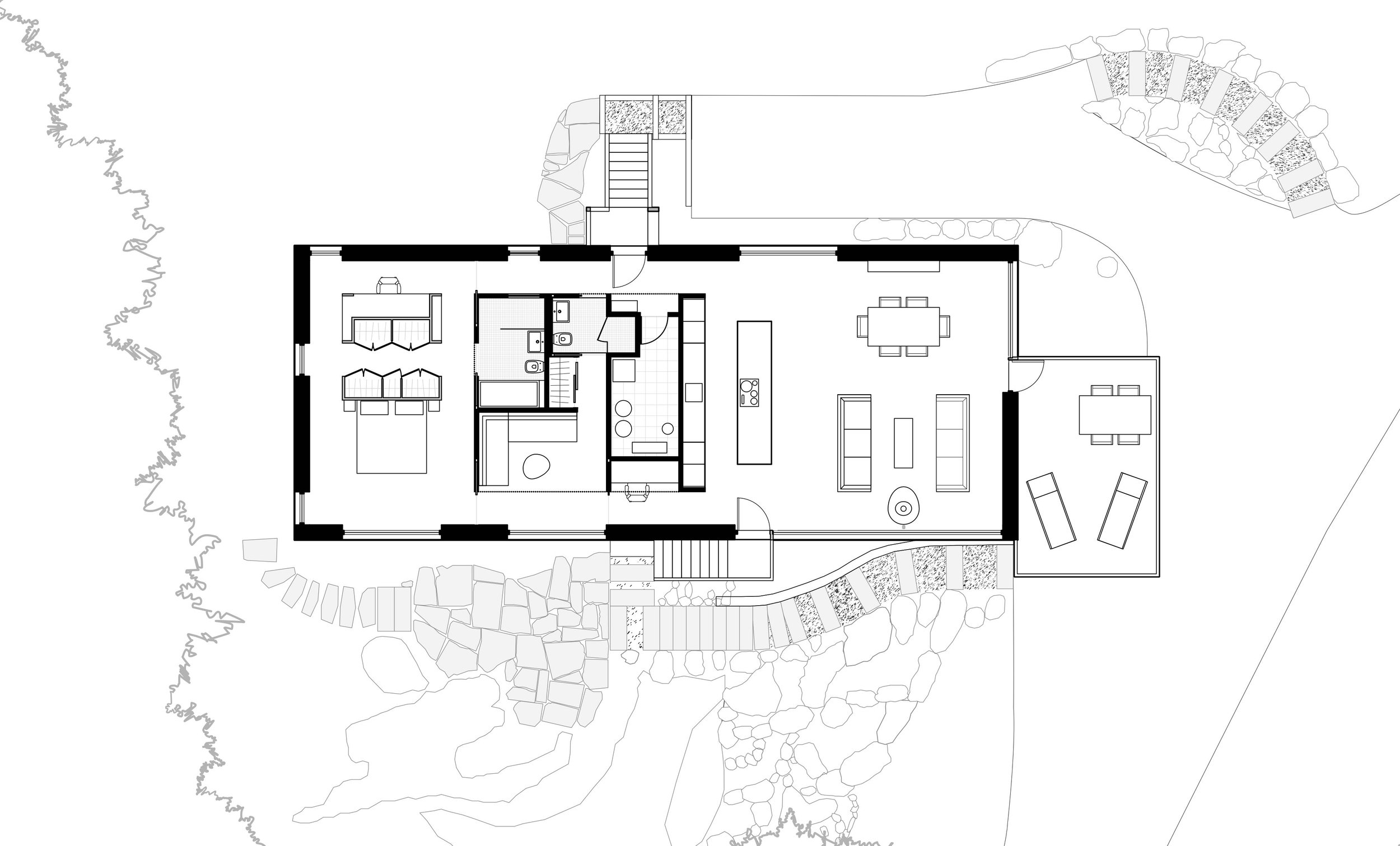
The design concept for the interior of the house is a box within a box. The central core of the house contains all the accessory functions: the kitchen, two bathrooms, a workstation, a reading area, and the mechanical room. This inner box, the core, is defined by walls and soffits clad in fir. The core’s ceiling, containing the air ducts and pipework, is 6 inches lower than the rest of the interior ceiling. The living and sleeping spaces bookend this central “box.” Two corridors on each side of the core connect the two primary areas. These corridors are three feet wide, as the house was planned on a three-foot grid. This three-foot design matrix helps to reduce the amount of construction materials used and creates clean lines and a minimalistic design aesthetic focusing on views of the surrounding nature.
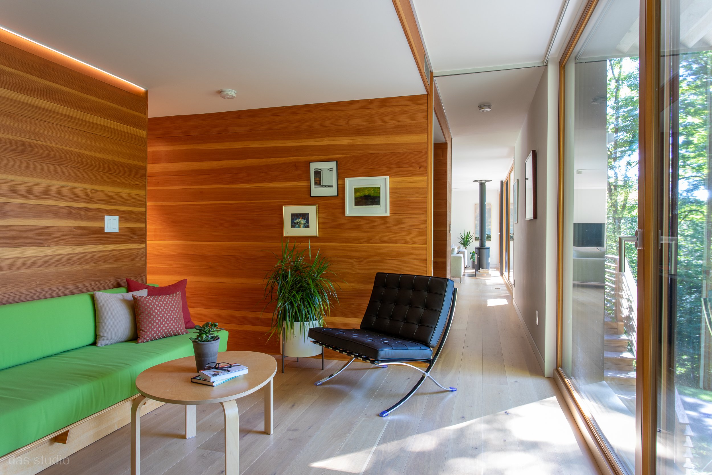
Hallway and Den/ Guest Room
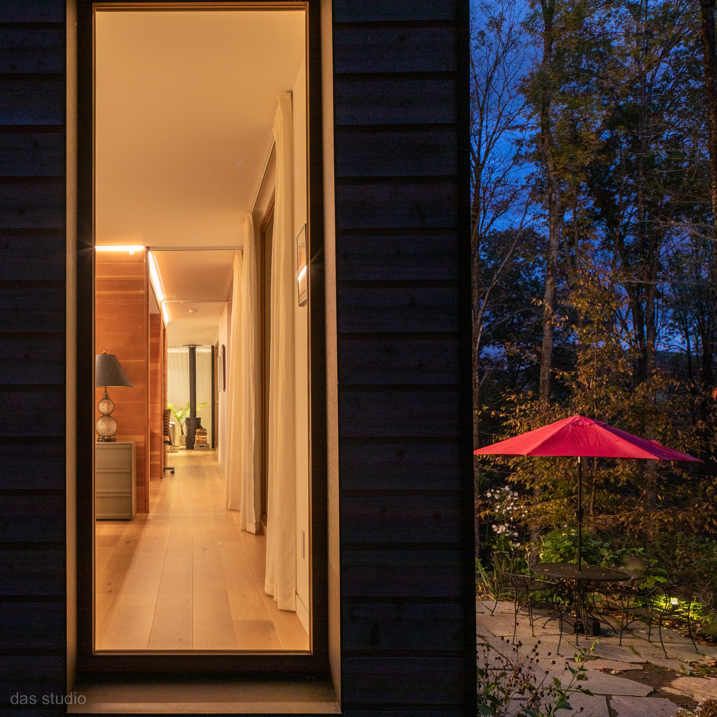
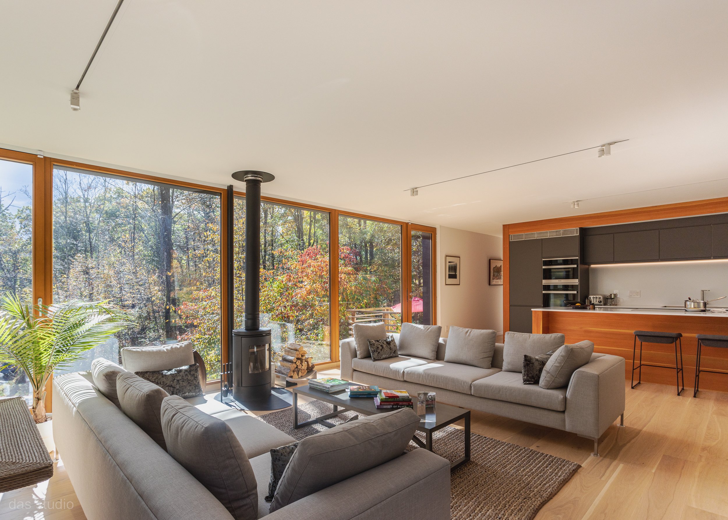
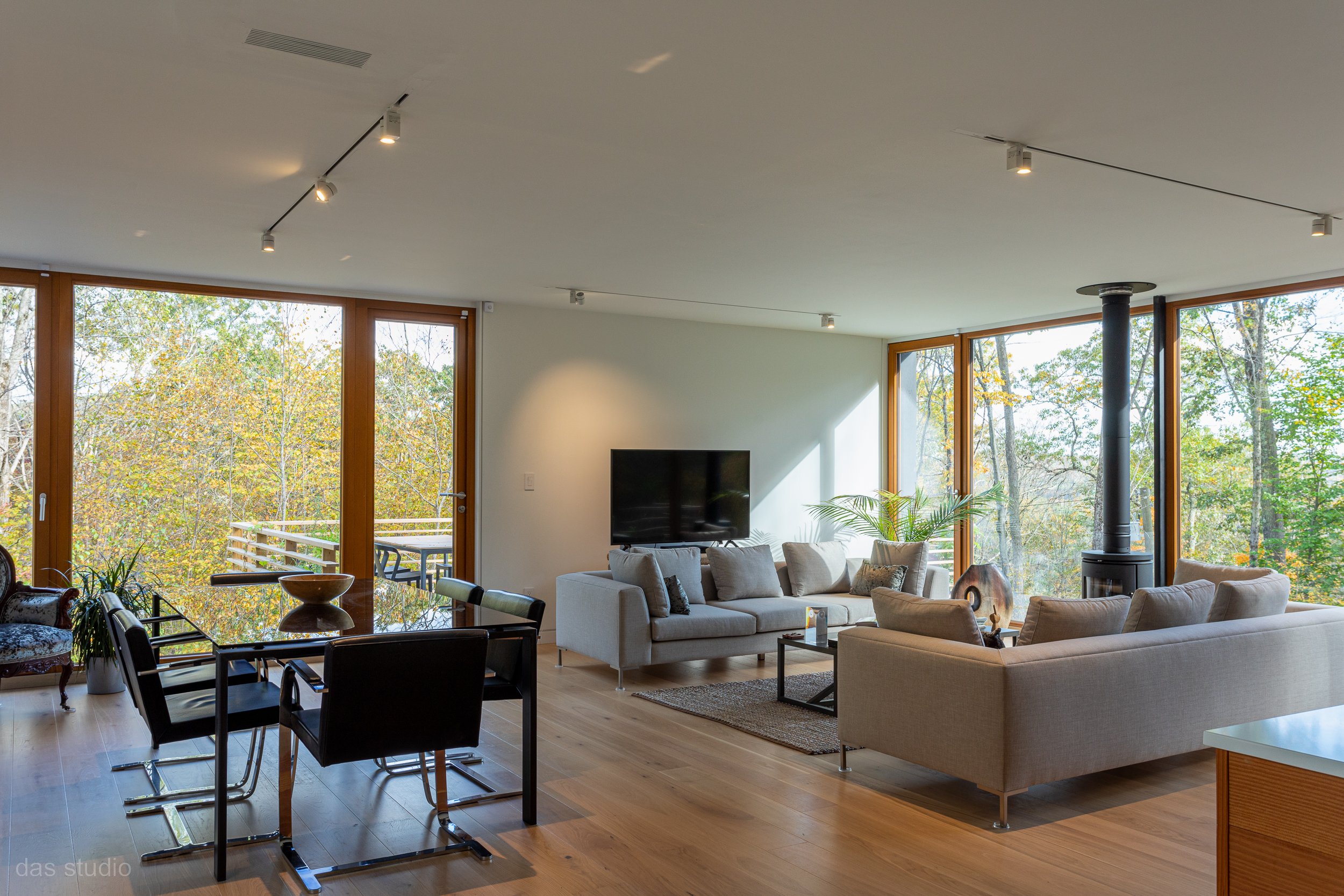
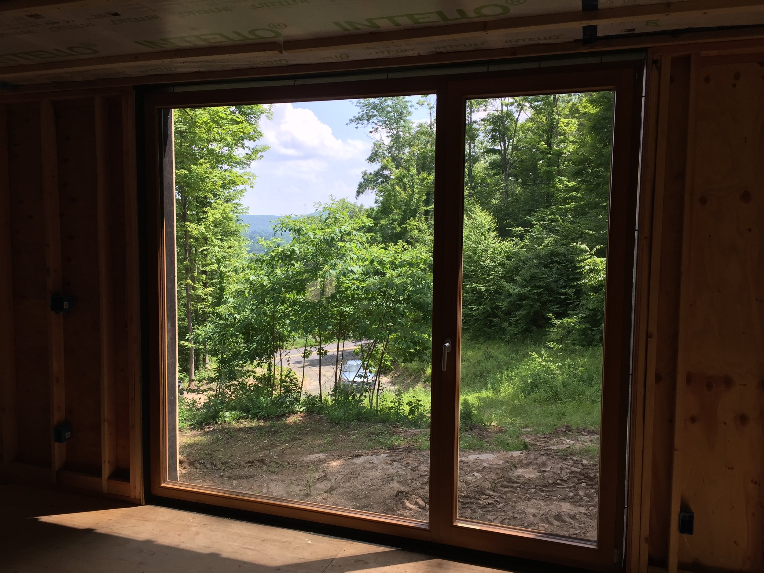
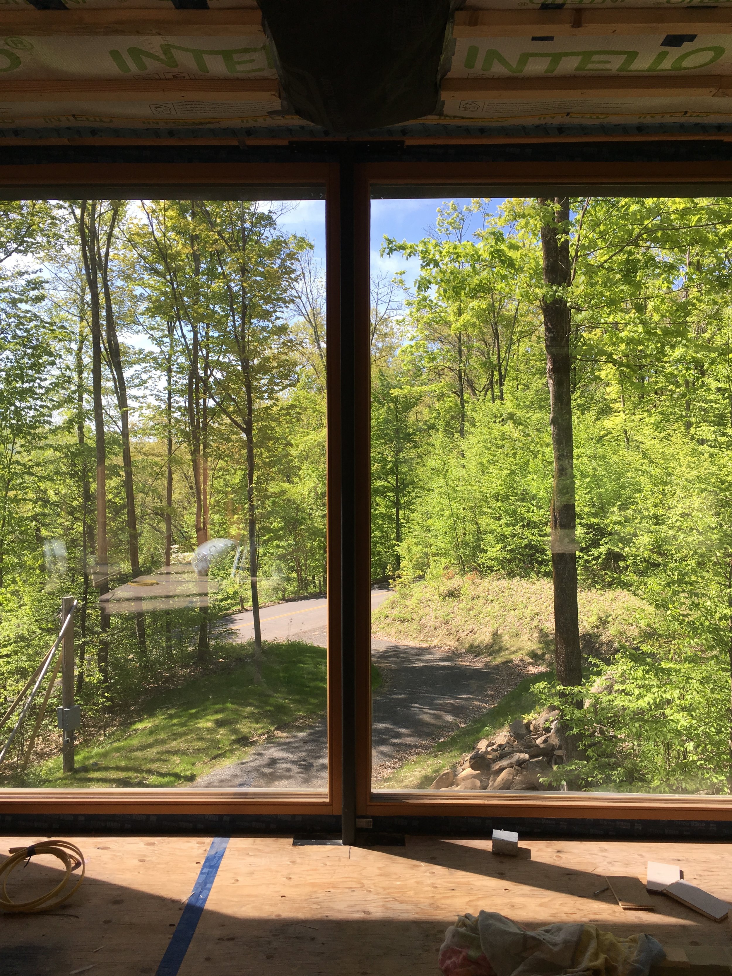
To take advantage of the valley views, the building has significant areas of glass, all triple pane, opening mainly to the south. On the other walls, the windows are carefully located to frame specific views of the surrounding forest and hillside. Clockwise movement through the circulation route of the home provides window views of the landscape on all four sides. In the opposite direction, the view ends with a strategically placed art piece. All the windows are floor-to-ceiling, which allows natural light to flood the space. The large windows visually expand the relatively low ceiling height of 8’- 3” and blur the division between the interior and the exterior. With its elevation above the ground, the interior provides the experience of a tree house suspended in nature. For privacy, different areas of the house can be closed off by pocket doors, and these pocket doors are virtually invisible when they are open.
Living Room View
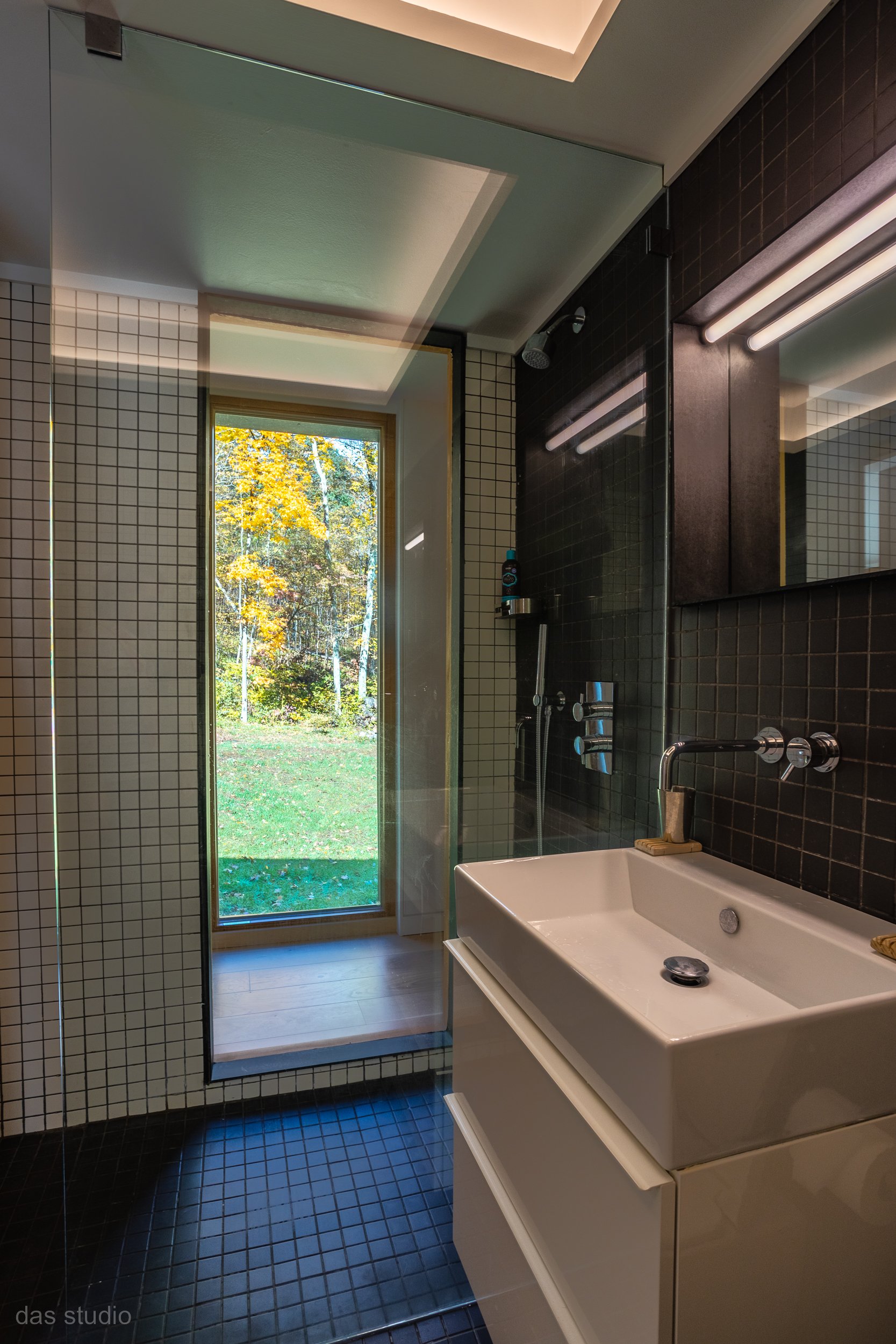
In addition to the abundance of natural light, the open floor plan of this house allows great versatility. By being designed on a single level, with minimal obstructions between spaces, this interior is inherently age-proofed. Both showers are roll-in showers with ample space to receive seats and grab bars in the future. For the exterior, a ramp can be easily added to the main entrance stairs as needed.
Energy Independence
For David, energy independence was a primary concern as it is an aging-in-place house. DAS Studio was able to achieve this by building it to Passive House standards. The Passive House standard is a voluntary standard for energy efficiency in a structure, which reduces the ecological footprint of the building. Passive House building methods result in ultra-low energy buildings that require little energy for heating or cooling while providing a high level of thermal comfort, quietness, and excellent indoor air quality. This house is heated and cooled with electricity and supplemented with a wood-burning stove. This approach ensures not only low energy usage for the life span of the house but also a path to zero energy use when solar panels with backup batteries are installed.
In addition to orienting the building towards the south for solar heat gain, to achieve the Passive House Standard for this building, DAS Studio designed a super-insulated and airtight envelope. The large, south-facing windows are shaded with wood and steel louvers to minimize summer overheating. The glass used for the wood-framed windows and doors is triple-pane with a “Low-E” coating. The operable windows have a tilt-and-turn function. The tilt position provides convenient night ventilation.
Building Section
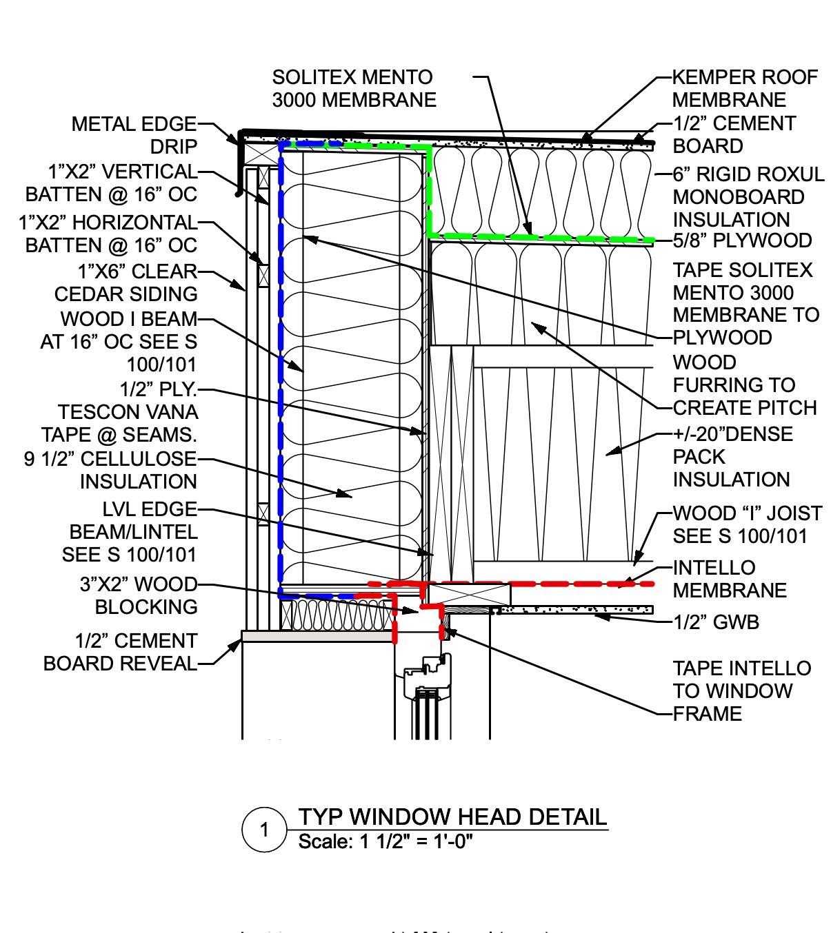
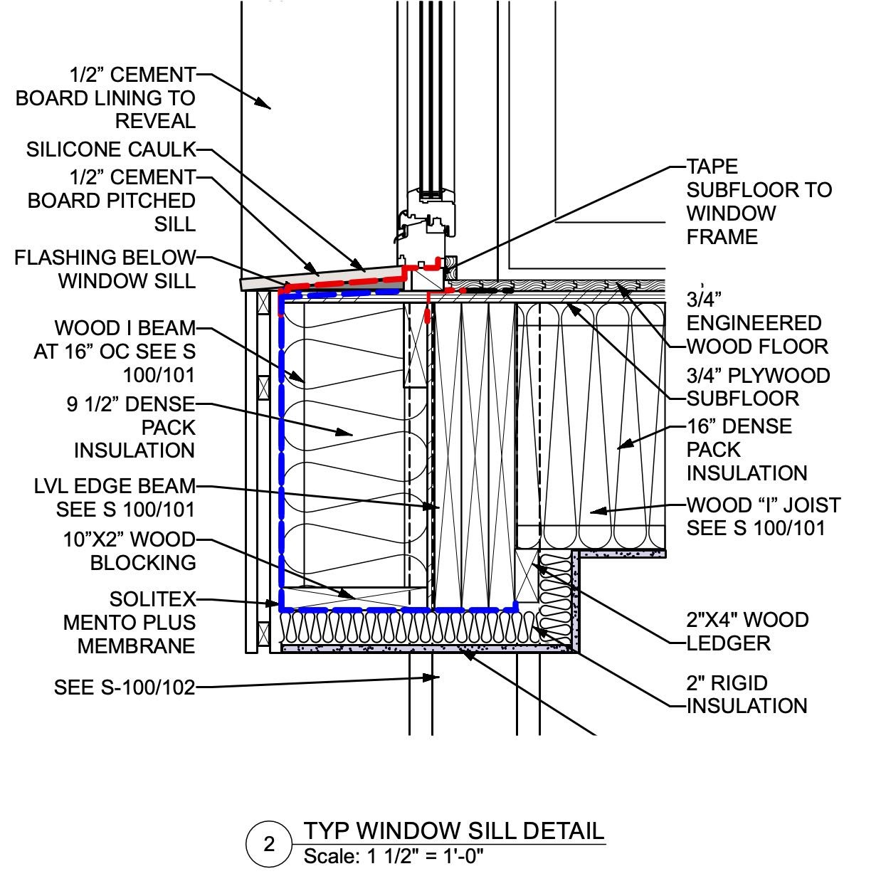
The structure has a traditional 2”x 4” wood frame as the bearing walls. TGIs form the insulated wall cavities as well as the insulated floor and roof structure. A moisture-permeable smart air barrier and a thick insulation layer between the TGIs envelop the entire building. This reduces thermal bridging within the structure and the building corners. Thermal bridges can significantly impact energy performance and interior comfort.
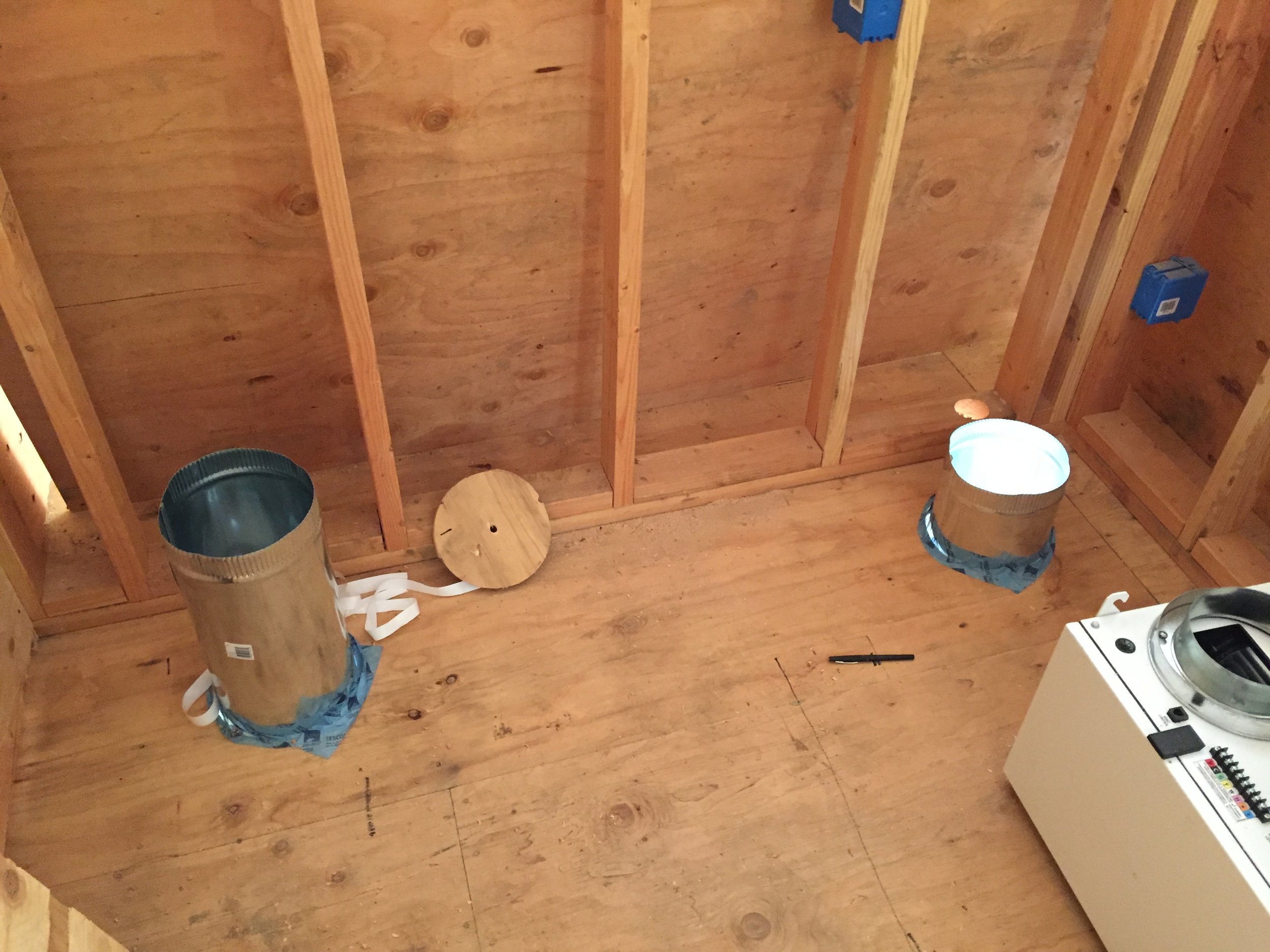
Because the building is airtight, a ventilation system with a built-in energy recovery component is a must. The internal climate and fresh air are controlled by a Minotair unit, a self-contained heating, cooling, and ventilating unit with energy recovery (an ERV), utilizing two heat pumps and not requiring an external condenser. One of the bonuses of a Passive House is that the mechanical systems are small; the Minotair unit has a similar output to a regular window AC unit. The air distribution system is effective but contained: the ducts are located in the core and do not extend to the perimeter of the building. For extremely cold weather, heating is supplemented with an electric resistance heater integrated into the duct system. There is also a direct-vent wood stove, and the fuel comes from fallen trees on the property. As the EVR unit runs 24/7, exchanging and filtering the air, the interior air quality is excellent; most dust particles and allergens, including pollen, are filtered out. Also, this heating, cooling, and ventilation system is quiet and space-efficient.
Sustainability- Sustainable and Healthy materials
To create a truly sustainable building, energy efficiency, or even achieving net zero, is just a starting point. “Touch the earth lightly” is also expressed in the selection of materials. The objective for this new home was not only to minimize its impact on the immediate surroundings but also the overall effect on the planet. These considerations lead to the additional design goal of utilizing low-environmental-impact materials.
Here, the materials and methods used reduce the global warming potential of the building. Most of the materials used, such as wood, have a low or negative embodied carbon footprint and can decompose or be reused at the end of the building's life span. For example, the house is insulated with dense-pack cellulose and stone-wool batt insulation, along with a minimal amount of foam to seal a couple of envelope penetrations that could not be effectively sealed any other way. Foam products have a large greenhouse gas footprint, and many foams use toxic chemicals that may off-gas into the interior. Cellulose insulation has 85% recycling content and, therefore, a negative embodied carbon footprint and basically no VOC off-gassing. The other primary insulation material is sustainable stone wool by Rockwool. It is certified as a recyclable and healthy material. All painted or sealed areas are done with low-VOC products.
Kitchen
Product life span is another main factor for sustainability. In general, Passive Houses last longer than conventionally built houses: The air-tight construction, smart membranes, and reduced thermal bridges keep the wood framing and insulation dry and minimize the risk of mold and rod within the structure of the building. High-quality materials, such as Passive House windows, guaranteed for 30 years and lasting up to 50, add to the longevity of the home. The appliances selected not only feature high energy efficiency but also have a 20-year design life, minimizing their embodied energy. This house, which combines sustainable materials with the Passive House standard, ensures that both the construction and use of the building utilize as little energy as possible, reducing the overall carbon footprint throughout its entire life.
Floor Plan
To further the sustainability, David and DAS Studio designed his home in a way that reduced the building materials themselves. This structure is designed on a 3’-0” grid. This layout minimized the number of strategically spaced 2”x 4” studs and TGI joists used in the construction. In addition, all utilities are in the central core, which eliminates the need for longer duct and plumbing lines. Future maintenance is minimal, but if needed, plumbing and duct lines are easily accessible through the core and under the floor structure.
This is a beautiful, quiet, and comfortable home. With excellent indoor air quality, it is allergen-free yet has a direct connection with nature. It is an ideal space for working, entertaining, and relaxing. Working with DAS Studio, David created not just a house but a complete living environment, respectful towards nature and our human needs.
Passive House Hilldale
Last year, we finished a small Passive House in Hillsdale, NY. You can find some of the metrics in the link below.
http://www.bldgtyp.com/Proj_2114/index.html
Here are some of the images at the end of construction.


Best of Houzz 2020
We won Best of Houzz 2020-the third year in a row.! We want to extend huge thank you to all our great clients who made this possible.
CT-3 Blower Door Test - Air tightness in a Passive House
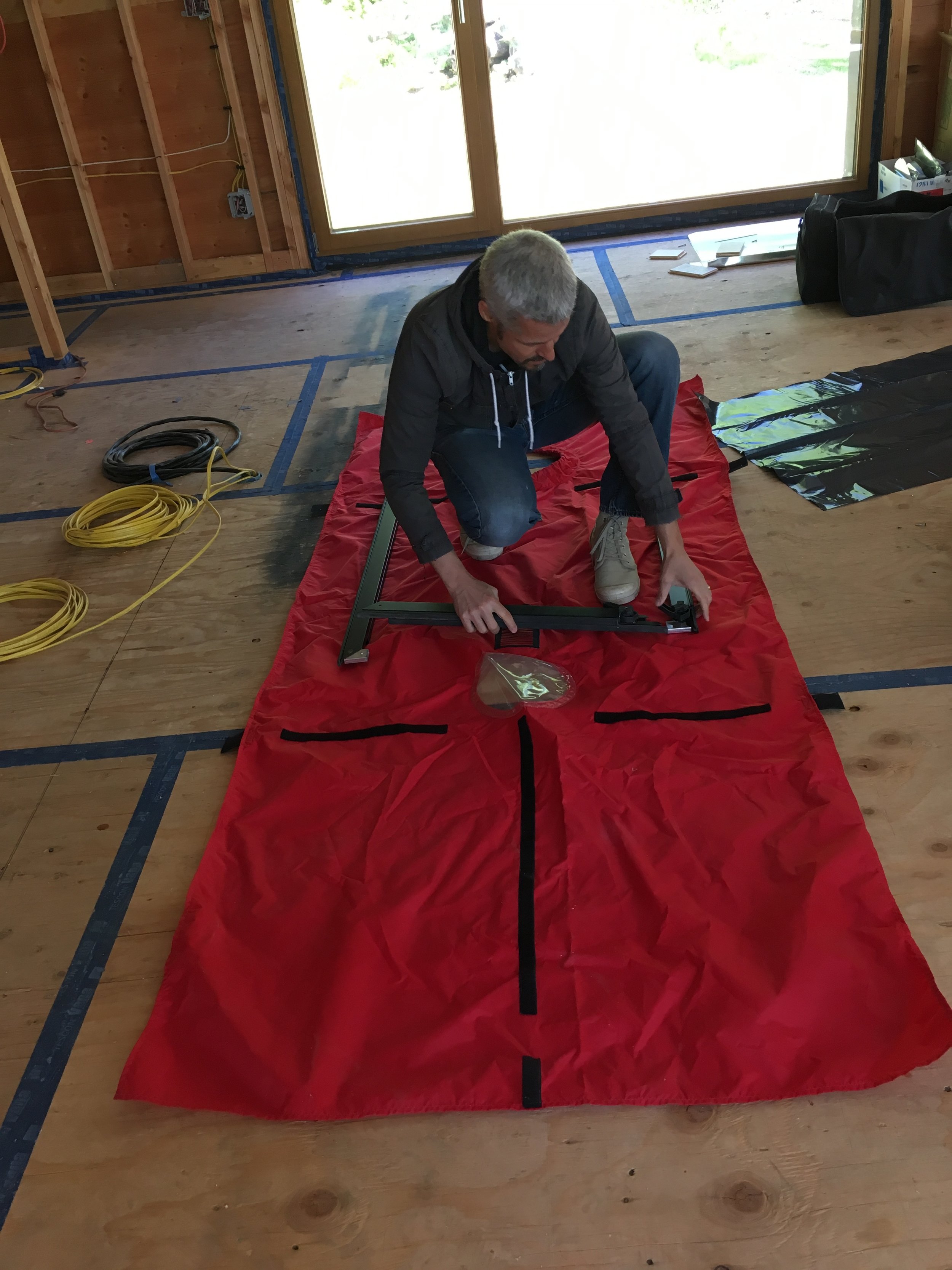
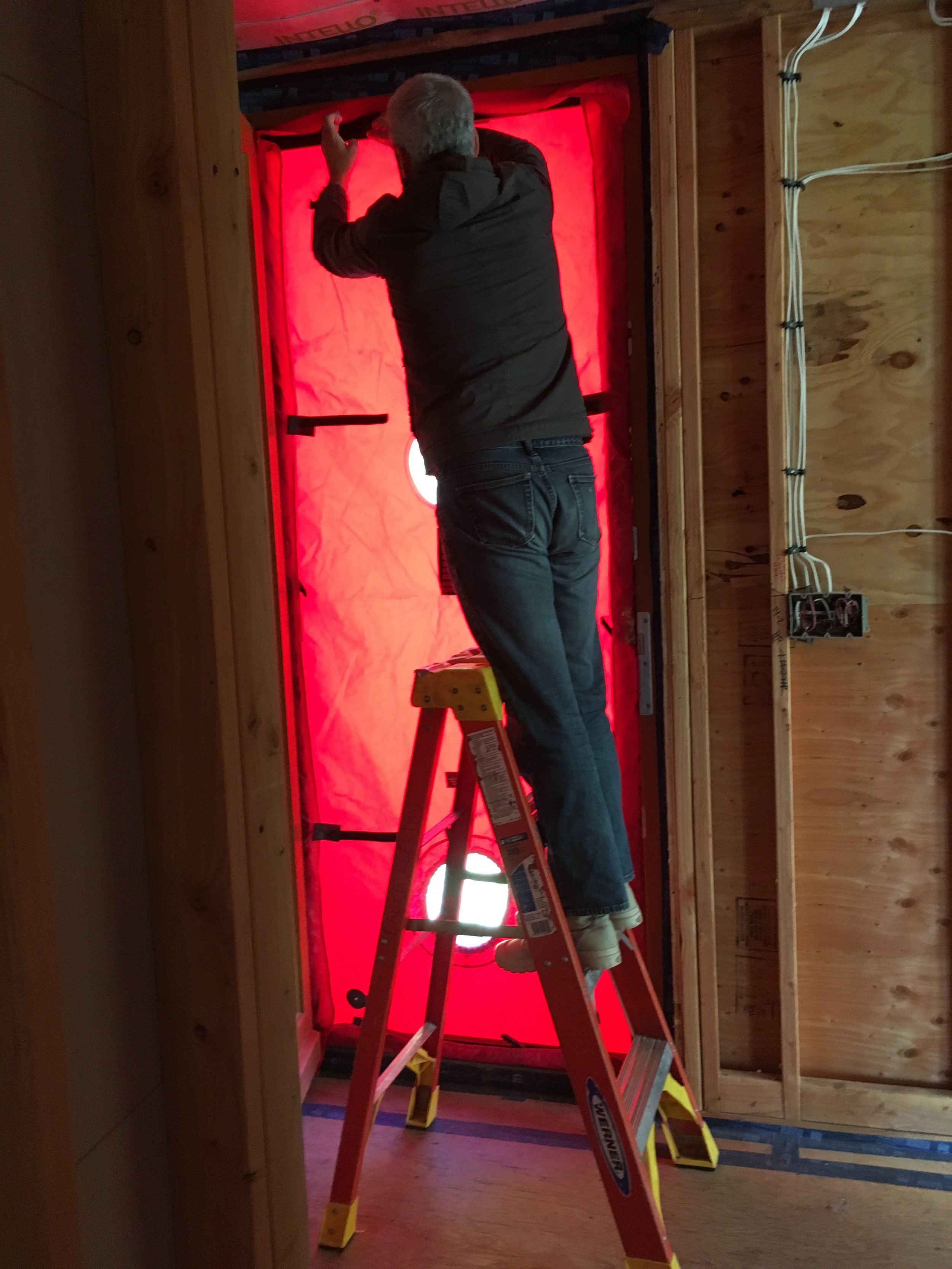
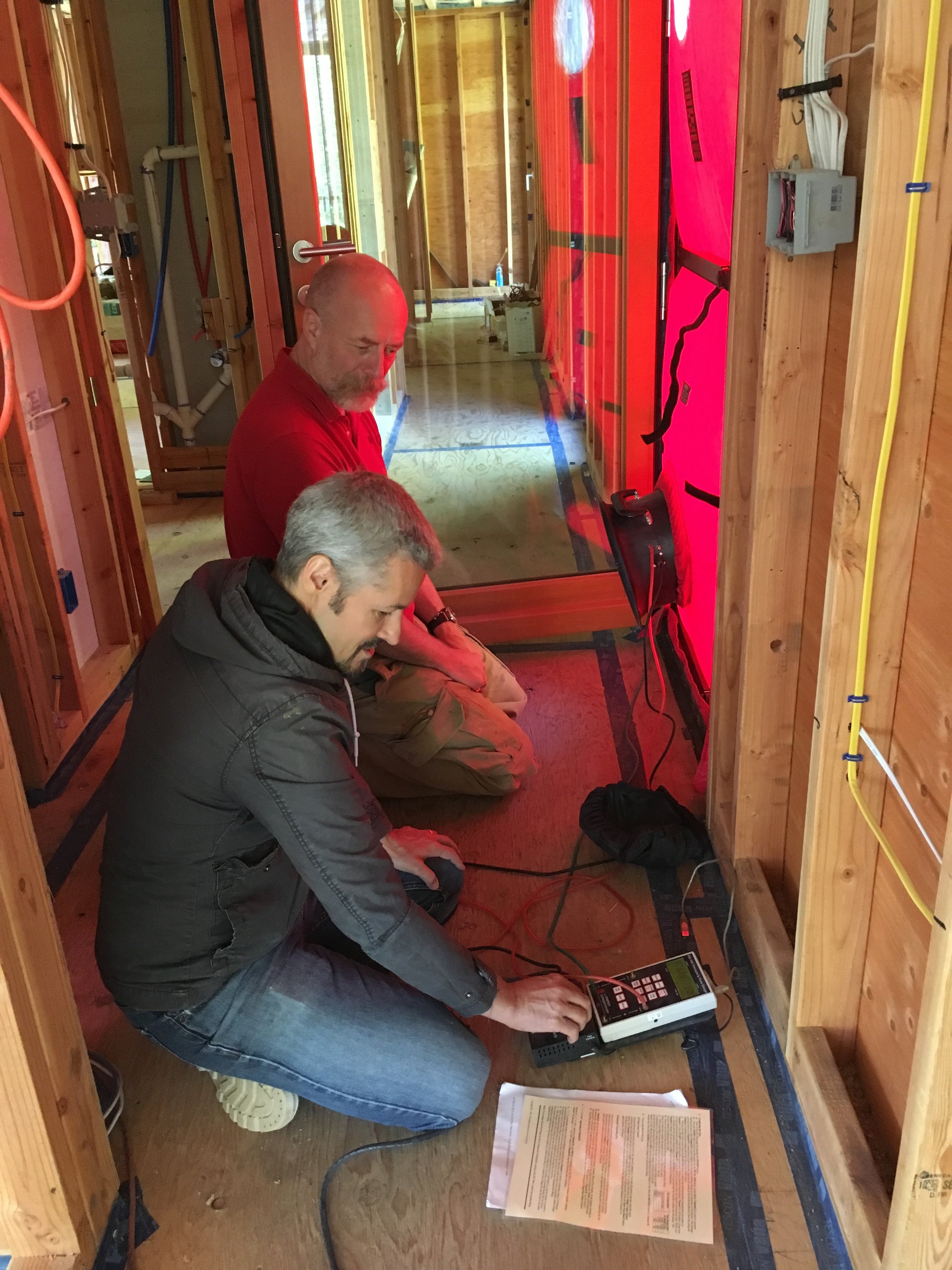
Air-tightness is a critical element of all energy efficient buildings. Air infiltration from the exterior is a major factor in heat loss (or in the summer the loss of cooled air in the building). This is independent of the level of thermal insulation in the structure. Air leaks also will allow moisture from the conditioned space into the insulation and building structure. This may lead to damage within the construction assemblies. To combat these issues the Passive House standards require a level of airtightness that allows a maximum of maximum of 0.6 air changes per hour at 50 Pascals pressure (ACH50), as verified by an onsite pressure test (in both pressurized and depressurized states).
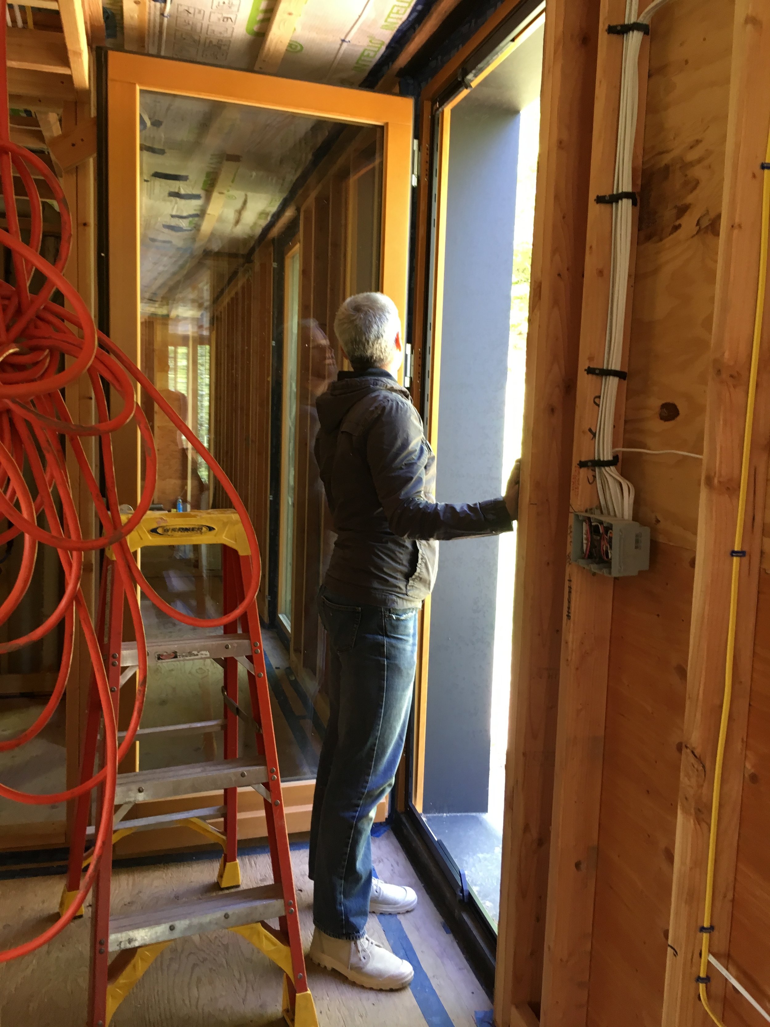
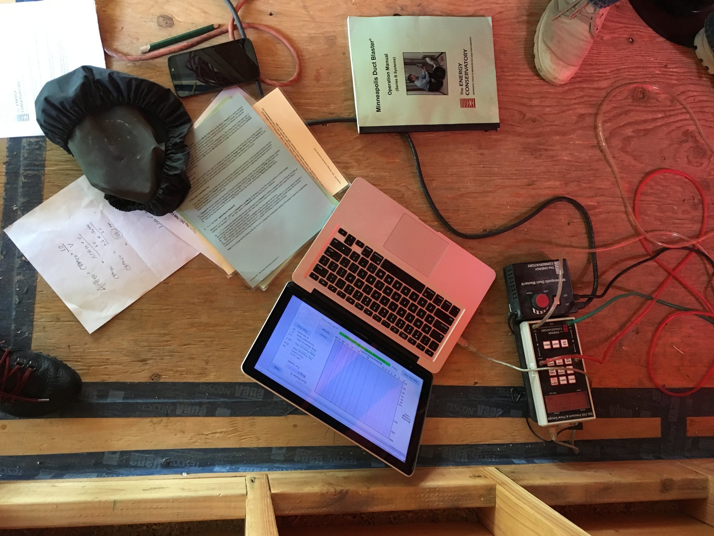
For our CT-3 Connecticut Passive House we carried out the blower door test on Saturday and passed with 0.5 air changes per hour. It is a small building which makes it harder to achieve the air tightness. We are very happy to have achieved this important goal. A big thank you to Andreas Benzing of A.M. Benzing Architects pllc for conducting the test.
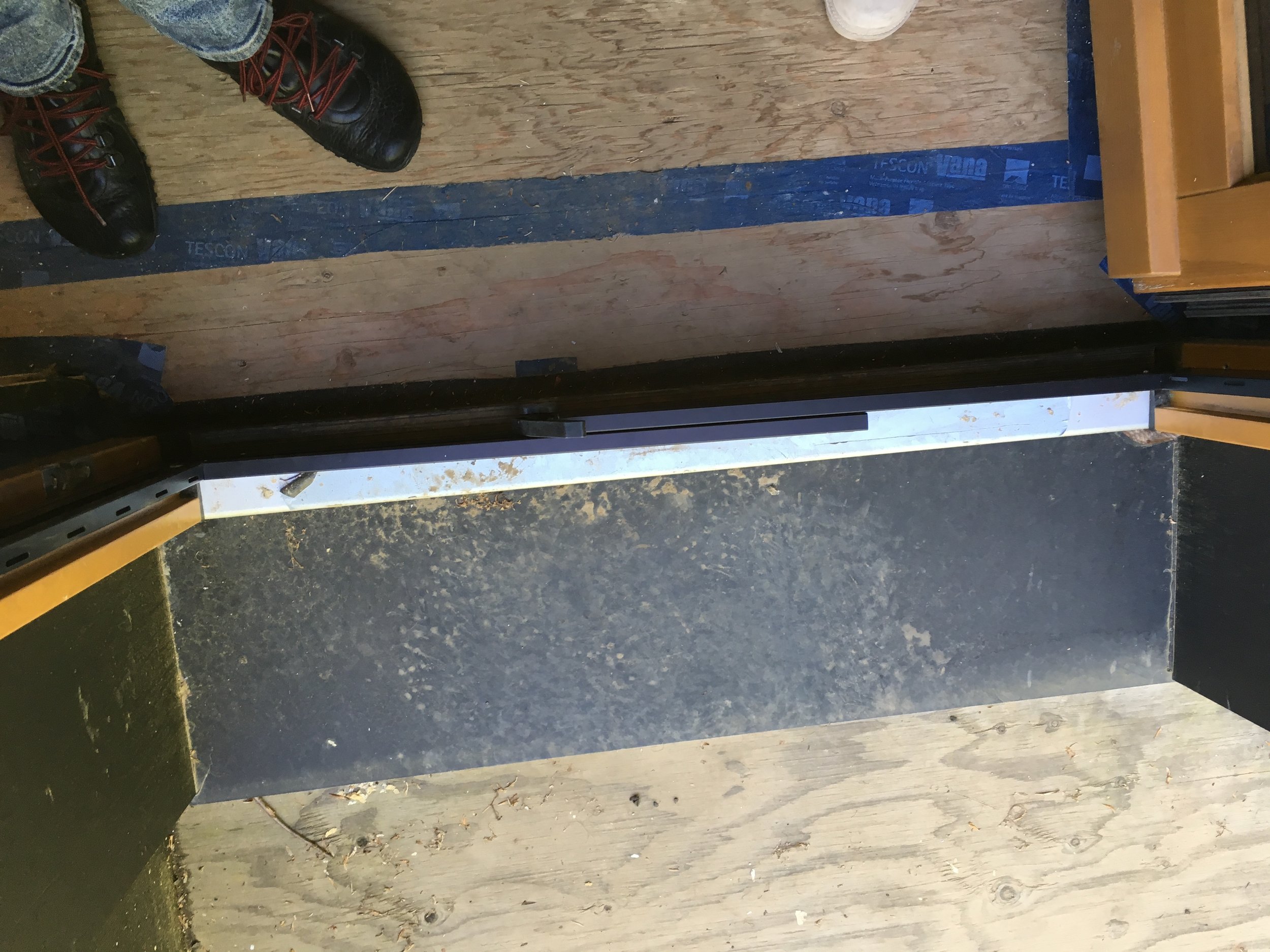
During the depressurization we inspected all exterior surfaces for air leaks. We found two big ones and a few smaller areas which needed additional tapping. They will be sealed this week and improve the air-tightness even more. The images attached show the testing, calculation the air change rate and the search for leaks.


CT-3 Passive House Construction in Connecticut
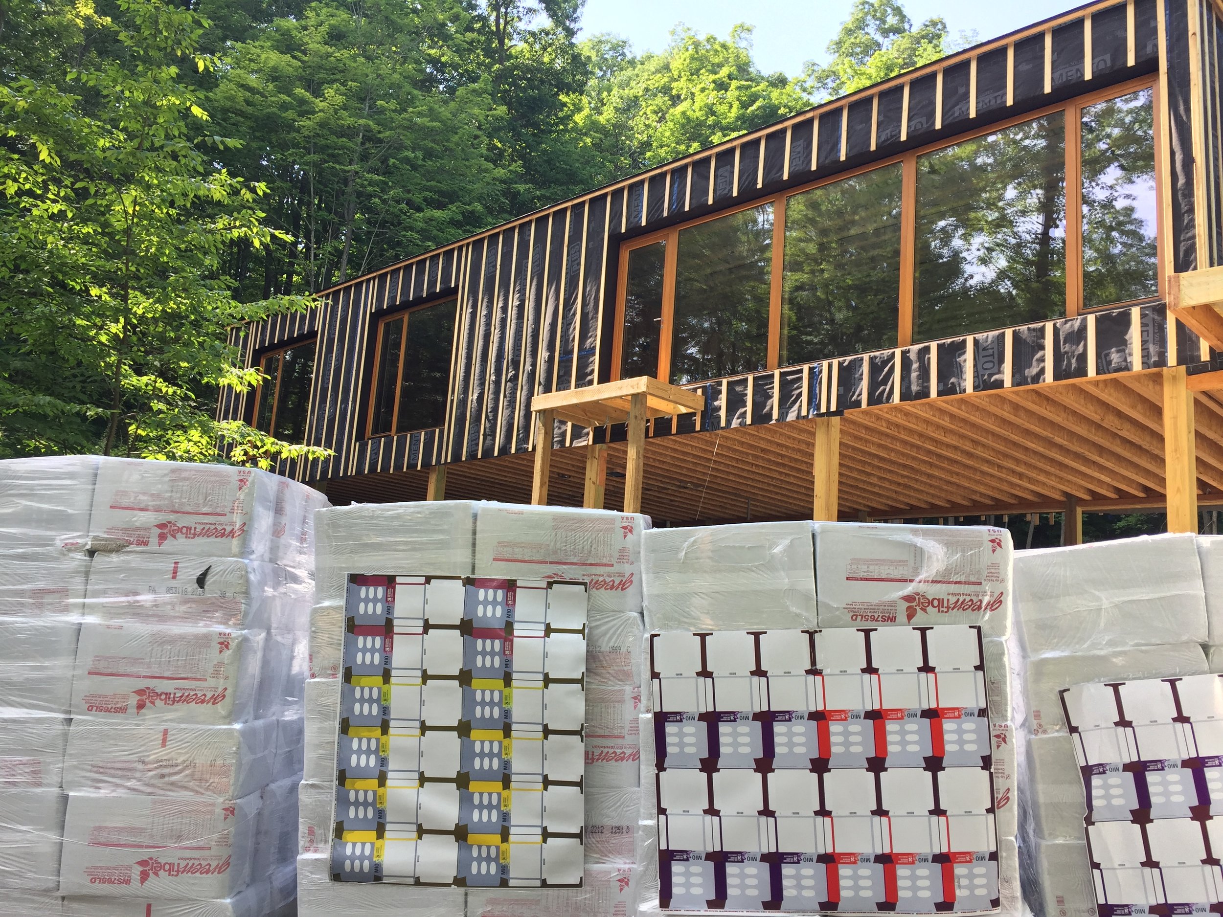
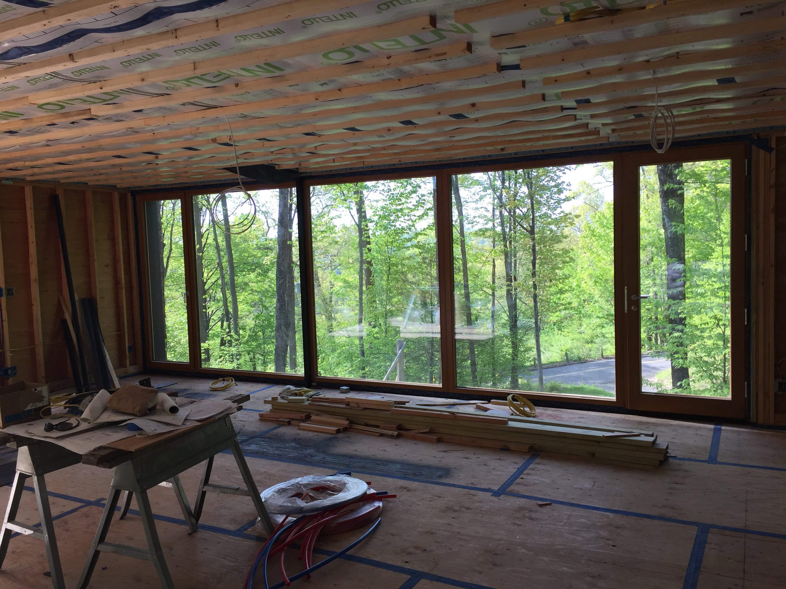
Our Connecticut Passive House is ready for the dense-packed cellulose installation. Cellulose insulation is made from recycled newspaper. When installed at a density of 3.5 pounds per cubic foot, it has an R-value of about R-3.6 or R-3.7 per inch.
Making the Most of Small Apartments - Smart Storage Solutions
The popularity of the book by Marie Kondo – "The Life-Changing Magic of Tidying Up: The Japanese Art of Decluttering and Organizing" – a New York Times bestseller, has people interested in achieving a streamlined, clutter free living. It is said that clutter-free and well organized spaces make you more creative and productive while also increasing your feelings of freedom and joy.
This certainly seems like a valuable goal to reach for. In fact, in cities like New York, with limited space in one’s home, clutter reduction is not only a choice but a necessity!
If one lives in a small space, a reality for most New Yorkers, as items get accumulated, the living space rapidly feels smaller and actually gets restrictive. Kitchen counters in suburban settings that comfortably manage juicers, coffee machines, fruit-baskets, knife racks etc. find it hard to do so in a dense urban situation. Similarly, retaining a separate room for a home office is a luxury rarely afforded to the City’s natives – and the resulting desk in the living room or bedroom significantly reduces the size of the room, all the while adding to the potential of clutter.
It is no surprise that many of our City clients ask for creative solutions to streamline their apartments. In response we have made it a point to spend considerable energy and time designing built-in storage and furniture that enables multi-purpose uses by stowing / hiding away utility items when they are not in use.
In this article, we share some techniques and ideas how to maximize efficient storage and create solutions for equipment to appear and disappear as needed. Enabled in this manner it keeps rooms tidy and clean in addition to increasing the overall usable square footage.
A famous holistic example of multi-functional space usage is that of micro-apartments. A clip featuring one of our designs (https://www.youtube.com/watch?v=J7Ue7B89PIM) shows space-saving storage and moveable furniture solutions.
Although not everyone wants to live in a micro-apartment, the solutions we describe are useful in regular sized apartments as well. Some can even be retrofit into existing cabinets. Here are some examples with suggestions and techniques we use.
1. Built-in storage below windows:
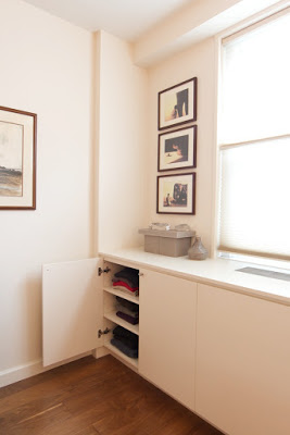
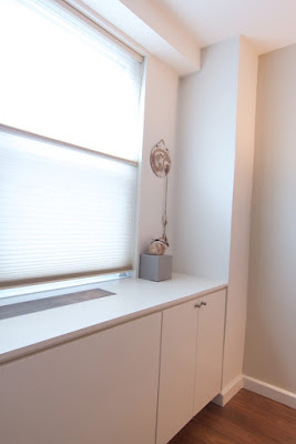
Most New York City apartments have PTAC Units, Radiators or AC Units located below windows. Unsightly and cluttering from a visual and physical perspective, they are the basis of our most frequent client request. As part of a solution to hide them, we double down and design millwork to create more storage and usable counter space. The example below shows built-in cabinetry designed for a one bedroom apartment in Chelsea. The PTAC unit is hidden behind a white matte-lacquer wood enclosure with added cabinets on both sides. As you will see from the “before” and “after” images, the room feels more spacious with the PTAC unit and dresser combined into one wall to wall millwork piece. Note from the provided cross sections how the wall-unit’s functionality is not compromised.
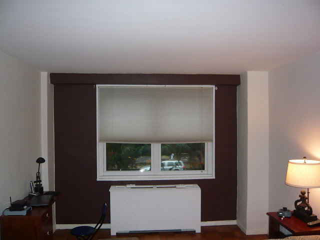
Before
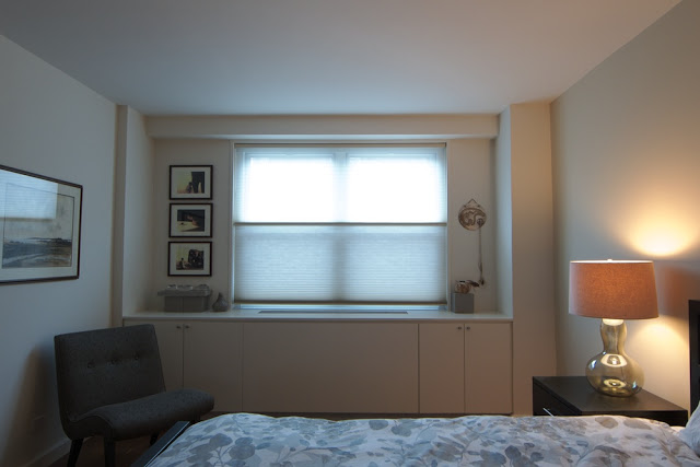
After

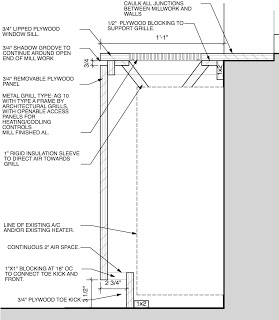
2. Stow away your office.
As mentioned above, most people living in cities don't have an extra room for their office, and don't want their desk and office equipment on display in the living room – the usual de-facto office of a cramped NYC apartment.
Featured here is a project showing cabinetry designed for the client with a fold-out desk. One of the cabinets contains a desk which slides and folds out for use while the one next to it contains the printer, modem, paper supply, etc. The laptop can be slotted on the fold-out desk and stowed away with the desk in the cabinet, saving time and space at the same time.
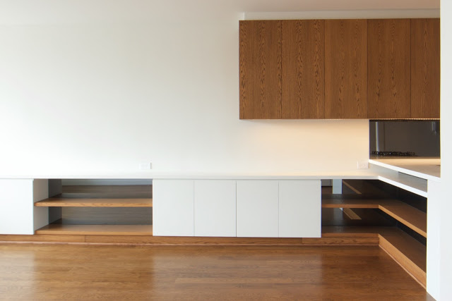
Desk is folded back into the cabinet

Desk is being folded out
3. Hidden TV – Entertainment when you need it.
For many clients, a TV on continuous display makes little aesthetic. They may rather prefer to hang art on the wall, an uninterrupted view through a window or maybe just a smooth, clean, object-free surface. In the tight space shown below, a TV on the counter or wall would have either blocked the view out of the window or taken up valuable wall space.
The solution is to lower the TV into the cabinets using a lift, when it is not in use. As the photographs show, the built in lift raises the TV to sit above the cabinet, ready for viewing, then lowers it back to storage when not in use – and provides for a clean, uncluttered living space.
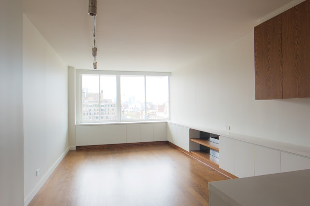
Living Room, TV sits in lower cabinet

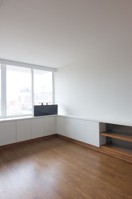
4. Dressers – going deep with shallow solutions.
What do you do if your bedroom does not fit a dresser, but you need one? One solution is to install a dresser that is shallower than standard store bought options. The depth of regular dressers ranges from 15 to 21 inches. The drawers are between 13 and 19 inches deep. However, if the drawers are for socks, undergarment or folded shirts stacked lengthwise, drawers of 9-10 inches depth are sufficient.
A built-in dresser saves another inch or two. This is often all it takes to provide significant storage in a tight space without compromise. In the example below we show the cross section of a floor-to-ceiling dresser for a small bedroom. The overall depth is only 12 inches (from wall to front of dresser) and the drawers just 10 inches deep. The top section is for shirts and jackets where a valet hanger system is used to rack them parallel to the door, instead of sideways as in a regular 24 inch closet.
In the example shown, the client has the option either to use the hanger system or put in removable shelves the millworker has already provided.
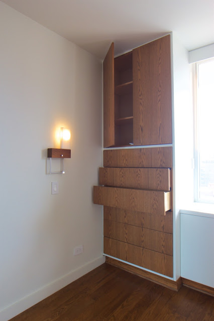
Floor to Ceiling Dresser

Valet hanger system
5. Closet doors – make space, don’t take space.
In an apartment renovation, if existing closet doors are to be replaced, a convenient way to increase storage is by making existing storage more accessible. We often suggest increasing closet door height. A regular closet door is either 6 feet 8 inches or 7 feet. The highest shelf is installed at about 5 feet 6 inches We enlarging the existing openings, installing an additional shelves at ca. 6 feet 8 inches and new doors that are either 8 feet or all the way to the ceiling. They might not match the doors of the room, but where space is limited the additional shelving and accessibility is a welcome benefit. While replacing, consider using bi-fold or sliding doors so that space in the room can be functionally utilized instead of being reserved for the doors to swing open.
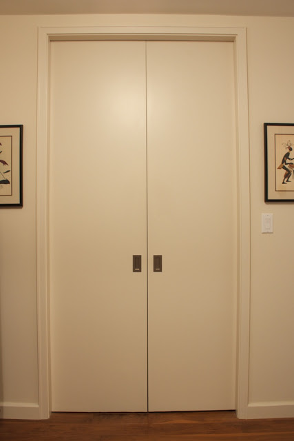
Foyer closet with 8 foot pocket doors

Floor to ceiling doors
In conclusion, we hope these techniques and methodologies have been useful in giving you some ideas. We would love to hear from you if you have any suggestions, other useful ideas – or if you want to share your experience with small spaces.
Thanks!
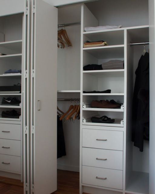
Closet with bi-fold doors
Architecture and Nature I: Taliesin West- Organic Architecture

Frank Lloyd Wright, the great American Architect, was one of the first to consciously design and build structures and interiors as a part of their environment, in a unified whole. Buildings were not considered separate from their furnishings, surroundings or inhabitants. To Frank Lloyd Wright, a building needed to ‘grow’ from its immediate surroundings and environment, to appear as one continuous unit.
He was the first to coin the term "Organic Architecture". In the Architectural Record (August 1914):“…the ideal of an organic architecture... is a sentient, rational building that would owe its ‘style’ to the integrity with which it was individually fashioned to serve its particular purpose – a ‘thinking’ as well as ‘feeling’ process.”, Frank Lloyd Wright wrote,“... In organic architecture then, it is quite impossible to consider the building as one thing, its furnishings another and its setting and environment still another. … The spirit in which these buildings are conceived sees all these together at work as one thing.”
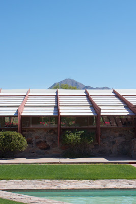
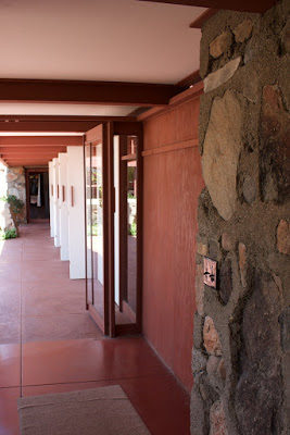
View of the Drafting Studio and Frank LLoydand Olgivanna Wright's Living Quarter
Founded in 1937, Taliesin West was Wright’s design laboratory for organic architecture and, at the same time, one of its prime examples. It was the winter home for the Taliesin Fellowship, where fifty to sixty apprentices could study under the architect. Every winter, when Wright and his students returned, he would see the place with fresh eyes, adding and removing walls here and there, experimenting with building materials. In Taliesin West he used the design principles of organic architecture, which can be summarized as the following:
- Use building materials in their natural state
- Build in harmony with nature
- Let the building grow out of the earth
- Allow the interiors to flow and engage in a dialogue with the outdoors
- Break the box — remove the corners and free the space
- Design “from the inside out” — express the interior through the exterior form of the building

When Frank Lloyd Wright arrived at the foot of the McDowell Mountains in present-day Scottsdale overlooking the desert, he was reminded of the ocean floor and that inspired the layout of the complex. As a keynote of his design, shaped like the prow of a ship pointing to the horizon, he created a shallow pool, which served as water storage in case of a fire and to clean the canvas sheets which formed the weather protection for the rooms before the glass was installed.
Another example of Wright’s abstracted interpretation of the surrounding nature is the slanted roof lines that echo the surrounding mountains; brightly painted, carved wood forms jutting like spiky wildflowers. “Wright wanted others to experience this amazing place as he experienced it”, said Frederick Prozillo, Director of Preservation at Taliesin West. The triangle shape repeats itself in section, elevation and floor plan. Using low level, horizontal planes the buildings were kept low to the ground to insure effective natural ventilation and protection and shade from the intense desert sun.

Floor Plan 1938
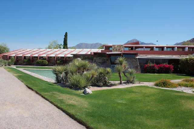
Drafting Studio and Pool

Apartment, Sunset Terrace and Garden Room
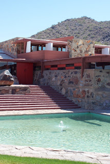
Every aspect of design and detail of the project was given particular attention by Wright. Besides closely accounting for the arid desert climate, Wright implemented local and site provided materials for the construction of the house and foundation. The structure's walls were built by the students as part of their curriculum and made of local desert rocks, stacked within wood forms before being filled with concrete. Once the concrete set, the wood forms were removed to expose the rocks and concrete.
Wright always favored using the materials readily available on site rather than transporting it there. This matched not just his philosophy and aesthetic, but also the critical economic and logistic constraint of bringing any exotic material to what was then a remote location. The architecture of Taliesin West described in Wright’s own words: “There were simple characteristic silhouettes to go by, tremendous drifts and heaps of sunburned desert rocks were nearby to be used. We got it all together with the landscape…”. The flat surfaces of the rocks were placed outward facing and large boulders filled the interior space so concrete could be conserved.
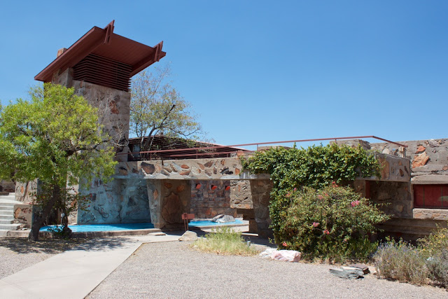
Water Tower
The rich red hue (a favorite Frank Lloyd Wright color) from the redwood timber along with the earthy, sandy hues from the concrete and stone of the walls creates a close natural relationship between the house and landscape. Frank Lloyd Wright’s typical color pallets can be reviewed here:
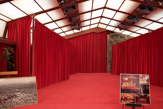
Cabaret

Structural elements of office painted red
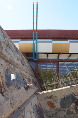
Color scheme at Drafting Studio and Door
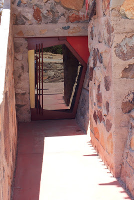
Compression Door
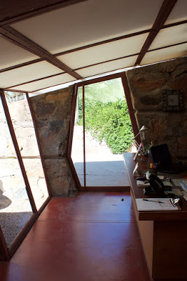
One of Wright's most famous design tools can be found in abundance at Taliesin West. It is his use of “compression and release”, which is also known as “tension and resolution” or “embrace and release". By making entrance spaces to a building a confining "compressing" experience Frank Lloyd Wright made the visitor mildly uncomfortable and then, by encouraging them to move into the larger main room, a feeling of relaxation, or "release”. This "release" also imparts a feeling (or impression) of freedom. As one can see in the image below, Wright designed entrances as narrow hallways with extremely low ceilings, often no more than six feet high. The claustrophobic hallways encouraged a flow of traffic into the main room, thereby preventing people from obstructing the entrance. A similar concept of encouraging certain behavior through architecture can be seen in the group dining room of Taliesin West. This room had ceilings that were also uncomfortably low, which encouraged diners to sit at the tables instead of standing.

Compression
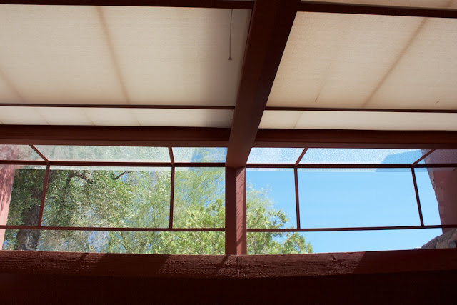
Release
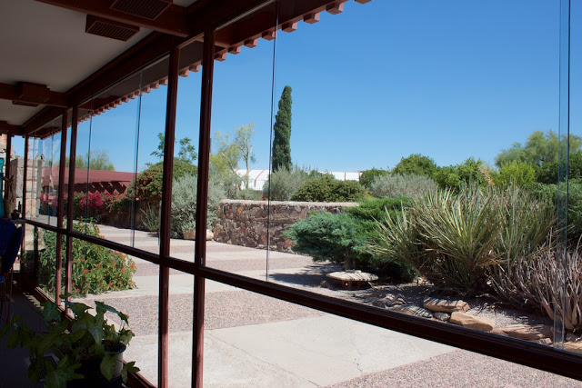
Dining Room View while Seated
Taliesin West is one of the great examples how drawing inspiration and all aspects of its design from the surrounding environment can enrich both, the architecture itself as well as the environment it sits in, making it a truly organic architectural complex.
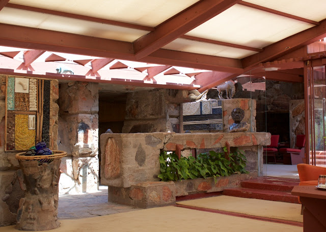
Garden Room Interior
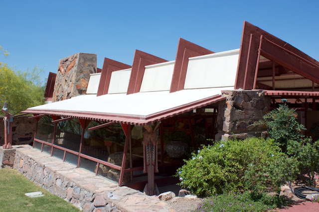
Garden Room Exterior
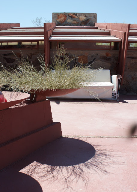
More info you can also find at:
Passive House Apartment in the East Village
We are very happy to announce that we just finished a unique apartment renovation with an extensive energy retrofit using the Passive House techniques.
This is only the second apartment in New York City to have Passive House methods implemented. We faced challenges in the configuration of the apartment, as well as with the exterior walls and window openings which we could not change. The retrofit hasresulted in a significant reduction in energy use, improved indoor air quality and a noticeably reduced outside noise. The apartment residents now have a quieter, cleaner and more energy efficient apartment with smaller variations in temperature through the day and year.

Living and Dining Room
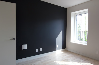
Bedroom
What is a Passive House?
Passepedia defines it as the following:
"Passive House is a building standard that is truly energy efficient, comfortable and affordable at the same time. Passive House is not a brand name, but a tried and true construction concept that can be applied by anyone, anywhere.
Yet, a Passive House is much more than “just” a low-energy building:
-Passive Houses allow for space heating and cooling related energy savings of up to 90% compared with typical building stock and over 75% compared to average new builds. Passive Houses use less than 1.5 l of oil or 1.5 m3 of gas to heat one square meter of living space for a year – substantially less than common “low- energy” buildings. Vast energy savings have been demonstrated in warm climates where typical buildings also require active cooling.
- Passive Houses make efficient use of the sun, internal heat sources and heat recovery, rendering conventional heating systems unnecessary throughout even the coldest of winters. During warmer months, Passive Houses make use of passive cooling techniques such as strategic shading to keep comfortably cool. -Passive Houses are praised for the high level of comfort they offer. Internal surface temperatures vary little from indoor air temperatures, even in the face of extreme outdoor temperatures. Appropriate windows and a building envelope consisting of a highly insulated roof and floor slab as well as highly insulated exterior walls keep the desired warmth in the house – or undesirable heat out.
-A ventilation system imperceptibly supplies constant fresh air, making for superior air quality without unpleasant draughts. A highly efficient heat recovery unit allows for the heat contained in the exhaust air to be re-used.” (http://www.passipedia.org/)
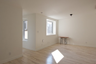
Living and Dining Room
When our client approached us in 2013 interested in refurbishing her apartment into a Passive House apartment, we knew it would not be easy. She had two main reasons to want this extensive energy retrofit: 1. The apartment was heated with three gas heaters, which were in need of replacement and she wanted an alternative, and 2. A night club off her backyard generated an inordinate amount of noise which she wanted reduced in her apartment. Having done her own research she already knew, before contacting us, that both issues could be solved by implementing Passive House methods. An informed client is the best client – and in this case that adage holds true many times over.
In general, a deep energy retrofit is done for an entire building, and that is almost the only way to guarantee a continuous airtight layer around the space and a “thermal bridge free” design - both very important for a low energy building - in a reasonable budget. An additional issue that added a degree of difficulty was that the apartment was on the highest floor with low ceilings and a small rectangular extension in the back connected by a narrow uninsulated corridor. This limited the thickness of the insulation layer we could install in the walls and roof (see floor plan below).
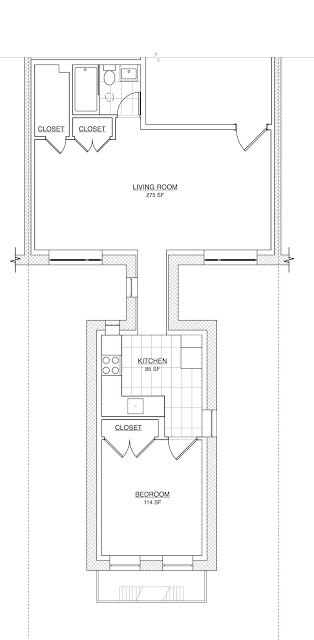
Due to the rules of the Co-op building, we were also constrained from making any changes to the exterior envelope / walls. Windows sizes and location were dictated by the existing openings. We were also not allowed to add exterior shading nor an extra layer of insulation on top of the existing roof.
This was our solution:
Air Barrier and Insulation:
In order to keep the construction cost reasonable we insulated and provided an airtight layer only on the exterior walls and roof; we chose not to do so on interior walls where the apartment was adjacent to another conditioned space. We added as much insulation as we could using dense pack cellulose in all the walls and ceiling. We chose dense pack cellulose insulation for it’s ability to store condensation moisture and release it over time. For the air barrier we used a membrane, Intello, which also functions as a smart vapor retarder (https://proclima.com/systems/intello/how-it- works). Any stored moisture can be evaporated to the inside of the building during the summer. This membrane was installed on the inside due to the existing masonry structure of the building. It is taped to the windows and at all penetrations. This is very important. there should be no penetration of this barrier, as it would lose its effectiveness. In order to minimize penetrations through the membrane, we installed a service cavity on top of the Intello using 3x2 battens so that wires, outlets and AC lines can be run through them without disrupting the air barrier. This service cavity is also insulated. (See detail section and images below). The air barrier tightness was checked with a blower door test. All penetrations and even the smallest holes where taped and sealed.
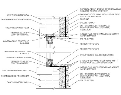
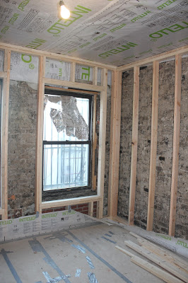
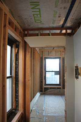
Walls with new wood studs and ceiling with Intello
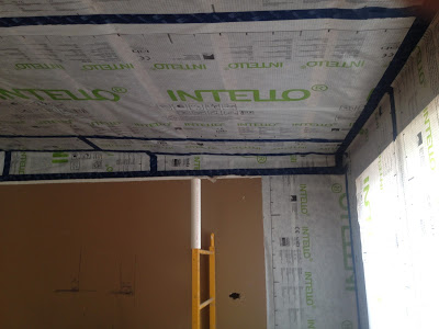
All air barrier joints are taped
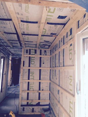

Service cavity battens and Light tube in bathroom for natural light
Windows:
We used triple-pane Klearwall aluminum windows which have a low U-value, are thermally broken and airtight (see http://www.klearwall.com/Windows/passiv-alup.html, http://www.klearwall.com/Windows/passiv-alup.html). Triple-pane windows are a must for Passive House construction in the Northern Climate zone. The double hung windows which are typically used in New York City are not feasible for a "low-energy" building, as they are too leaky- creating draughts and let letting conditioned air escape to the outside. The solar tube in the bathroom is airtight, thermally broken and insulated to reduce energy loss in the winter and overheating in the summer (https://foursevenfive.com/product-category/fenestration/lightway-solar-tubes/).
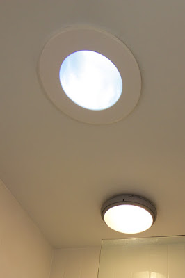
Solar tube in bathroom and Tilt and turn bedroom window
Ventilation:
As we created an airtight envelope on all exterior surfaces of the apartment , a mechanical ventilation system is needed to supply the apartment with fresh air. Each room had an existing gas heater which we removed and we reused the openings to install a through-wall ventilation unit with heat recovery.(http://www.lunos.de/en/product/e_with_heat_recovery/). These units supply the apartment with fresh outdoor air while ejecting stale air from inside the space. Heating/cooling losses are minimized (with an efficiency of 90%) with a heat-exchange within the units. Energy losses are minimal and the apartment is supplied with a constant flow of fresh air. Windows can be opened or closed, as in a normal building, but it is just not needed for ventilation anymore. In fact, using a ventilation system such as this keeps the space better ventilated than a regular building with less temperature loss and thermal variation.
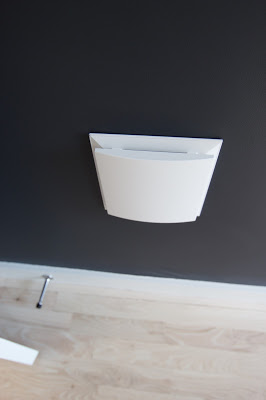
Lunos e2 in bedroom wall
Heating and Cooling:
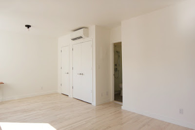
For heating and cooling we installed two of the smallest ductless Mitsubishi Mini-Split units. While one unit would have been enough to cover the heating and cooling demand, the unusual shape of the apartment forced us to install two.
Mini split unit for heating and cooling
In summary the overall look of the apartment is simple and understated. The light coming in through the windows is bright, yet does not overheat the apartment. The apartment stayed surprisingly cool during the hottest weeks even without the AC being used. We are very excited with the result and look forward to the winter months to assess the overall energy saving and quality.
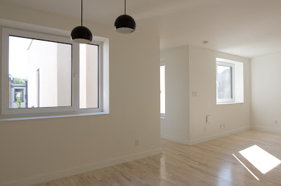
Living Dining Room
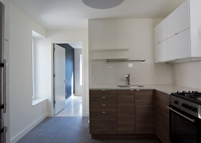
Kitchen
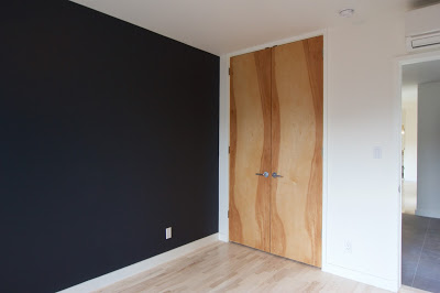
Bedroom
We conducted an open house where architects, clients and Passive House practitioners visited to review the results. Here is a little comment we received from a fellow architect after she walked through the apartment:
"I had the opportunity to tour an apt coop unit that had just undergone gut-rehab -- but via energy-saving Passive House construction techniques, thanks to Stefanie's expertise and a forward-thinking client. I remarked on how the super-insulated walls created deep, crisp window jambs, actually complementing DAS Studio's elegant minimalist design. Then I noticed all the sunlight streaming-in through the super-insulated efficient windows, yet how comfortable the temperature was inside (even though we were at the top floor of a 1920's brick building in the sweltering summer). Only 2 split AC/heating units are needed to serve the entire apt. Talk about energy savings! But one of the best revelations came near the end of my visit, when I acknowledged how calm the space felt. I realized this was because it was so quiet. The air barrier tightness and super-insulation of Passive House technology truly does keep the noise out.
..... It’s a perfect integration of elegant design with environmentally responsible methods and materials."
Please contact us with any questions and comments at: info@das-studio.us. We will be happy to provide additional information and details.
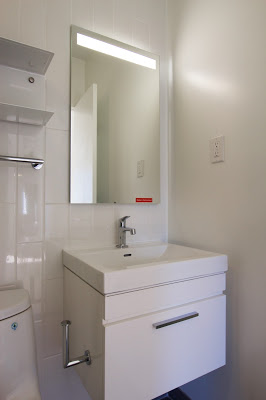
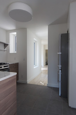
Bathroom and Kitchen
Turning Challenges into Opportunities
In recent years we feel the real effects of climate change with ever more intensity. Just this June (2016) was the hottest month on record in the contiguous US . 2014 and 2015 are the hottest years on record globally - with records starting 150 years ago. It is almost certain that 2016 will beat the previous records, which will make it the third hottest year on record in a row. The earth is warming at a dangerous rate and it is a threat for all of humanity and life as we know it. Cities like New York, mainly built on islands and with over 520 miles of shore line, are especially vulnerable. The change in climate is threatening the city in various ways; most seriously by rising sea level rise, but also by extreme storms and heat waves as we have experienced in recent years. Therefore New York State and the City of New York has set the ambitious goal to reduce Greenhouse gas emissions 80 percent by 2050. To reach this goal New York City alone needs to reduce 43 million metric tons of greenhouse gas emissions of which 25 million metric tons come from energy used in buildings. http://www1.nyc.gov/html/onenyc/visions/sustainability/goal-1-sustain.html

One proven solution is to construct buildings to Passive House standard. Passive House standard reduces the energy use of a building by 75-90%, compared to an average of the existing building stock. The 2016 Energy Code is another step in that direction. But the goal set by State and City can, however, only be reached if the existing buildings can be retrofitted into energy efficient buildings.
This is simultaneously agreat challenge and also a great opportunity for architects and the building industry at large. Innovationand new ways of thinking are required. A strong partnership between Passive House Standard architects, contractors and manufacturers is imperative to achieve these goals. New York City and New York State have put forth several initiatives to facilitate the necessary changes in the energy use of buildings. For those interested in in-depth information, please review:http://www.nyc.gov/html/builttolast/pages/solution/solution.shtml, https://www.ny.gov/programs/reforming-energy-vision-rev
At the North American Passive House conferences in June NYSERDA (New York State Energy Research and Development Authority) introduced their plan to promote and facilitate deep energy retrofits for all off the 1.7 million Affordable Housing Units in New York State over the next 20 years. The energy retrofitting of those units will address a number of needs and constraints, including:
- Aging stock: Capital needs/ capital constraint
- Resident health, comfort and affordability
- Resident relocation issue
Eventually NYSERDA hopes that his initiative will lead to the adoption of the tools and methods for deep energy retrofits for the entire housing market.

NYSERDA's role in this process would be to accelerate innovations and testing solutions, which includes; identifying specific buildings as pilots, Technology Agnostic (unbiased towards the use of different technology tools) and conducting open competitions as well as creating the right environment for those innovations, including:
- Regulatory framework: address regulatory barriers
- Financial tools: underwriting, credit enhancement, social bonds insurance backstop, HUD, etc.
- Supply chain development
One of the major difficulties that needs to be solved is the How. How can 1.7 million Affordable Housing units be deep energy retrofitted while still being occupied. New ways of construction and refurbishing are required. One of the working examples NYSERDA was investigating is a very successful project in the Netherlands. It is the Dutch model Energysprong, which is now adopted by multiple European countries.
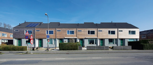
Image from
https://passivehouseplus.ie/magazine/insight/energiesprong
The image above is an Energiepsrong project that is turning old terraced housing into modern net zero energy homes through the installation of new insulated external roof and wall panels that completely transform the properties. The process is done by using prefabricated panels and most houses can be retrofitted within a week, with minimal disturbance for the residents because the majority of the work is on the exterior. The links below provide more information:
http://www.energypost.eu/zero-energy-zero-cost-industrialising-building-sector/
https://passivehouseplus.ie/magazine/insight/energiesprong
As you can see from the webpages it works for all kinds of aesthetics and building materials. The big challenge for cities like New York is if this can be done for high and medium rise buildings as well. Watch a building being retrofitted using prefabricated panels: https://www.youtube.com/watch?v=xcnZVRG419Y. NYSERDA is hoping to receive feedback from the Passive House community on building typology (what can be done), code and supply chain hurdles and take part in the design competitions, which NYSERDA is planning to launch.
For updates see:
http://www.nyserda.ny.gov/Business-and-Industry/Housing-and-Development
OUR ICFF FAVORITES 2016
This years ICFF was dominated by wood and LED lights. Overall there was a focus on unaltered building materials like stainless steel, concrete, and as mentioned above wood. Here are some of our favorites:

Pantosh Chair:
The original design of the Pantosh easychair was born of the fusion of two pieces of furniture: the Panton chair by Danish architect Verner Panton (created in 1968), and the Willow Chair, designed by Scottish architect Charles Rennie Mackintosh (created between 1902 - 1904).
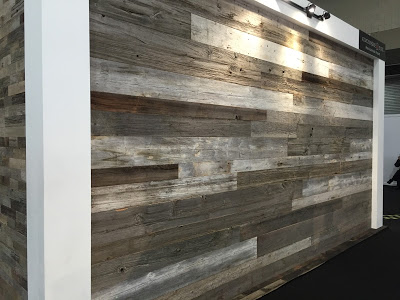
Atmosphere-Bois cladding comes from old Canadian and European loft barns. It can be used for interior or exterior trimming. The cladding is: greyish, brown or with original paint works, red, white, black, green, axe-hewn decorative beams, etc.
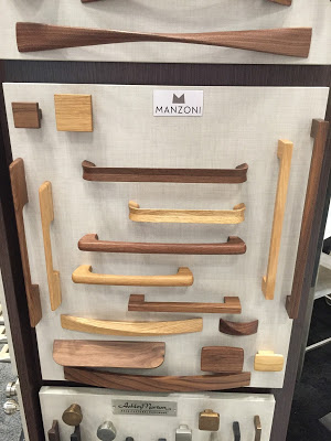
Mazoni has a series of wood handles and pulls. They come in two finishes, and would look great for an all wood look on cabinets or the pull just creating some accent.
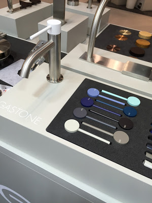
cea design has beautiful stainless steel plumbing fixtures. All very simple and elegant. Their Gastone serie includes customizable faucets.
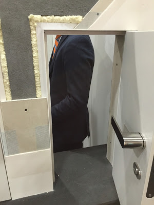
Xinnix Doors are beautiful ready made frameless flush doors and pocket doors which make the installation easy:
They include everything you don’t see after the install (which is the important stuff like the completely milled frame, installation materials, gaskets, 3D hinges, magnetic locks, door straightener…)"

Bazzeo Kitchen:
Very exciting. Above you see an induction cook top which is installed below a stone counter. Only engraved rings indicating the location of the induction plates otherwise you see an continuous stone counter. Elegant and easy to clean
Another new invention by Bazzeo Kitchenis their movable counter top. Ideal for small spaces. See movie below
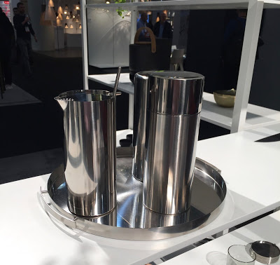
And lastly some fun with a cocktail set from Stelton....
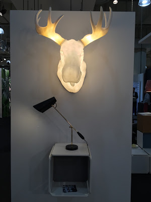
an elk....
and a leather sofa

A few more links for items we really like but we didn't take picture of them
Beautiful wood and concrete light fixtures:
Juniper THIN Chandelier:
Basaltina Mosaic:


