The Yellow City of Hills, Izamal
Last September my partner and I traveled to the Yucatan Peninsula to see Maya architecture and art. We decided to risk traveling during hurricane season in order to escape the crowds which normally visit the ruins as sideshows to a beach vacation. We prefer off-seasons as this gives us more exposure to the environment in an unhurried and relaxed manner. It does help that one often gets good deals - but the weather, opening hours and service may not be up to most people's reqs!
We landed in Cancun and immediately drove out to Izamal - a small town about 45 minutes away from Chichén Itzá, just north of Highway 180. Called "The Yellow City", with virtually every building painted a mustard yellow, Izamal was founded between 600-800AD one of the last Mayan towns established before the Conquest. Izamal is one of the largest and oldest cities of the Yucatan peninsula and has been continually occupied by the last chieftains of the local Maya through modern times. Also called "The City of Hills", the remains of 80 pre-Hispanic structures exist within city limits - many of which are are covered pyramids (the 'Hills') - but more about these later. With its royal Maya, Hispanic colonial and contemporary flavors, this is one of the few cities that brings elements of all three cultures together in a beautiful and relaxed milieu.
 |
| Road from Highway 180 to Izamal |
 |
| Typical Street in Izamal |
Upon Conquest, as narrated by Friar Diego de Landa in his "Relaciones de las Cosas de Yucatan", there were originally twelve pyramids in Izamal in the early 16th century. Only four remain today: Kinich Kak Mo, Itzamatul, Ppap Hol Chak and Hun Pik Tok.
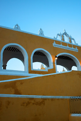 |
| Stairs of the Convento de San Antonio |
The impressive convent of Izamal - the Convento de San Antonio de Padua - was built atop and with masonry from the immense Ppap Hol Chak pyramid under orders from De Landa. De Landa is also famous for initially recording Mayan literature and then in a fit of rage ordering all extant texts to be burned. Construction of the convent began in 1533, and was completed in 1561. It was one of the first convents built in the western hemisphere, and one can find evidence of maize patterns, Maya glyphs and square block-columns used in the original Maya temple. Even the unusual elevation of the courtyard/cloister of the monastery is an indication of the pyramid's platform on which it is built. The courtyard is accessed from the street by a wide stair-ramp on one side and a stair system on the other side (see image to the right). Probably due the size of the original Pyramid the Convent boasts an open air atrium second only in size to that at the Vatican.
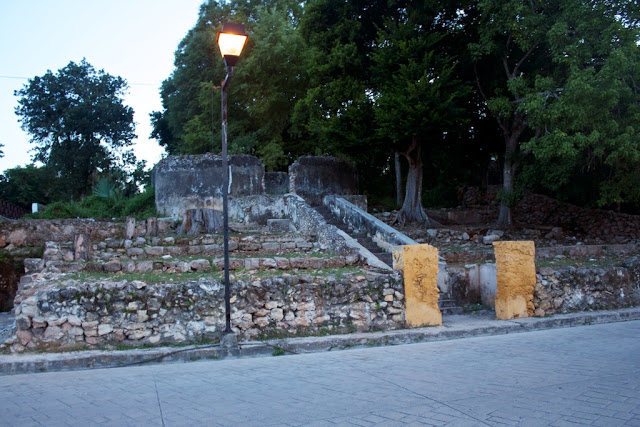
A short walk to the north of the Convent / Ppap Hol Chak complex is the Kinich Kak Mo pyramid, largest in the state of Yucatán and third largest by volume in Mexico. It's base covers 2 acres with a 10 level pyramid on top. Built around 400–600 AD, the pyramid was dedicated to the sun god, or Fire Macaw. It was the principal structure of a massive plaza that extended over much of present-day Izamal. We arrived too late to enter the site, and while a local restaurant invited us to climb up through other access points on a side street, we declined as it was also getting dark. We have some external shots (see image below) that hint at its magnificence.
Izamal is on the tentative list for the UNESCO Wold Heritage Nominations. All photographs copyright (c) Stefanie Werner, Das Studio.
Sources: whc.unesco.org/en/tentativelists/5394/, http://www.tripadvisor.com/Travel-g616322-s2/Izamal:Mexico:Background.html, http://www.mayantravelguide.com/izamal.html
 |
| Convento de San Antonio Ramp to Courtyard |
 |
| Convento de San Antonio Church |
 |
| Convento de San Antonio Courtyard |
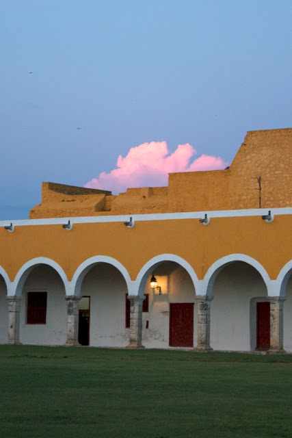 |
| Convento de San Antonio Courtyard |
 |
| Convento de San Antonio Ramp |
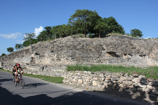 |
| Kinich Kak Mo from the street. We arrived too late.The site was already closed |
New Years Resolutions
We found this article on Houzz and felt it is really helpful
Browse Home Office Products on Houzz- For Example:
Passive House Designer
We are happy to announce that Stefanie Werner of DAS Studio received the
Certification as a Passive House Designer. Passive Houses require only
10- 20% of the energy a conventional building requires and provide a healthier living environments. We are looking forward moving towards sustainable planet.
For more information on Passive Houses and why they are so great see:
Or contact us at info@das-studio.us. We will be happy to explain
75th Anniversary of the Golden Gate Bridge
7.5 fun facts in honor of the 75th Anniversary of the Golden Gate Bridge
The dream of spanning the Golden Gate Strait had been around for well over a century before the Golden Gate Bridge opened to traffic on May 28, 1937. Pedestrian Day was held on May 27, 1937.
“A Wild Flight of the Imagination” was the title of a promotional pamphlet written in 1922 by chief engineer of the bridge, Joseph Strauss, and city top engineer, Michael O’Shaughnessy.
http://www.californiahistoricalsociety.org/exhibitions/
Theater architect John Eberson originally rendered the bridge’s suspension tower, circa 1930, in his brief work as a consultant to Strauss. One of his more famous theatres in the U.S. is the Loew’s Paradise in the Bronx, New York, which opened in 1929 on the then-thriving Grand Concourse, which was recently restored in 2006.
http://www.sfgate.com/cgi-bin/object/article?f=/c/a/2012/03/07/DDBO1NFHPA.DTL&object=/c/pictures/2012/03/07/ba-place07_SFC0107311348.jpg
Eleven men died in the construction of the bridge. Until February 17, 1937, there had been only one fatality, setting a new all-time record in a field where one man killed for every million dollars spent had been the norm. On February 17, ten more men lost their lives when a section of scaffold carrying twelve men fell through the safety net. The most conspicuous precaution was the safety net, suspended under the floor of the Bridge from end to end. During construction, the net saved the lives of 19 men who became known as the “Halfway-to-Hell Club.”
The Golden Gate Bridge is painted Golden Gate Bridge International Orange which was selected by Consulting Architect Irving F. Morrow.
http://en.wikipedia.org/wiki/International_orange
The 4,200 foot long suspension span of the Golden Gate Bridge was the longest span in the world from the time of its construction in 1937 until New York City’s Verrazano Narrows Bridge was opened on November 21, 1964. It is 60 feet longer than the Golden Gate Bridge.
On Sunday, May 27, 2012 there will be an event celebrating the 75th Anniversary of the Golden Gate Bridge.
http://goldengatebridge75.org/The dream of spanning the Golden Gate Strait had been around for well over a century before the Golden Gate Bridge opened to traffic on May 28, 1937. Pedestrian Day was held on May 27, 1937.
“A Wild Flight of the Imagination” was the title of a promotional pamphlet written in 1922 by chief engineer of the bridge, Joseph Strauss, and city top engineer, Michael O’Shaughnessy.
http://www.californiahistoricalsociety.org/exhibitions/
Theater architect John Eberson originally rendered the bridge’s suspension tower, circa 1930, in his brief work as a consultant to Strauss. One of his more famous theatres in the U.S. is the Loew’s Paradise in the Bronx, New York, which opened in 1929 on the then-thriving Grand Concourse, which was recently restored in 2006.
http://www.sfgate.com/cgi-bin/object/article?f=/c/a/2012/03/07/DDBO1NFHPA.DTL&object=/c/pictures/2012/03/07/ba-place07_SFC0107311348.jpg
Eleven men died in the construction of the bridge. Until February 17, 1937, there had been only one fatality, setting a new all-time record in a field where one man killed for every million dollars spent had been the norm. On February 17, ten more men lost their lives when a section of scaffold carrying twelve men fell through the safety net. The most conspicuous precaution was the safety net, suspended under the floor of the Bridge from end to end. During construction, the net saved the lives of 19 men who became known as the “Halfway-to-Hell Club.”
The Golden Gate Bridge is painted Golden Gate Bridge International Orange which was selected by Consulting Architect Irving F. Morrow.
http://en.wikipedia.org/wiki/International_orange
The 4,200 foot long suspension span of the Golden Gate Bridge was the longest span in the world from the time of its construction in 1937 until New York City’s Verrazano Narrows Bridge was opened on November 21, 1964. It is 60 feet longer than the Golden Gate Bridge.
On Sunday, May 27, 2012 there will be an event celebrating the 75th Anniversary of the Golden Gate Bridge.
Blog by Francisco de León
DAS Guest Blogger Francisco
Which comes first the chicken or the well-designed egg?
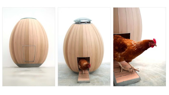
Does a chicken have a sense of style? Does the design of a chicken coop affect egg production? Do country chickens live in shabby coops while urban chickens reside in contemporary abodes? These are some of the questions that came to my mind when I found this:
http://www.nogg.co/
This is indeed a beautifully designed chicken coop. The idea of a chicken roosting in an egg is a clever one that might inspire meditation on recursion. And, of course, this coop would look fabulous in a modernist backyard. I must admit, I am easily seduced by beautiful well-made things.
But what if we asked a chicken what it thinks of this? It might say, “I’m not a fussy chick. All I need is a place that keeps me dry and safe. So yes, this would work but here’s the challenge. The price of this beautiful chicken house is £1950.00 (currently $3,146.52) not including shipping etc. That’s a lot of eggs to lay to pay for this fabulous house.” Does this foreshadow a chicken house foreclosure scandal in our future? Who knows? All I know is that if I were that chicken I’d look for a couple of heavy laying sisters as housemates.
May your roost be finely feathered,
Francisco
P.S. No chickens were hurt during the writing of this blog entry.
Due to Francisco's chicken coop post some readers have expressed an interest in egg-shaped dwellings for humans. Therefore, we think you might be interested in this (click on link):
Francisco A. de León is a graphic designer with a Bachelor of Architecture. We enjoy his sharp wit and keen observations. He will periodically guest post on our blog. We hope you enjoyed his "eggcentric" point of view.
Francisco A. de León is a graphic designer with a Bachelor of Architecture. We enjoy his sharp wit and keen observations. He will periodically guest post on our blog. We hope you enjoyed his "eggcentric" point of view.
DAS Architectural Idea
Making an Old Bathtub Look New.
Renovating a bathroom can be a pricey, disruptive and time consuming endeavor: Demolish everything; Replace the tiles and fixtures. Taking the old and perfectly good bathtub and replacing it with a new one often of poorer quality adds even more cost without great benefits. However leaving the bathtub as is creates an eye sore in an otherwise new bathroom.
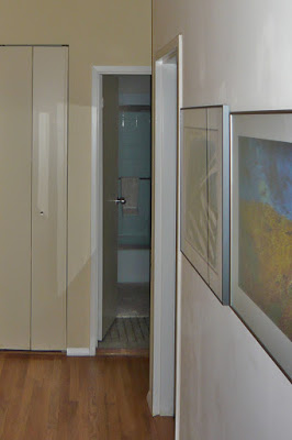 |
| Before |
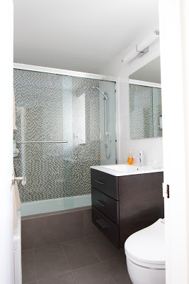 |
| After |
One of the ideas we implemented in this project is keeping the old bathtub in place but enclosing it's front with tile. It appears new from the outside and fits in perfectly with the new styling of the bathroom. Two things should be considered when doing this: you need a big enough bathroom as the new ledge will take up 4", you must carefully waterproof the tile ledge and floor. In our case we used the floor tiles for the ledge This visually links the front of the bathroom with the floor, eliminates the ugly standard bathtub front and the room feels more continuous and spacious.
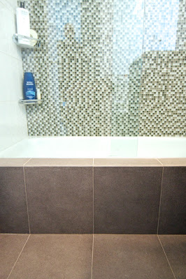 |
| Floor tiles creating the edge |
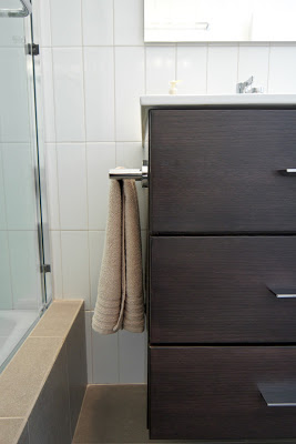 |
| Ledge and Vanity |
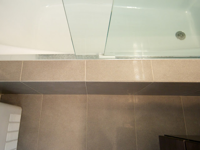 | |||
| Ledge with Shower Door Track |
Things We Like
It is Mid April, the taxes are done, and time to start new ideas! Each month we will feature designs, furniture, fixtures and appliances we find worth interesting. Good designs for some items are hard to find, for example; area rugs. We have found they are often very expensive for good ones or when not expensive they look cheap and are of low quality. Therefor we decided to start this series with introducing a rug designer we like, who addresses this issue very well.
Tania Johnson Design does custom contemporary hand-knotted rugs. She specializes in translating her textural photographs into ethereal designs. Every rug starts with an image that inspires her. The great thing about the carpets is that most of them can be ordered in different qualities knot, which makes them affordable to more of us while being beautiful and of good quality.
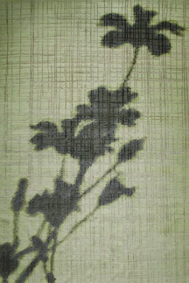
Tania Johnson Design does custom contemporary hand-knotted rugs. She specializes in translating her textural photographs into ethereal designs. Every rug starts with an image that inspires her. The great thing about the carpets is that most of them can be ordered in different qualities knot, which makes them affordable to more of us while being beautiful and of good quality.

DAS Minimalist Easter Egg
 |
| Architectural Easter Egg |
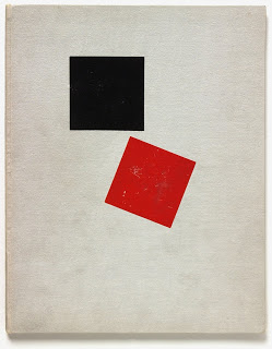
For a little more color and fun why not attempt to recreate some twentieth Century art on the eggs? Maybe a little Mondrian or El Lissitsky like the two eggs below.
DAS Interior Design Ideas
As we move from winter into spring we all feel the need to spruce things up. It’s a time of change, the warm lighter days of spring are replacing the cold dark ones of winter. Why not extend that feeling to our homes? It does not have to be a major project entailing months of planning and vast expense. A few simple changes to accessories or accents can transform the winter room to a summer one.
Let's go back to David and John's place and show you how very minor modifications can lead to significant changes in mood and setting.
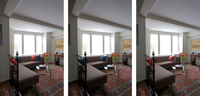
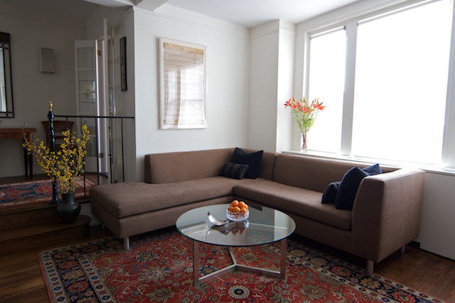
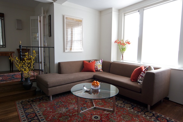
In the following photos we show the same couch with different pillows. As you see, the atmosphere of the room changes. Some pillows intensifying the colors in the rugs others subduing them. These photos, all taken with at the same time of day with identical lighting and exposure settings, show stark differences between the effect of the black, orange and white patterned pillows. The black ones create a subtle lounge like effect, creating a sophisticated evening atmosphere. While the orange pillows pick out the colors of the rug and console in the back - giving the space a lighter casual daytime feel. Two starkly different moods created by swapping nothing but pillow covers.

