The popularity of the book by Marie Kondo – "The Life-Changing Magic of Tidying Up: The Japanese Art of Decluttering and Organizing" – a New York Times bestseller, has people interested in achieving a streamlined, clutter free living. It is said that clutter-free and well organized spaces make you more creative and productive while also increasing your feelings of freedom and joy.
This certainly seems like a valuable goal to reach for. In fact, in cities like New York, with limited space in one’s home, clutter reduction is not only a choice but a necessity!
If one lives in a small space, a reality for most New Yorkers, as items get accumulated, the living space rapidly feels smaller and actually gets restrictive. Kitchen counters in suburban settings that comfortably manage juicers, coffee machines, fruit-baskets, knife racks etc. find it hard to do so in a dense urban situation. Similarly, retaining a separate room for a home office is a luxury rarely afforded to the City’s natives – and the resulting desk in the living room or bedroom significantly reduces the size of the room, all the while adding to the potential of clutter.
It is no surprise that many of our City clients ask for creative solutions to streamline their apartments. In response we have made it a point to spend considerable energy and time designing built-in storage and furniture that enables multi-purpose uses by stowing / hiding away utility items when they are not in use.
In this article, we share some techniques and ideas how to maximize efficient storage and create solutions for equipment to appear and disappear as needed. Enabled in this manner it keeps rooms tidy and clean in addition to increasing the overall usable square footage.
A famous holistic example of multi-functional space usage is that of micro-apartments. A clip featuring one of our designs (https://www.youtube.com/watch?v=J7Ue7B89PIM) shows space-saving storage and moveable furniture solutions.
Although not everyone wants to live in a micro-apartment, the solutions we describe are useful in regular sized apartments as well. Some can even be retrofit into existing cabinets. Here are some examples with suggestions and techniques we use.
1. Built-in storage below windows:
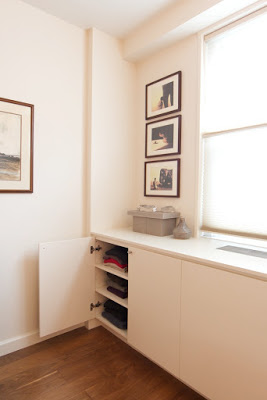
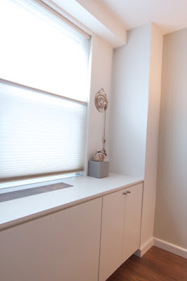
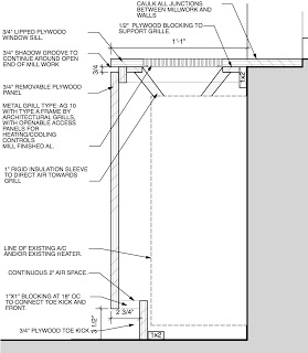
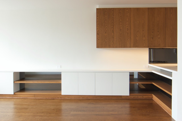
Most New York City apartments have PTAC Units, Radiators or AC Units located below windows. Unsightly and cluttering from a visual and physical perspective, they are the basis of our most frequent client request. As part of a solution to hide them, we double down and design millwork to create more storage and usable counter space. The example below shows built-in cabinetry designed for a one bedroom apartment in Chelsea. The PTAC unit is hidden behind a white matte-lacquer wood enclosure with added cabinets on both sides. As you will see from the “before” and “after” images, the room feels more spacious with the PTAC unit and dresser combined into one wall to wall millwork piece. Note from the provided cross sections how the wall-unit’s functionality is not compromised.
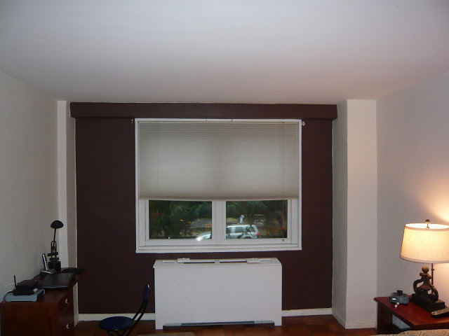
Before
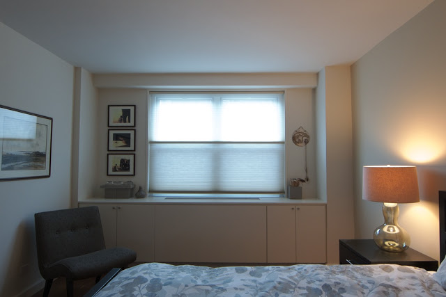
After

2. Stow away your office.
As mentioned above, most people living in cities don't have an extra room for their office, and don't want their desk and office equipment on display in the living room – the usual de-facto office of a cramped NYC apartment.
Featured here is a project showing cabinetry designed for the client with a fold-out desk. One of the cabinets contains a desk which slides and folds out for use while the one next to it contains the printer, modem, paper supply, etc. The laptop can be slotted on the fold-out desk and stowed away with the desk in the cabinet, saving time and space at the same time.
Desk is folded back into the cabinet

Desk is being folded out
3. Hidden TV – Entertainment when you need it.
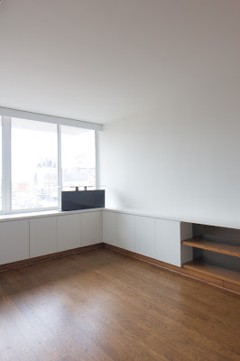
For many clients, a TV on continuous display makes little aesthetic. They may rather prefer to hang art on the wall, an uninterrupted view through a window or maybe just a smooth, clean, object-free surface. In the tight space shown below, a TV on the counter or wall would have either blocked the view out of the window or taken up valuable wall space.
The solution is to lower the TV into the cabinets using a lift, when it is not in use. As the photographs show, the built in lift raises the TV to sit above the cabinet, ready for viewing, then lowers it back to storage when not in use – and provides for a clean, uncluttered living space.
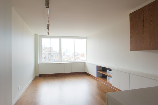
Living Room, TV sits in lower cabinet

4. Dressers – going deep with shallow solutions.
What do you do if your bedroom does not fit a dresser, but you need one? One solution is to install a dresser that is shallower than standard store bought options. The depth of regular dressers ranges from 15 to 21 inches. The drawers are between 13 and 19 inches deep. However, if the drawers are for socks, undergarment or folded shirts stacked lengthwise, drawers of 9-10 inches depth are sufficient.
A built-in dresser saves another inch or two. This is often all it takes to provide significant storage in a tight space without compromise. In the example below we show the cross section of a floor-to-ceiling dresser for a small bedroom. The overall depth is only 12 inches (from wall to front of dresser) and the drawers just 10 inches deep. The top section is for shirts and jackets where a valet hanger system is used to rack them parallel to the door, instead of sideways as in a regular 24 inch closet.
In the example shown, the client has the option either to use the hanger system or put in removable shelves the millworker has already provided.
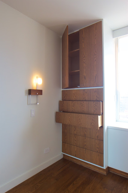
Floor to Ceiling Dresser

Valet hanger system
5. Closet doors – make space, don’t take space.
In an apartment renovation, if existing closet doors are to be replaced, a convenient way to increase storage is by making existing storage more accessible. We often suggest increasing closet door height. A regular closet door is either 6 feet 8 inches or 7 feet. The highest shelf is installed at about 5 feet 6 inches We enlarging the existing openings, installing an additional shelves at ca. 6 feet 8 inches and new doors that are either 8 feet or all the way to the ceiling. They might not match the doors of the room, but where space is limited the additional shelving and accessibility is a welcome benefit. While replacing, consider using bi-fold or sliding doors so that space in the room can be functionally utilized instead of being reserved for the doors to swing open.
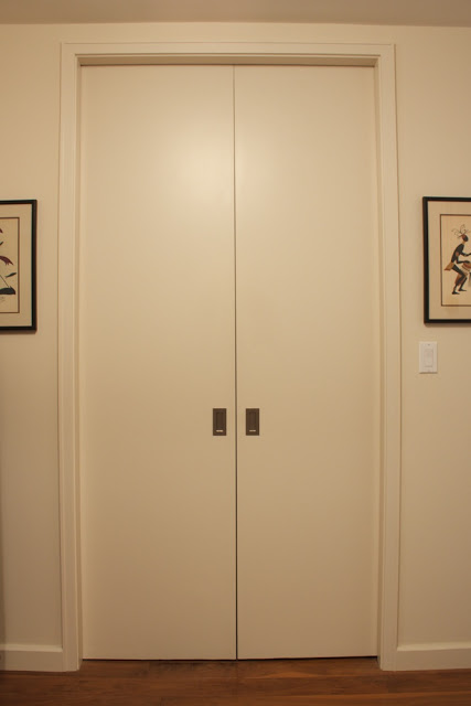
Foyer closet with 8 foot pocket doors
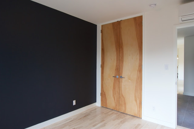
Floor to ceiling doors
In conclusion, we hope these techniques and methodologies have been useful in giving you some ideas. We would love to hear from you if you have any suggestions, other useful ideas – or if you want to share your experience with small spaces.
Thanks!
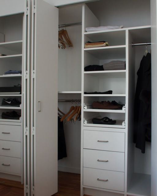
Closet with bi-fold doors


