Architecture and Nature I: Taliesin West- Organic Architecture
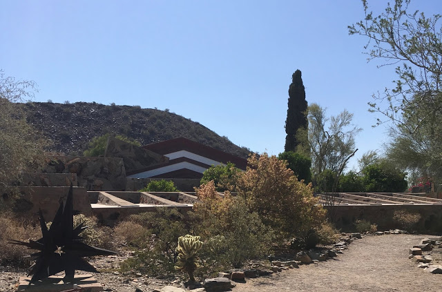
Frank Lloyd Wright, the great American Architect, was one of the first to consciously design and build structures and interiors as a part of their environment, in a unified whole. Buildings were not considered separate from their furnishings, surroundings or inhabitants. To Frank Lloyd Wright, a building needed to ‘grow’ from its immediate surroundings and environment, to appear as one continuous unit.
He was the first to coin the term "Organic Architecture". In the Architectural Record (August 1914):“…the ideal of an organic architecture... is a sentient, rational building that would owe its ‘style’ to the integrity with which it was individually fashioned to serve its particular purpose – a ‘thinking’ as well as ‘feeling’ process.”, Frank Lloyd Wright wrote,“... In organic architecture then, it is quite impossible to consider the building as one thing, its furnishings another and its setting and environment still another. … The spirit in which these buildings are conceived sees all these together at work as one thing.”
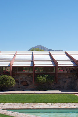
View of the Drafting Studio and Frank LLoydand Olgivanna Wright's Living Quarter
Founded in 1937, Taliesin West was Wright’s design laboratory for organic architecture and, at the same time, one of its prime examples. It was the winter home for the Taliesin Fellowship, where fifty to sixty apprentices could study under the architect. Every winter, when Wright and his students returned, he would see the place with fresh eyes, adding and removing walls here and there, experimenting with building materials. In Taliesin West he used the design principles of organic architecture, which can be summarized as the following:
- Use building materials in their natural state
- Build in harmony with nature
- Let the building grow out of the earth
- Allow the interiors to flow and engage in a dialogue with the outdoors
- Break the box — remove the corners and free the space
- Design “from the inside out” — express the interior through the exterior form of the building

When Frank Lloyd Wright arrived at the foot of the McDowell Mountains in present-day Scottsdale overlooking the desert, he was reminded of the ocean floor and that inspired the layout of the complex. As a keynote of his design, shaped like the prow of a ship pointing to the horizon, he created a shallow pool, which served as water storage in case of a fire and to clean the canvas sheets which formed the weather protection for the rooms before the glass was installed.
Another example of Wright’s abstracted interpretation of the surrounding nature is the slanted roof lines that echo the surrounding mountains; brightly painted, carved wood forms jutting like spiky wildflowers. “Wright wanted others to experience this amazing place as he experienced it”, said Frederick Prozillo, Director of Preservation at Taliesin West. The triangle shape repeats itself in section, elevation and floor plan. Using low level, horizontal planes the buildings were kept low to the ground to insure effective natural ventilation and protection and shade from the intense desert sun.

Floor Plan 1938
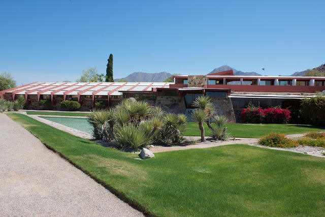
Drafting Studio and Pool
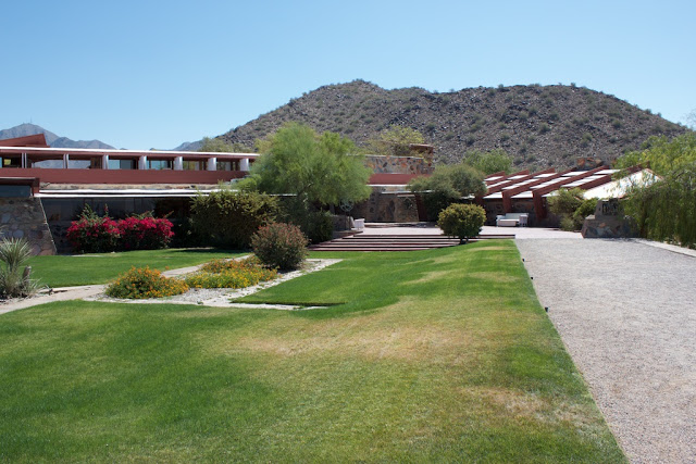
Apartment, Sunset Terrace and Garden Room
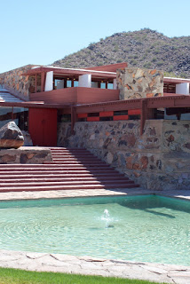
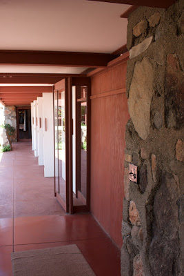
Every aspect of design and detail of the project was given particular attention by Wright. Besides closely accounting for the arid desert climate, Wright implemented local and site provided materials for the construction of the house and foundation. The structure's walls were built by the students as part of their curriculum and made of local desert rocks, stacked within wood forms before being filled with concrete. Once the concrete set, the wood forms were removed to expose the rocks and concrete.
Wright always favored using the materials readily available on site rather than transporting it there. This matched not just his philosophy and aesthetic, but also the critical economic and logistic constraint of bringing any exotic material to what was then a remote location. The architecture of Taliesin West described in Wright’s own words: “There were simple characteristic silhouettes to go by, tremendous drifts and heaps of sunburned desert rocks were nearby to be used. We got it all together with the landscape…”. The flat surfaces of the rocks were placed outward facing and large boulders filled the interior space so concrete could be conserved.
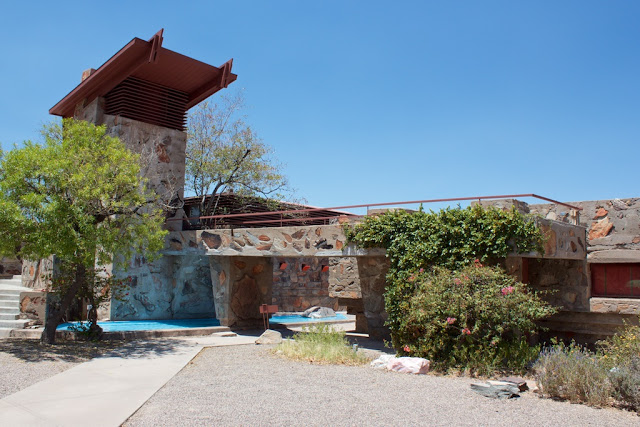
Water Tower
The rich red hue (a favorite Frank Lloyd Wright color) from the redwood timber along with the earthy, sandy hues from the concrete and stone of the walls creates a close natural relationship between the house and landscape. Frank Lloyd Wright’s typical color pallets can be reviewed here:
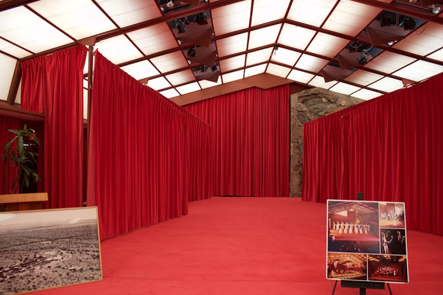
Cabaret
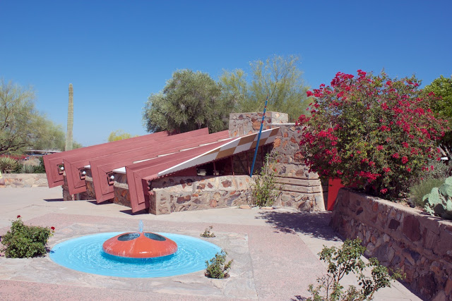
Structural elements of office painted red
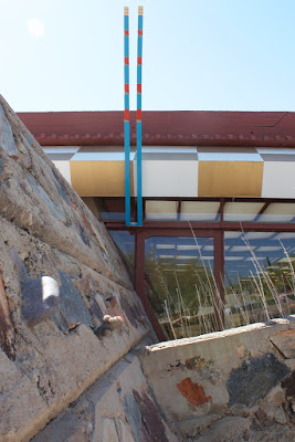
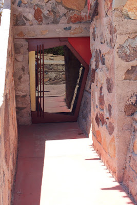
Color scheme at Drafting Studio and Door
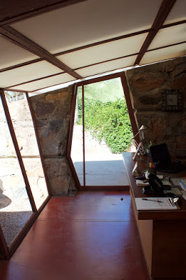
Compression Door
One of Wright's most famous design tools can be found in abundance at Taliesin West. It is his use of “compression and release”, which is also known as “tension and resolution” or “embrace and release". By making entrance spaces to a building a confining "compressing" experience Frank Lloyd Wright made the visitor mildly uncomfortable and then, by encouraging them to move into the larger main room, a feeling of relaxation, or "release”. This "release" also imparts a feeling (or impression) of freedom. As one can see in the image below, Wright designed entrances as narrow hallways with extremely low ceilings, often no more than six feet high. The claustrophobic hallways encouraged a flow of traffic into the main room, thereby preventing people from obstructing the entrance. A similar concept of encouraging certain behavior through architecture can be seen in the group dining room of Taliesin West. This room had ceilings that were also uncomfortably low, which encouraged diners to sit at the tables instead of standing.
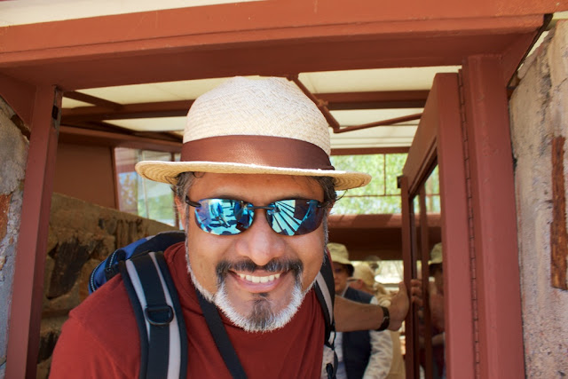
Compression
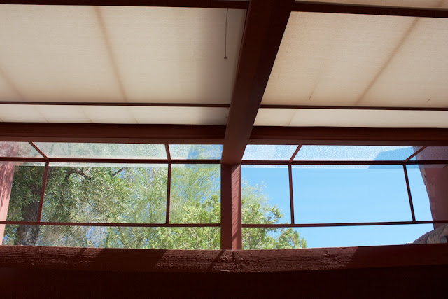
Release
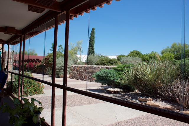
Dining Room View while Seated
Taliesin West is one of the great examples how drawing inspiration and all aspects of its design from the surrounding environment can enrich both, the architecture itself as well as the environment it sits in, making it a truly organic architectural complex.
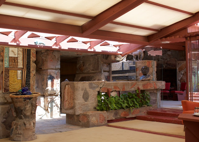
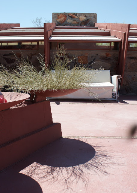
Garden Room Interior
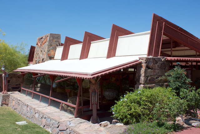
Garden Room Exterior
More info you can also find at:
Fire Island House Completed!
 We have designed our 3rd House on Fire Island which is already listed for sale.
Thank you Doreen Katen of Fire Island Properties for the great write up and the pictures.
Please see link for more information: http://www.fireislandpines.com/properties/418-ocean-walk-2/
Our first Micro Apartment is featured on Tiny House Nation
David introduces it in the Tiny House Nation episode below. You Can see the David and our design by jumping to minute 21. It is about 2 minutes long. Check it out!
http://www.fyi.tv/shows/tiny-house-nation/videos/204-sq-ft-climbing-gym
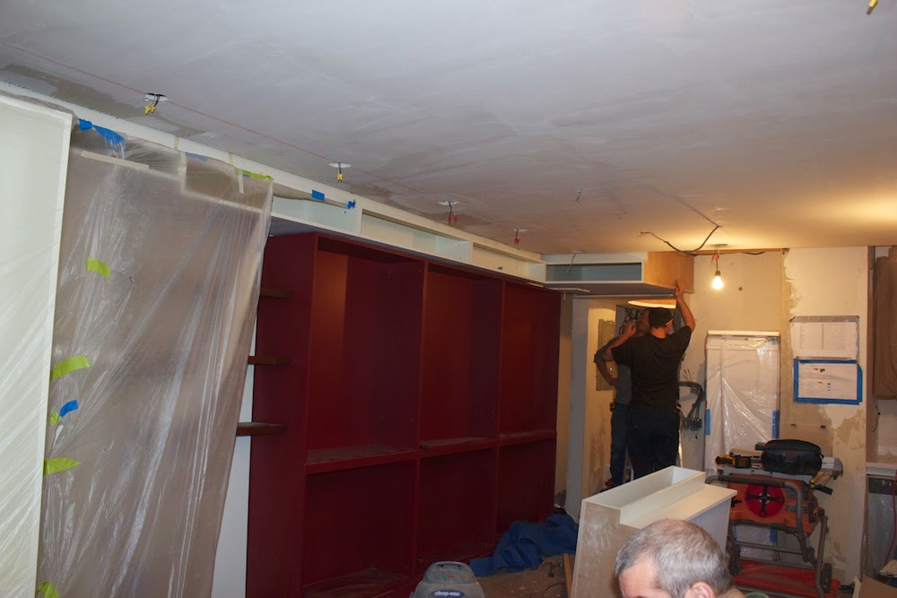
The Construction of our Micro Apartment
More images will follow, but here is a little taste. The General Contractor is testing our foldable wall and bunk beds during construction.

The Beginning
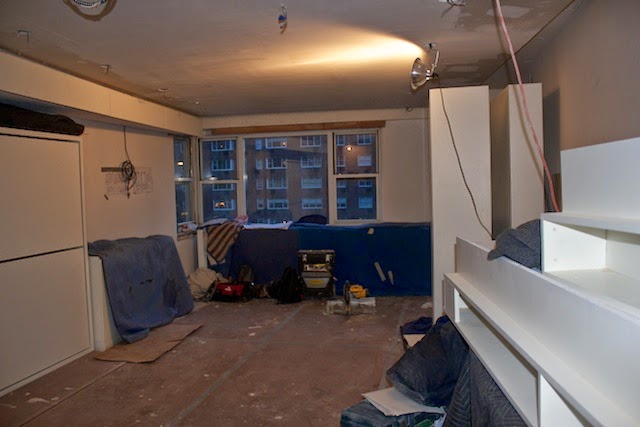
Resource Furniture beds and lower cabinets are installed
Red cabinet and soffit cabinets are being installed
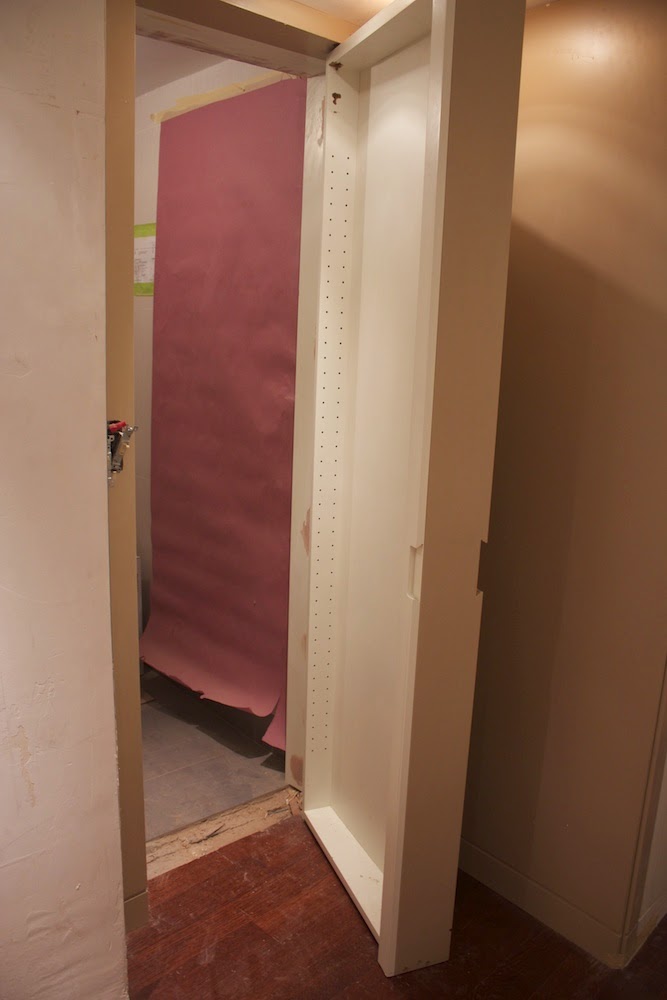
Bathroom/ medicine cabinet door
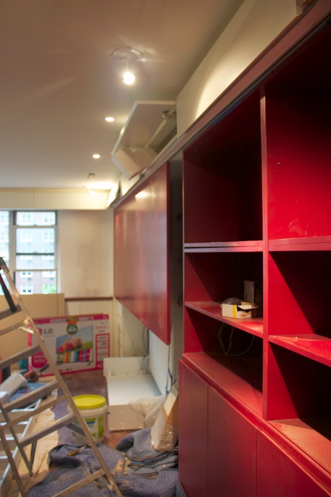
Sliding panel for painting is installed
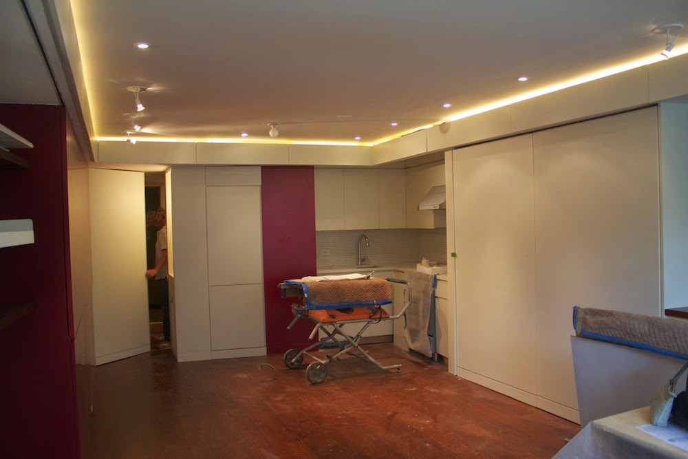
All cabinets but movable kitchen island are in

Folding wall in front of bunk beds in open position
Micro Apartment Design
 |
| Foyer and Gallery Space |
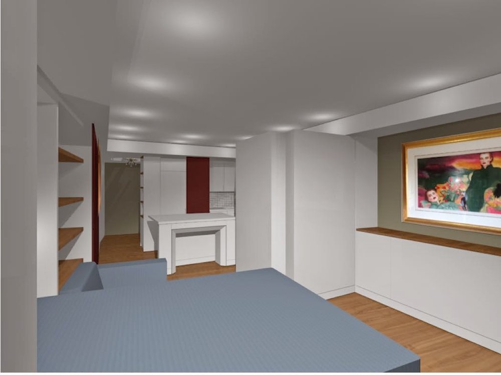
Early in 2014, the owners of a small Manhattan studio approached DAS Studio with a request to convert their 320 sqft space into a high-functioning micro-apartment. The desire was to have all the functionality of a full-sized apartment within the footprint of this tiny studio. On taking on this challenge, we identified the minimal design objective of needing to incorporate four fully functional spaces into one room - a dining room seating 12, a master bedroom, guest room for two. The owners also needed enough storage space for their extensive china collection, hanging space to display their art collection, including a 4' x 10' painting and room for an entertainment system. Further, space needed to be accounted for a work desk that could be separated from the sleeping area in case one of the owners were still asleep. We set out to achieve all the above while still creating a space that was open and generous.
The following renderings showing the different possible apartment configurations. Photos of the apartment will follow soon.
 |
| During day time a living |
 |
| During night time a master bedroom with guest bedroom option |
 |
| During day time master bed becomes a couch and guest beds collapse behind folding wall |
 |
| During night time master bed opens over couch and guest beds pull out behind folding wall |
 |
| Daytime configuration with couch and sliding panel/ art wall |
 |
| Night time configuration with master bed and folding wall |
Weidlinger House Kickstarter Campaign


EVENTS: 2013/14
Oct. 9th
Screenings of “Built on Narrow Land” Documentary by Malachi Connolly:http://www.narrowland.org/
Oct 9th, 6:00pm
Oct 18, 6:15pm
Nov 2nd, 2:00pm
Nov. 9th
May 2014.
