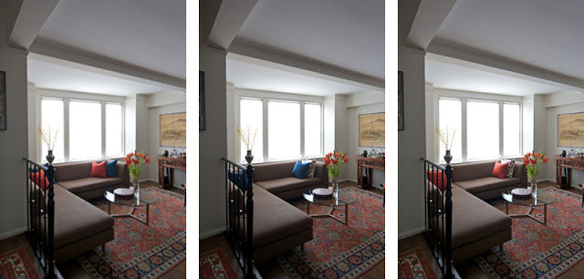
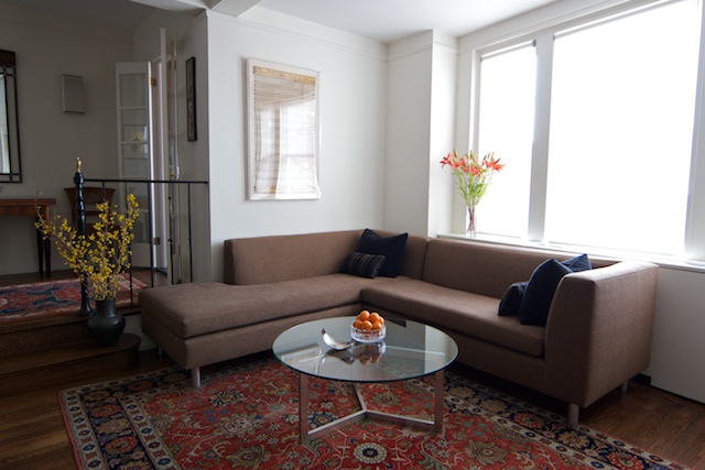
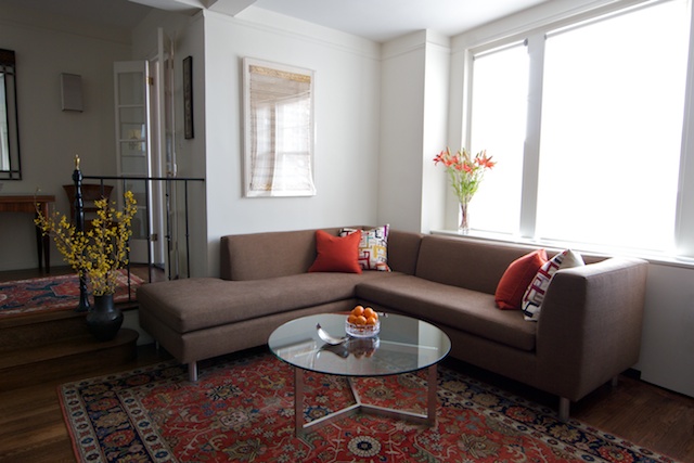
We are very happy to announce that we just finished a unique apartment renovation with an extensive energy retrofit using the Passive House techniques.
This is only the second apartment in New York City to have Passive House methods implemented. We faced challenges in the configuration of the apartment, as well as with the exterior walls and window openings which we could not change. The retrofit hasresulted in a significant reduction in energy use, improved indoor air quality and a noticeably reduced outside noise. The apartment residents now have a quieter, cleaner and more energy efficient apartment with smaller variations in temperature through the day and year.

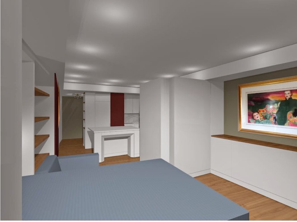
Living and Dining Room
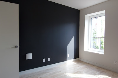
Bedroom
What is a Passive House?
Passepedia defines it as the following:
"Passive House is a building standard that is truly energy efficient, comfortable and affordable at the same time. Passive House is not a brand name, but a tried and true construction concept that can be applied by anyone, anywhere.
Yet, a Passive House is much more than “just” a low-energy building:
-Passive Houses allow for space heating and cooling related energy savings of up to 90% compared with typical building stock and over 75% compared to average new builds. Passive Houses use less than 1.5 l of oil or 1.5 m3 of gas to heat one square meter of living space for a year – substantially less than common “low- energy” buildings. Vast energy savings have been demonstrated in warm climates where typical buildings also require active cooling.
- Passive Houses make efficient use of the sun, internal heat sources and heat recovery, rendering conventional heating systems unnecessary throughout even the coldest of winters. During warmer months, Passive Houses make use of passive cooling techniques such as strategic shading to keep comfortably cool. -Passive Houses are praised for the high level of comfort they offer. Internal surface temperatures vary little from indoor air temperatures, even in the face of extreme outdoor temperatures. Appropriate windows and a building envelope consisting of a highly insulated roof and floor slab as well as highly insulated exterior walls keep the desired warmth in the house – or undesirable heat out.
-A ventilation system imperceptibly supplies constant fresh air, making for superior air quality without unpleasant draughts. A highly efficient heat recovery unit allows for the heat contained in the exhaust air to be re-used.” (http://www.passipedia.org/)
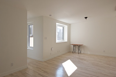
Living and Dining Room
When our client approached us in 2013 interested in refurbishing her apartment into a Passive House apartment, we knew it would not be easy. She had two main reasons to want this extensive energy retrofit: 1. The apartment was heated with three gas heaters, which were in need of replacement and she wanted an alternative, and 2. A night club off her backyard generated an inordinate amount of noise which she wanted reduced in her apartment. Having done her own research she already knew, before contacting us, that both issues could be solved by implementing Passive House methods. An informed client is the best client – and in this case that adage holds true many times over.
In general, a deep energy retrofit is done for an entire building, and that is almost the only way to guarantee a continuous airtight layer around the space and a “thermal bridge free” design - both very important for a low energy building - in a reasonable budget. An additional issue that added a degree of difficulty was that the apartment was on the highest floor with low ceilings and a small rectangular extension in the back connected by a narrow uninsulated corridor. This limited the thickness of the insulation layer we could install in the walls and roof (see floor plan below).
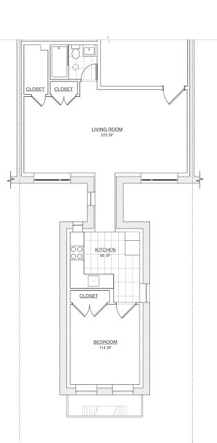
Due to the rules of the Co-op building, we were also constrained from making any changes to the exterior envelope / walls. Windows sizes and location were dictated by the existing openings. We were also not allowed to add exterior shading nor an extra layer of insulation on top of the existing roof.
This was our solution:
Air Barrier and Insulation:
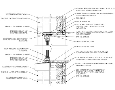
In order to keep the construction cost reasonable we insulated and provided an airtight layer only on the exterior walls and roof; we chose not to do so on interior walls where the apartment was adjacent to another conditioned space. We added as much insulation as we could using dense pack cellulose in all the walls and ceiling. We chose dense pack cellulose insulation for it’s ability to store condensation moisture and release it over time. For the air barrier we used a membrane, Intello, which also functions as a smart vapor retarder (https://proclima.com/systems/intello/how-it- works). Any stored moisture can be evaporated to the inside of the building during the summer. This membrane was installed on the inside due to the existing masonry structure of the building. It is taped to the windows and at all penetrations. This is very important. there should be no penetration of this barrier, as it would lose its effectiveness. In order to minimize penetrations through the membrane, we installed a service cavity on top of the Intello using 3x2 battens so that wires, outlets and AC lines can be run through them without disrupting the air barrier. This service cavity is also insulated. (See detail section and images below). The air barrier tightness was checked with a blower door test. All penetrations and even the smallest holes where taped and sealed.
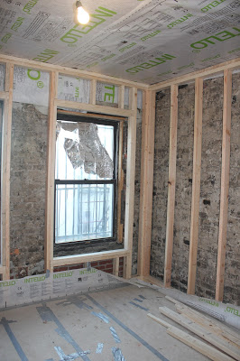
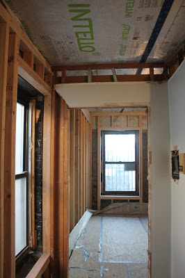
Walls with new wood studs and ceiling with Intello
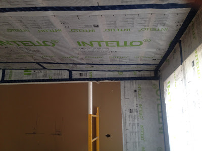
All air barrier joints are taped
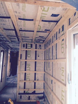

Service cavity battens and Light tube in bathroom for natural light
Windows:
We used triple-pane Klearwall aluminum windows which have a low U-value, are thermally broken and airtight (see http://www.klearwall.com/Windows/passiv-alup.html, http://www.klearwall.com/Windows/passiv-alup.html). Triple-pane windows are a must for Passive House construction in the Northern Climate zone. The double hung windows which are typically used in New York City are not feasible for a "low-energy" building, as they are too leaky- creating draughts and let letting conditioned air escape to the outside. The solar tube in the bathroom is airtight, thermally broken and insulated to reduce energy loss in the winter and overheating in the summer (https://foursevenfive.com/product-category/fenestration/lightway-solar-tubes/).
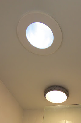
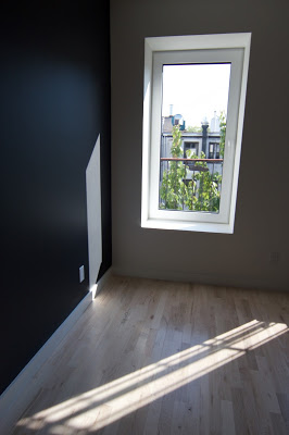
Solar tube in bathroom and Tilt and turn bedroom window
Ventilation:
As we created an airtight envelope on all exterior surfaces of the apartment , a mechanical ventilation system is needed to supply the apartment with fresh air. Each room had an existing gas heater which we removed and we reused the openings to install a through-wall ventilation unit with heat recovery.(http://www.lunos.de/en/product/e_with_heat_recovery/). These units supply the apartment with fresh outdoor air while ejecting stale air from inside the space. Heating/cooling losses are minimized (with an efficiency of 90%) with a heat-exchange within the units. Energy losses are minimal and the apartment is supplied with a constant flow of fresh air. Windows can be opened or closed, as in a normal building, but it is just not needed for ventilation anymore. In fact, using a ventilation system such as this keeps the space better ventilated than a regular building with less temperature loss and thermal variation.
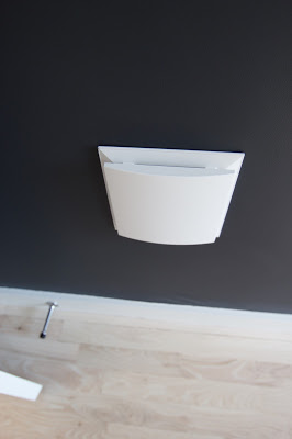
Lunos e2 in bedroom wall
Heating and Cooling:
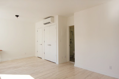
For heating and cooling we installed two of the smallest ductless Mitsubishi Mini-Split units. While one unit would have been enough to cover the heating and cooling demand, the unusual shape of the apartment forced us to install two.
Mini split unit for heating and cooling
In summary the overall look of the apartment is simple and understated. The light coming in through the windows is bright, yet does not overheat the apartment. The apartment stayed surprisingly cool during the hottest weeks even without the AC being used. We are very excited with the result and look forward to the winter months to assess the overall energy saving and quality.
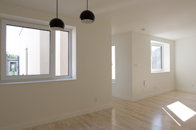
Living Dining Room
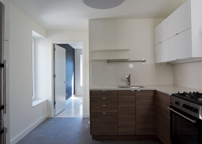
Kitchen
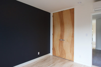
Bedroom
We conducted an open house where architects, clients and Passive House practitioners visited to review the results. Here is a little comment we received from a fellow architect after she walked through the apartment:
"I had the opportunity to tour an apt coop unit that had just undergone gut-rehab -- but via energy-saving Passive House construction techniques, thanks to Stefanie's expertise and a forward-thinking client. I remarked on how the super-insulated walls created deep, crisp window jambs, actually complementing DAS Studio's elegant minimalist design. Then I noticed all the sunlight streaming-in through the super-insulated efficient windows, yet how comfortable the temperature was inside (even though we were at the top floor of a 1920's brick building in the sweltering summer). Only 2 split AC/heating units are needed to serve the entire apt. Talk about energy savings! But one of the best revelations came near the end of my visit, when I acknowledged how calm the space felt. I realized this was because it was so quiet. The air barrier tightness and super-insulation of Passive House technology truly does keep the noise out.
..... It’s a perfect integration of elegant design with environmentally responsible methods and materials."
Please contact us with any questions and comments at: info@das-studio.us. We will be happy to provide additional information and details.
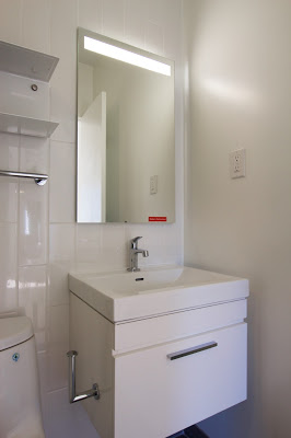
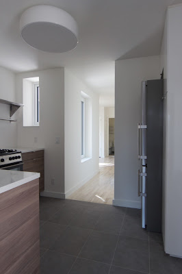
Bathroom and Kitchen


