David introduces it in the Tiny House Nation episode below. You Can see the David and our design by jumping to minute 21. It is about 2 minutes long. Check it out!
http://www.fyi.tv/shows/tiny-house-nation/videos/204-sq-ft-climbing-gym
The Construction of our Micro Apartment
More images will follow, but here is a little taste. The General Contractor is testing our foldable wall and bunk beds during construction.

The Beginning
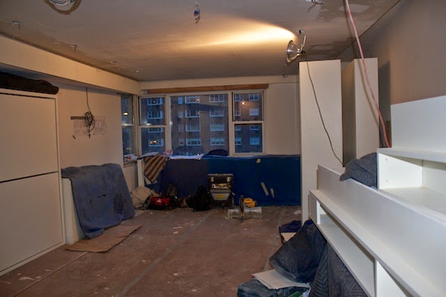
Resource Furniture beds and lower cabinets are installed
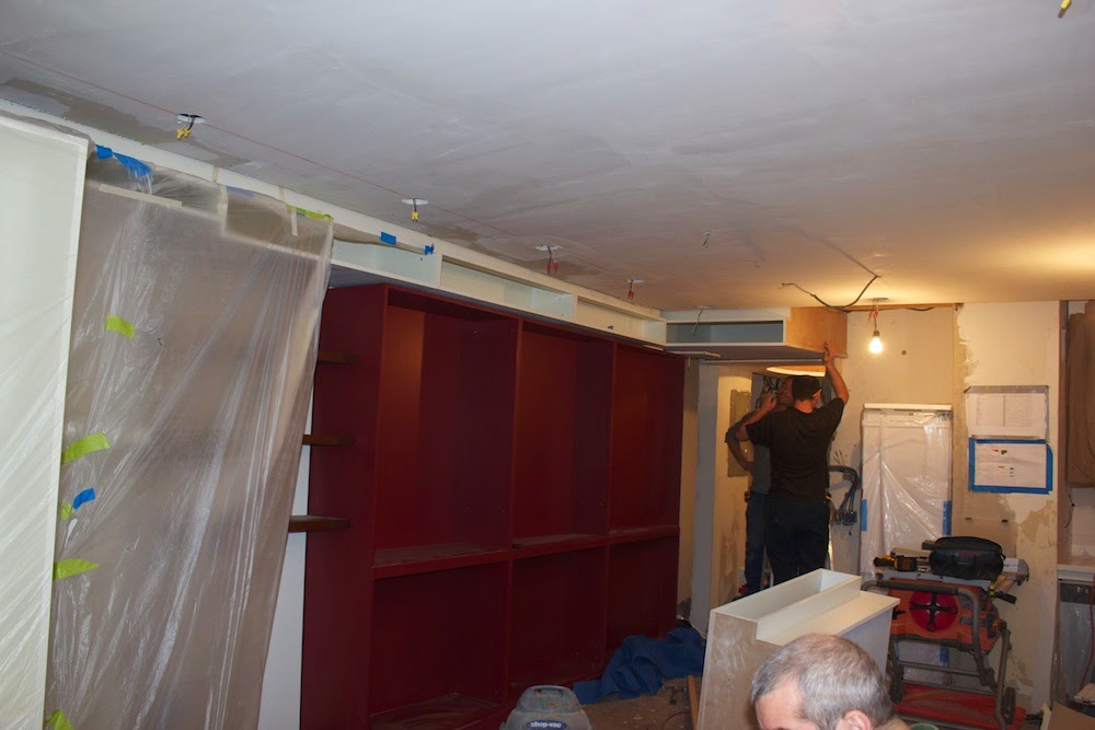
Red cabinet and soffit cabinets are being installed
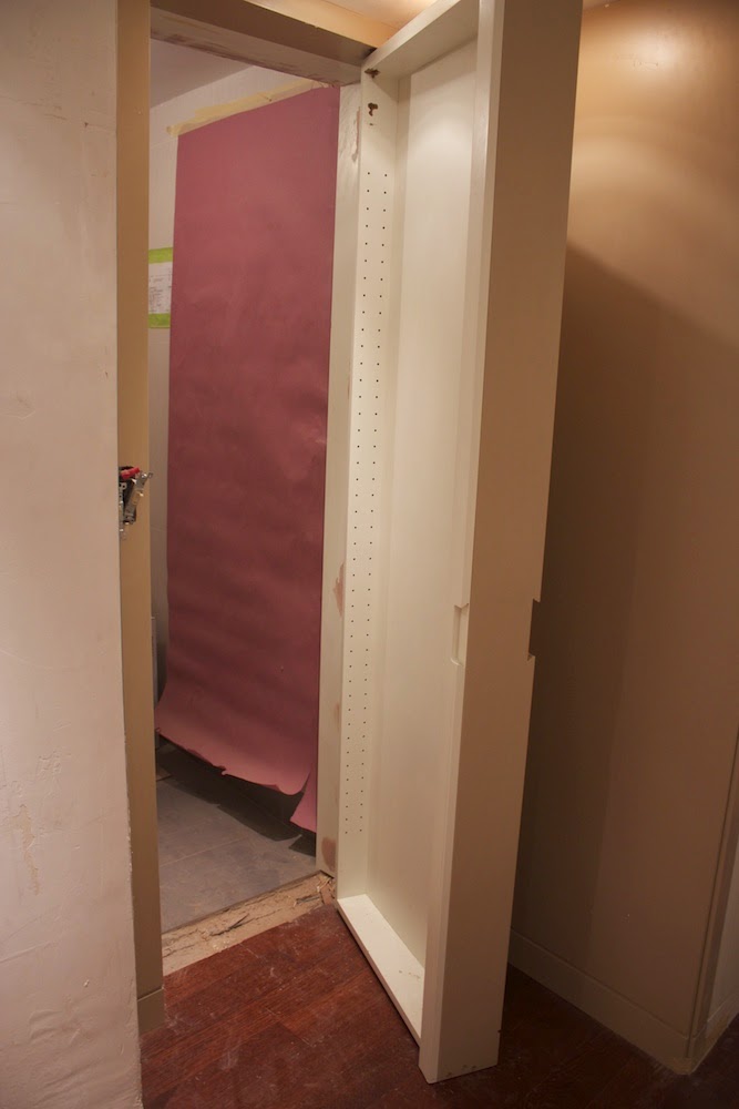
Bathroom/ medicine cabinet door
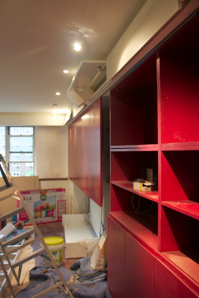
Sliding panel for painting is installed
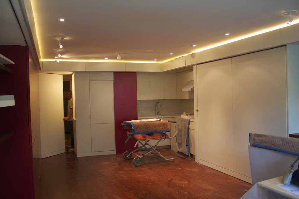
All cabinets but movable kitchen island are in

Folding wall in front of bunk beds in open position
Micro Apartment Design
 |
| Foyer and Gallery Space |
Early in 2014, the owners of a small Manhattan studio approached DAS Studio with a request to convert their 320 sqft space into a high-functioning micro-apartment. The desire was to have all the functionality of a full-sized apartment within the footprint of this tiny studio. On taking on this challenge, we identified the minimal design objective of needing to incorporate four fully functional spaces into one room - a dining room seating 12, a master bedroom, guest room for two. The owners also needed enough storage space for their extensive china collection, hanging space to display their art collection, including a 4' x 10' painting and room for an entertainment system. Further, space needed to be accounted for a work desk that could be separated from the sleeping area in case one of the owners were still asleep. We set out to achieve all the above while still creating a space that was open and generous.
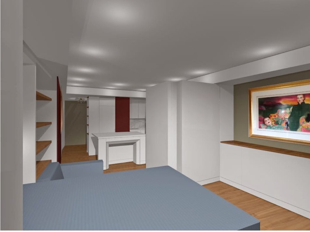
The following renderings showing the different possible apartment configurations. Photos of the apartment will follow soon.
 |
| During day time a living |
 |
| During night time a master bedroom with guest bedroom option |
 |
| During day time master bed becomes a couch and guest beds collapse behind folding wall |
 |
| During night time master bed opens over couch and guest beds pull out behind folding wall |
 |
| Daytime configuration with couch and sliding panel/ art wall |
 |
| Night time configuration with master bed and folding wall |
DAS Guest Blogger Francisco
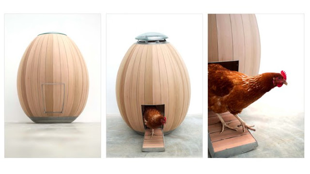
Which comes first the chicken or the well-designed egg?
Does a chicken have a sense of style? Does the design of a chicken coop affect egg production? Do country chickens live in shabby coops while urban chickens reside in contemporary abodes? These are some of the questions that came to my mind when I found this:
http://www.nogg.co/
This is indeed a beautifully designed chicken coop. The idea of a chicken roosting in an egg is a clever one that might inspire meditation on recursion. And, of course, this coop would look fabulous in a modernist backyard. I must admit, I am easily seduced by beautiful well-made things.
But what if we asked a chicken what it thinks of this? It might say, “I’m not a fussy chick. All I need is a place that keeps me dry and safe. So yes, this would work but here’s the challenge. The price of this beautiful chicken house is £1950.00 (currently $3,146.52) not including shipping etc. That’s a lot of eggs to lay to pay for this fabulous house.” Does this foreshadow a chicken house foreclosure scandal in our future? Who knows? All I know is that if I were that chicken I’d look for a couple of heavy laying sisters as housemates.
May your roost be finely feathered,
Francisco
P.S. No chickens were hurt during the writing of this blog entry.
Due to Francisco's chicken coop post some readers have expressed an interest in egg-shaped dwellings for humans. Therefore, we think you might be interested in this (click on link):
Francisco A. de León is a graphic designer with a Bachelor of Architecture. We enjoy his sharp wit and keen observations. He will periodically guest post on our blog. We hope you enjoyed his "eggcentric" point of view.
Francisco A. de León is a graphic designer with a Bachelor of Architecture. We enjoy his sharp wit and keen observations. He will periodically guest post on our blog. We hope you enjoyed his "eggcentric" point of view.
DAS Architectural Idea
Making an Old Bathtub Look New.
Renovating a bathroom can be a pricey, disruptive and time consuming endeavor: Demolish everything; Replace the tiles and fixtures. Taking the old and perfectly good bathtub and replacing it with a new one often of poorer quality adds even more cost without great benefits. However leaving the bathtub as is creates an eye sore in an otherwise new bathroom.
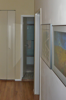 |
| Before |
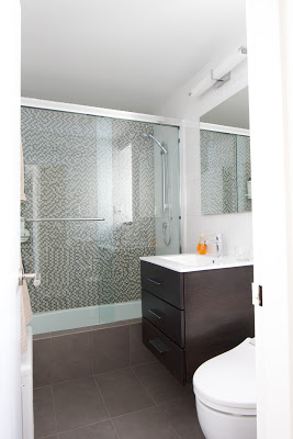 |
| After |
One of the ideas we implemented in this project is keeping the old bathtub in place but enclosing it's front with tile. It appears new from the outside and fits in perfectly with the new styling of the bathroom. Two things should be considered when doing this: you need a big enough bathroom as the new ledge will take up 4", you must carefully waterproof the tile ledge and floor. In our case we used the floor tiles for the ledge This visually links the front of the bathroom with the floor, eliminates the ugly standard bathtub front and the room feels more continuous and spacious.
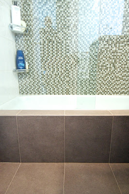 |
| Floor tiles creating the edge |
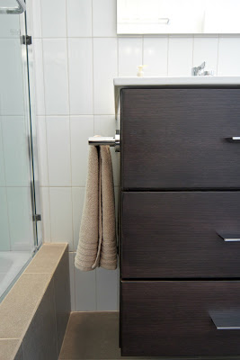 |
| Ledge and Vanity |
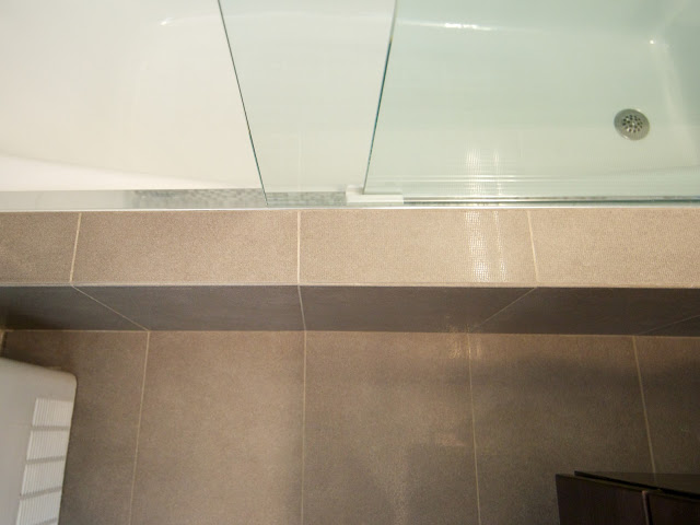 | |||
| Ledge with Shower Door Track |
DAS Minimalist Easter Egg
 |
| Architectural Easter Egg |
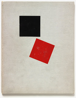
For a little more color and fun why not attempt to recreate some twentieth Century art on the eggs? Maybe a little Mondrian or El Lissitsky like the two eggs below.
DAS Interior Design Ideas
As we move from winter into spring we all feel the need to spruce things up. It’s a time of change, the warm lighter days of spring are replacing the cold dark ones of winter. Why not extend that feeling to our homes? It does not have to be a major project entailing months of planning and vast expense. A few simple changes to accessories or accents can transform the winter room to a summer one.
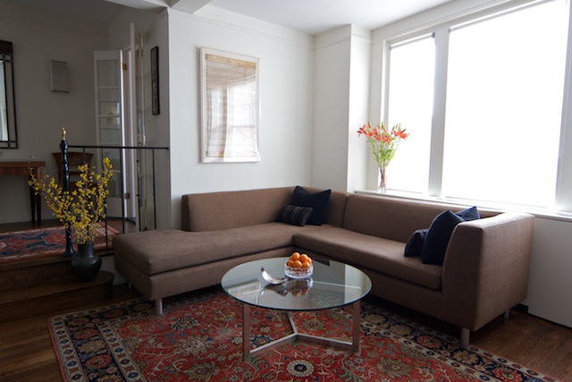
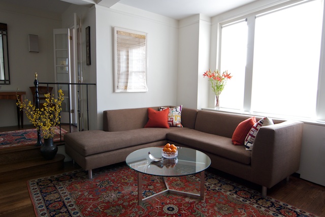
Let's go back to David and John's place and show you how very minor modifications can lead to significant changes in mood and setting.
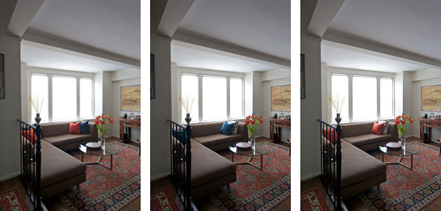
In the following photos we show the same couch with different pillows. As you see, the atmosphere of the room changes. Some pillows intensifying the colors in the rugs others subduing them. These photos, all taken with at the same time of day with identical lighting and exposure settings, show stark differences between the effect of the black, orange and white patterned pillows. The black ones create a subtle lounge like effect, creating a sophisticated evening atmosphere. While the orange pillows pick out the colors of the rug and console in the back - giving the space a lighter casual daytime feel. Two starkly different moods created by swapping nothing but pillow covers.
DAS Spring Idea
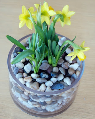
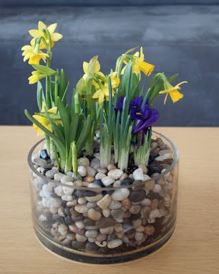
On the question: How are you? One of our friends replied, "I've got daffodils on my desk which make me happy. You should get some too!" She's right. Even if it is still cold and sometimes wet outside we all feel spring is coming. The days are getting longer. The sun is warmer and the farmers market are full of fresh flowers.
Why not bring spring into our homes and offices? Pick potted crocuses, daffodils or tulips. You can just leave them in a clay pot or put them in a glass bowl with some pebbles around or colored wax paper.
At Harlem Flo they add some twigs around the tulips to give them a bouquet like look, contrasting the spiky twigs with the fresh new leaves.

